Actions
Defect #22196
closedImprove positioning of issue history and changesets on small screens
Start date:
Due date:
% Done:
0%
Estimated time:
Resolution:
Fixed
Affected version:
Description
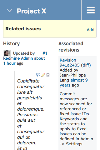
On small screens, just like on the big ones, the issue history and the associated changesets are positioned next to each other. This looks strange, especially, if the the issue comments contain blockquotes.

The attached patch adds CSS rules to place them below each other on small screens.
Files
 Updated by Gregor Schmidt about 9 years ago
- File 0001-Place-changesets-above-history-on-small-screens.patch 0001-Place-changesets-above-history-on-small-screens.patch added
- File one-below-the-other.png one-below-the-other.png added
The attached patch is targeted at trunk. It removes the floating and horizontal spacing and adds some vertical spacing.

 Updated by Jean-Philippe Lang almost 9 years ago
- Status changed from New to Closed
- Assignee set to Jean-Philippe Lang
- Resolution set to Fixed
Committed, thanks.
Actions