 improve the readably and clarity of the Issue Page
Added by Moritz Koehler almost 11 years ago
Hi everyone,
@ Redmine Dev Team: first of all, Thank you very much for providing such a beautiful peace of software. At the moment I write my Bachelor thesis about Engineering Change Management. When I started off I could not find any independent software that can cover the needs for an Engineering change management system, so I already prepared myself to program something (most likely access) by my self. But then I learned about Redmine and I was surprised how identical an software issue tracking and a issue tracking system for products are. So Thank you very more for saving me hours of programming (where I am anyway not good in, I man an engineer not an programmer) creating a tool which would not slightly as good as Redmine.
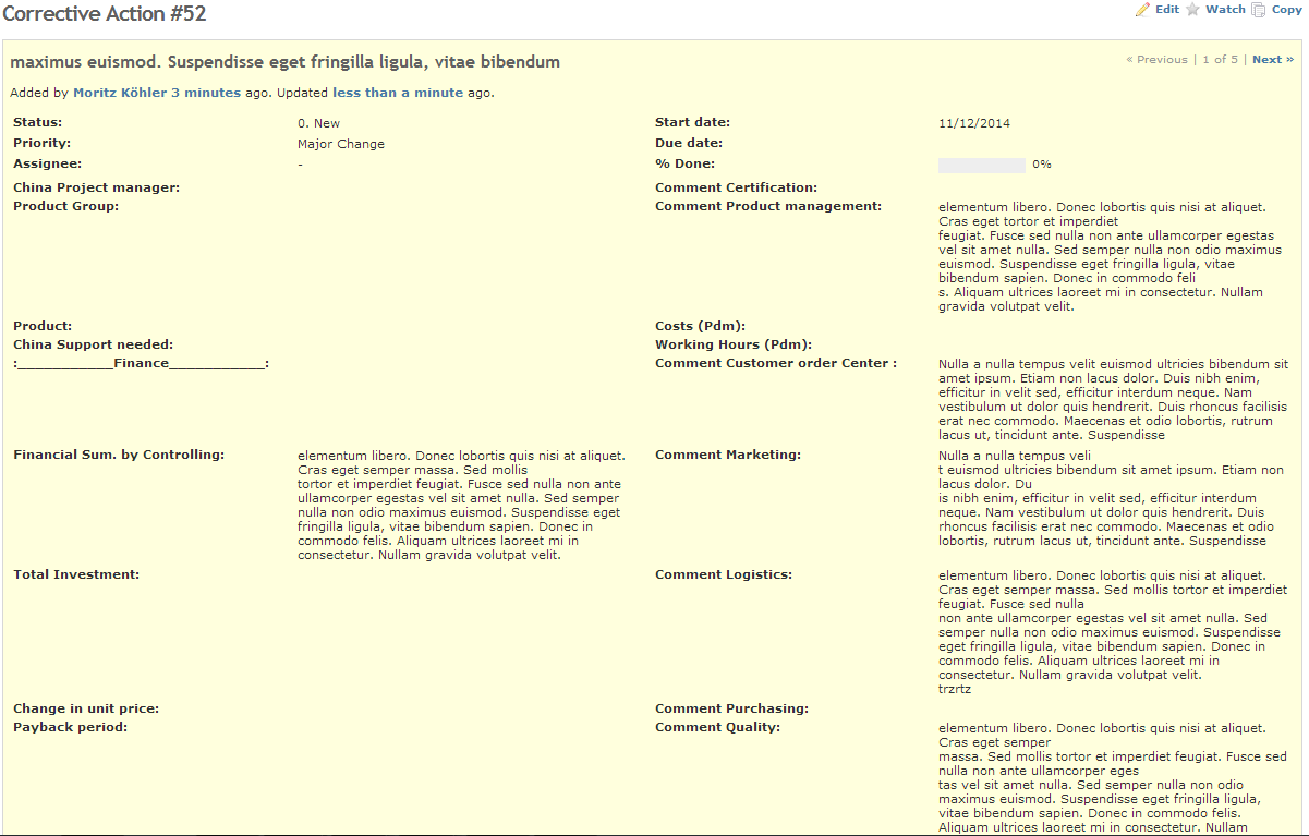
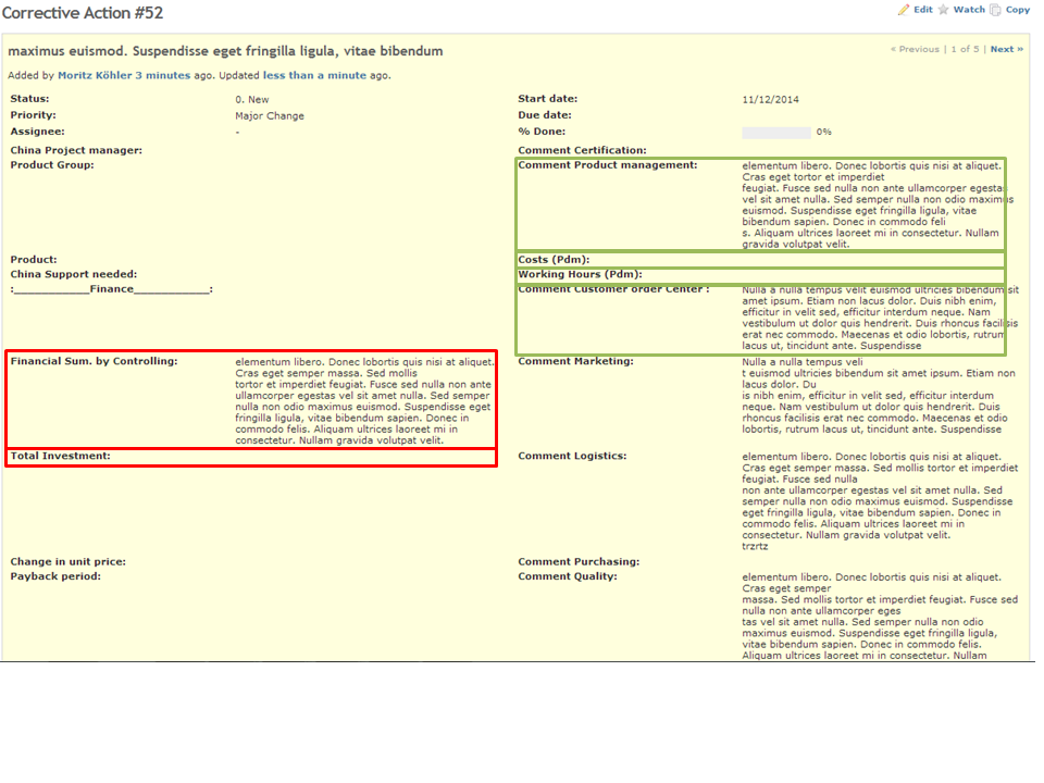
Does any one has an idea how I can structure the issue page better? Since I have a lot of custom filds (some with much text in it) the page can get very confusing. To start of it could help when I insert frames around the every custom field, so at least it is clear to which custom field the content belongs to. Also it would be nice to have some kind of grouping the custom fields so they can be read much faster. In the attached picture I grouped it by different colored frames.
I would be happy about any tip how I can implement that In the source code. Also I would be very open to other ideas how to improve the readably and clarity of the Issue Page.
Thanks you in advance
Kind Regards
Moritz
| Change Request.PNG (61.1 KB) Change Request.PNG | example issue page | ||
| Change Request 2.png (281 KB) Change Request 2.png | example of solution |
Replies (2)
 RE: improve the readably and clarity of the Issue Page
-
Added by Mischa The Evil almost 11 years ago
RE: improve the readably and clarity of the Issue Page
-
Added by Mischa The Evil almost 11 years ago
Moritz Koehler wrote:
Does any one has an idea how I can structure the issue page better? Since I have a lot of custom filds (some with much text in it) the page can get very confusing. To start of it could help when I insert frames around the every custom field, so at least it is clear to which custom field the content belongs to. Also it would be nice to have some kind of grouping the custom fields so they can be read much faster. In the attached picture I grouped it by different colored frames.
Such can be done using some CSS in a custom theme, although it can be a bit tricky.
If you look at the html source of issues/show (meta-code) you can see that the related parts are like1:
<div#content>
  <div.issue.details...more.attributes...>
    <table.attributes>
      <tbody>
        <tr>
          <th.status>
          <td.status>
          <th.start-date>
          <td.start-date>
        </tr>
        ...more.rows.with.core.fields...
        <tr>
          <th.cf_3>
          <td.cf_3>
          <th.cf_12>
          <td.cf_12>
        </tr>
        ...more.custom.field.rows...
As you see the issues attributes are wrapped in a table where each cell contains the attribute name in its class. For custom fields the prefix cf_ followed with the custom field id is used. In this above example the custom fields ids are three and twelve, which are added in the classes of both the th and td elements (.cf_id).
The position of the custom field on the view is using the sort order of the custom fields.
Now within you theme you can use these classes to style the elements and their contents.
For example, you can simply add a one px border around both the header cell and the regular cell by using something like:
#content div.issue.details table th.cf_3 {
  border: 1px solid black;
}

#content div.issue.details table td.cf_3 {
  border: 1px solid black;
}
and (almost) surround a th and td pair with a border like:
#content div.issue.details table th.cf_3 {
  border-top: 1px;
  border-right: 0px;
  border-bottom: 1px;
  border-left: 1px;
  border-style: solid;
  border-color: black;
}

#content div.issue.details table td.cf_3 {
  border-top: 1px;
  border-right: 1px;
  border-bottom: 1px;
  border-left: 0px;
  border-style: solid;
  border-color: black;
}
If you want to have full control over all table elements and their properties (like borders without the gap) you first need to set the tables borders to collapse using
#content div.issue.details table {
  border-collapse: collapse;
}
in your theme. Then you can fully layout the table to your specific needs based on the
ids of the custom fields.
Another example, with the need for the table to be in border-collapse: collapse mode, for when you want to modify an individual row (number 6, using CSS3 selector [beware: this is not always reliable]) and individual cells can roughly look like something like this:
#content div.issue.details table {
  border-collapse: collapse;
}
#content div.issue.details table tr:nth-child(6) {
  border: 3px solid green;
}

#content div.issue.details table th.cf_3 {
  border: 1px solid black;
}

#content div.issue.details table td.cf_3 {
  border: 1px solid black;
}

#content div.issue.details table th.cf_12 {
  border: 1px solid black;
}

#content div.issue.details table td.cf_12 {
  border: 1px solid black;
}
I hope these examples are useful to get you in the right direction...
Regards,
Mischa.
1
RE: improve the readably and clarity of the Issue Page
-
Added by Moritz Koehler almost 11 years ago
Thank you very much, that helped me a lot