Actions
Defect #22196
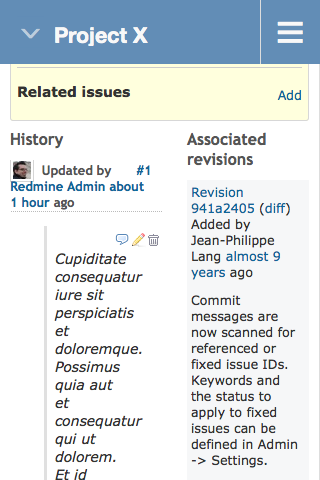
closedImprove positioning of issue history and changesets on small screens
Start date:
Due date:
% Done:
0%
Estimated time:
Resolution:
Fixed
Affected version:
Description
On small screens, just like on the big ones, the issue history and the associated changesets are positioned next to each other. This looks strange, especially, if the the issue comments contain blockquotes.

The attached patch adds CSS rules to place them below each other on small screens.
Files
Actions
