Defect #6271
closedToo many tabs on project views
0%
Description
r4013 (#6153) added new modules for Gantt and Calendar views, which is a good thing in my opinion.
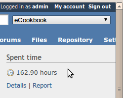
But now we have 14 tabs if we activate every modules for a project, which is far too much. It forces user to scroll horizontally for horizontal resolutions less than 1024px.
Plus for Calendar and Gantt cases, there are already links in Issues' sidebar. It makes UI a bit messy / confusing.
Any idea to improve that ?
Files
 Updated by Eric Davis about 15 years ago
I (and a few of my clients) have created themes where project modules are on the side with a vertical menu. I think this is the best option because web users are familiar with vertical navigation menus and the menus would all have a set height (instead of a variable width like now).
 Updated by Jean-Baptiste Barth about 15 years ago
Maybe "New issue" could disappear (see #6204). And Docs + Files should be merged. I don't know if we need to do something before 1.1, but I don't like having so many tabs in current trunk, and I suspect others to agree.
That said, I really really loved previews of Shane&Peter theme, with vertical left menu. Are you/they still working on it ? How & where does it display sidebar ?
 Updated by Eric Davis about 15 years ago
Jean-Baptiste Barth wrote:
That said, I really really loved previews of Shane&Peter theme, with vertical left menu. Are you/they still working on it ? How & where does it display sidebar ?
It's done (with some minor tweaks over time). It's using CSS and a custom menu generator but nothing too complex.
 Updated by Jean-Baptiste Barth almost 15 years ago
- Status changed from New to Closed
- Resolution set to Duplicate
Closing this one in favor of #6624, where we could discuss related UI problems.
 Updated by Jean-Philippe Lang almost 15 years ago
I had to remove gantt and calendar tabs that were added recently because the core menu is not designed to hold an item for each view.
Plugins can add these tabs at will.
 Updated by Eric Davis almost 15 years ago
- Status changed from Closed to Reopened
- Assignee set to Jean-Philippe Lang
Jean-Philippe Lang wrote:
I had to remove gantt and calendar tabs that were added recently because the core menu is not designed to hold an item for each view.
Plugins can add these tabs at will.
Instead of fixing the core menu so that it will hold more items, you removed two that belong there. Since adding those two menu items, I've used both the Calendar and Gantt daily. Having Calendar and Gantt buried inside the Issues module is wrong. Please reconsider this decision and add the Calendar and Gantt back in.
 Updated by Jean-Philippe Lang almost 15 years ago
- Status changed from Reopened to Closed
Eric Davis wrote:
Instead of fixing the core menu so that it will hold more items, you removed two that belong there. Since adding those two menu items, I've used both the Calendar and Gantt daily. Having Calendar and Gantt buried inside the Issues module is wrong. Please reconsider this decision and add the Calendar and Gantt back in.
If these tabs are really needed, the menu should have been fixed before adding them. Nobody requested them here for now so I think that a plugin to add them is a fair solution.
 Updated by Felix Schäfer almost 15 years ago
Okay, if you want people to chime in…
Eric Davis wrote:
Having Calendar and Gantt buried inside the Issues module is wrong.
I agree that the place they are currently at (in the issue list) is cumbersome at best, unintuitive at worst. Why not put the Roadmap with them in the issue list then? I'd like to keep Gantt and calendar in the core menu too.
 Updated by Jean-Philippe Lang almost 15 years ago
Felix, I'm not saying that the gantt and calendar tabs are useless or not.
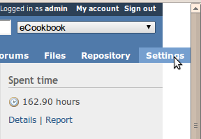
The problem here (read the ticket subject) is that the current menu can not hold so many items. A user with all permissions and an average screen can not even see the settings tab.
So, let's fix the menu first and add the tabs back if needed. This is not a quick fix and we should define how the new menu should look like before changing anything.
 Updated by Eric Davis almost 15 years ago
Forget it, I'll just keep my vertical menu code private. I've already had to fork/patch some of Redmine's code due to disagreements in the features and UI, this will just be another one.
Felix: You might want to give the heads up in the forums about this change. The Gantt and Calender tabs are present in 1.0.2 and 1.0.3 (stable) so this is going to confuse people if 1.0.4 suddenly loses them.
 Updated by Jean-Baptiste Barth almost 15 years ago
- File 6271_1.png 6271_1.png added
- File 6271_2.png 6271_2.png added
Eric Hulser: other people may actually have a plugin just to deal with the introduction of these two tabs, hehe ;) A vertical menu would be a credible (if not great!) option imho. I'd really like to see you share it with the community.
Just to show you what kind of problem I wanted to point out, so that it becomes less abstract, here are two screenshots.


I think everybody's trying to make Redmine a better piece of software here, so keep being constructive everyone. This issue is no big deal at all, we just need to find a consensus decision on what to do before 1.1.
 Updated by Jean-Philippe Lang almost 15 years ago
- Resolution changed from Duplicate to Wont fix
Eric, I've reverted r4381 so that it fits well with your private code.
Thanks for contributing to an open source software. I'll try to fix the core menu as soon as I can.