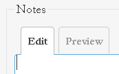
 The Preview link converted into a tab after upgrade to Redmine 4.1.1
Added by Anton Shepelev over 4 years ago
Hello, all
After we upgraded our Redmine from 2.x to 4.1.1 as part of the Bitnami Remine stack, the Preview link:

Since this site still as the link and no tabs, it is either configublem in Redmine or some Bitnami-specific modification. If it is the former, can you please tell me how to get rid of the tabs and have the Preview link back—

| rmtab.png (1.06 KB) rmtab.png | A screenshot with the Preview tab | ||
| rmlink.png (536 Bytes) rmlink.png | A screenshot with the Preview link |
Replies (2)
 RE: The Preview link converted into a tab after upgrade to Redmine 4.1.1
-
Added by Marius BĂLTEANU over 4 years ago
This site runs a very old Redmine version. The "Preview" link is no longer available in the latest versions. Being the person who provided the patch to replace the link with tabs, can you tell my why do you prefer the old method?
 RE: The Preview link converted into a tab after upgrade to Redmine 4.1.1
-
Added by Anton Shepelev over 4 years ago
While composing large messages, I am in the habit of scrolling from source to preview and back. This process is very fast, because it does not require interaction from the browser. With the tab interface, however, it is much slower because a new preview has to be rendered and displayed every time I click on the tab. Furthermore, the location of the Preview link at the bottom of the editor window is more convenient than the tab at the top of it, because one usually wants to see a preview after one has finished composition, with the cursor at the end of the editor window. With the new Redmine I am forced to scroll back up after every edit cycle. For these reasons, I consider the tab a less efficient interface element.
Edit:
Another annoyance is that the Preview tab is visually inconsistent with the final rendered output: it is displayed on a white background, in a smaller type, and in a narrower window. Furthermore, the rendering of compact and sparse Markdown lists on the Preview tab is different from the same in the final output. The old Preview link better aesthetically because of its harmony with the general look of Redmine. I have a case of nostalgia everytime I use it in this forum :-)
Edit: If implementing a configuration setting is not worth it, what about having both—the tab and the link?