Feature #25988
closedPreview files by default instead of downloading them
Added by Jan from Planio www.plan.io almost 9 years ago. Updated almost 9 years ago.
Description
Through user research at Planio, we determined that users expect to preview file attachments (images, text, pdfs - see #22483) in a browser window rather than downloading them when they click.
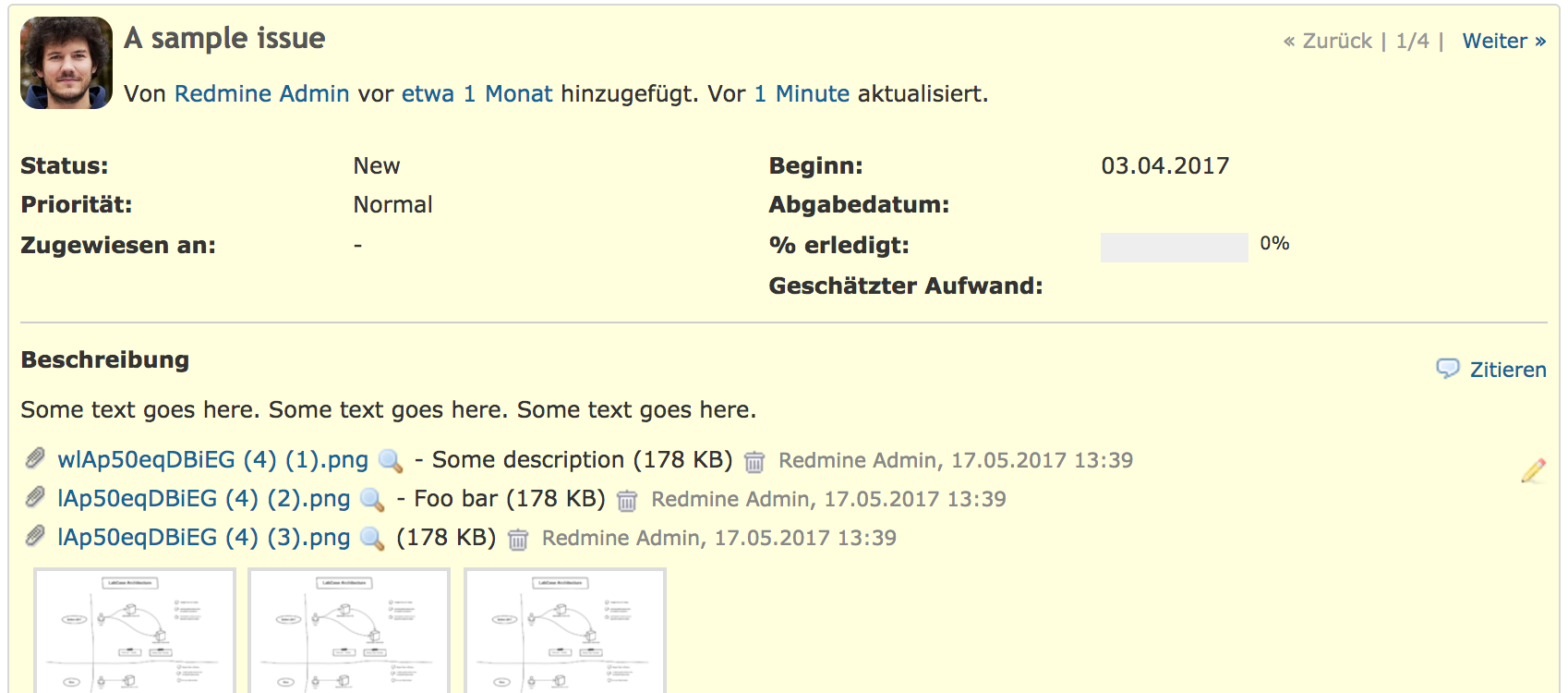
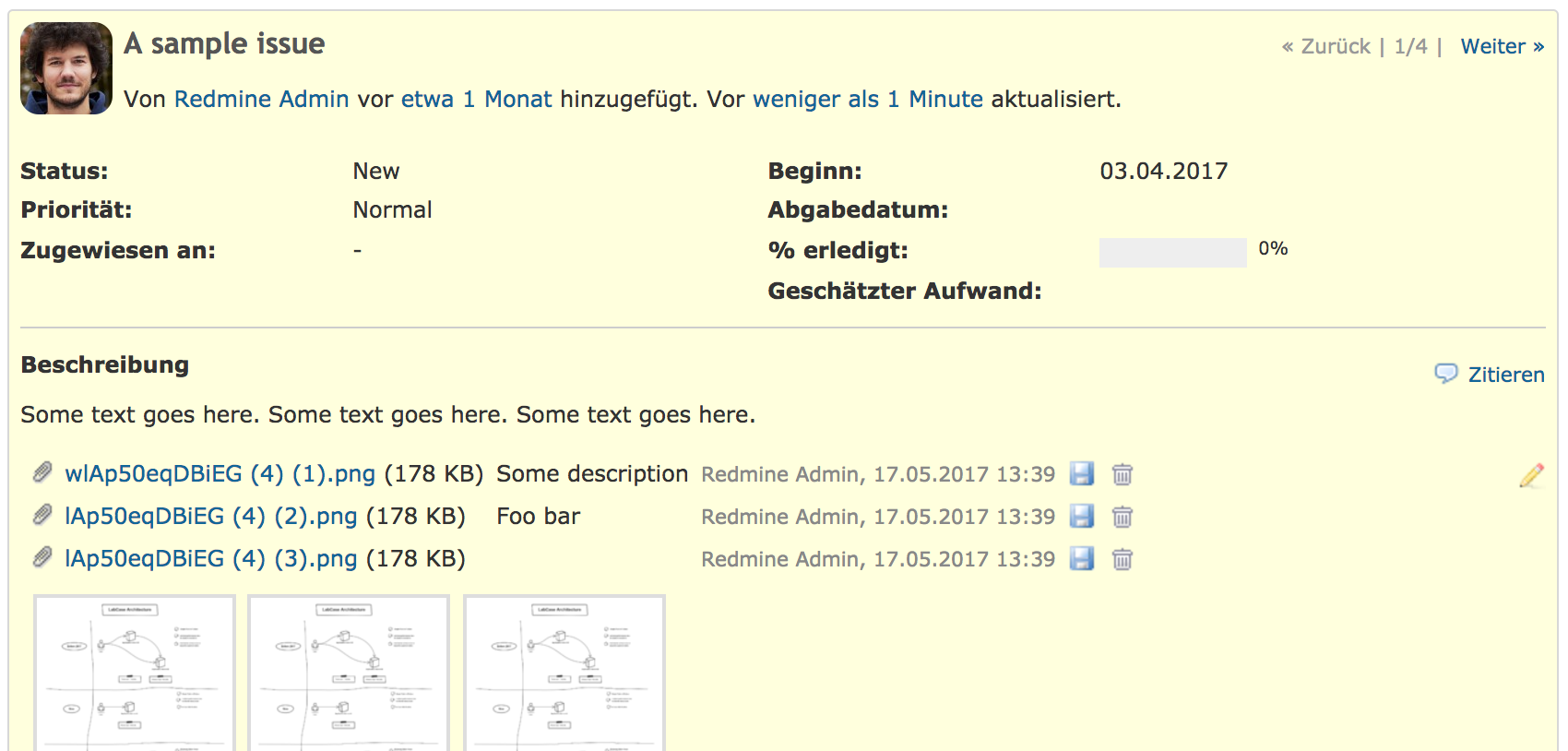
The attached patch switches the default behaviour from downloading to previewing and it replaces the old magnifier icon (for previewing) with a disk icon (for downloading).
It also cleans up attachment display using the attachments/links partial by displaying data in a borderless table format.
Here's a preview:
Current status:

Proposed new status:

Files
Related issues
 Updated by Jan from Planio www.plan.io almost 9 years ago
- File 0003-Use-new-icon-download-class-for-downloads.patch 0003-Use-new-icon-download-class-for-downloads.patch added
Since there’s a semantical difference between saving and downloading (saving to disk), I've introduced a new CSS class here (but I'm still using the same icon for now).
 Updated by budo kaiman almost 9 years ago
+1 the default behaviour always throws me off.
 Updated by Go MAEDA almost 9 years ago
I think it is dangerous to place a download button just beside the delete button. Some user may accidentally delte files.
 Updated by Jan from Planio www.plan.io almost 9 years ago
Go MAEDA wrote:
I think it is dangerous to place a download button just beside the delete button. Some user may accidentally delte files.
Thank you for your feedback. I agree that might be the case. However, Redmine has already JS popups asking if files should really be deleted. I also liked the fact that we place the icons next to each other, to make a clearer separation between text and icons.
Do you have a proposal where the icons would be better placed?
 Updated by Go MAEDA almost 9 years ago
Jan from Planio www.plan.io wrote:
I also liked the fact that we place the icons next to each other, to make a clearer separation between text and icons.
Do you have a proposal where the icons would be better placed?
I would rather prefer the position where the magnifier icon is placed in the current implementation, but I can understand what you said.
 Updated by Jan from Planio www.plan.io almost 9 years ago
- Blocks Feature #25999: View repository content by default (instead of the history) added
 Updated by Gregor Schmidt almost 9 years ago
I agree. Putting the download buttons into a new column between file name and description might be the safer option.
 Updated by Jan from Planio www.plan.io almost 9 years ago
- File ragged_right.png ragged_right.png added
- File three_columns.png three_columns.png added
Thank you for your feedback, Go and Gregor. Holger and I played around with different layouts before I submitted the patch. We went for the current implementation because we felt it looks cleaner to have the two icons next to each other.
When placing the download icon next to the filename, you will either end up with three stacked columns of icons (paperclip, disk, and trashcan), or you re-introduce much of the current visual style which I find not very appealing due to its "ragged right" appearance.
Here are the two screenshots:

Cons: Three columns of icons

Cons: "Ragged right" appearance
 Updated by Go MAEDA almost 9 years ago
- Target version changed from Candidate for next minor release to 3.4.0
Jan, thanks for testing UI variations. Now I have understood that the first UI is best.
I am setting target version to 3.4.0.
 Updated by Go MAEDA almost 9 years ago
- Related to Feature #22481: Show thumbnails for PDF attachments added
 Updated by Jean-Philippe Lang almost 9 years ago
- Blocks deleted (Feature #25999: View repository content by default (instead of the history))
 Updated by Jean-Philippe Lang almost 9 years ago
- Status changed from New to Closed
- Assignee set to Jean-Philippe Lang
- Resolution set to Fixed
I've committed the change with the download icons close to the filename, I find it more usable.
I prefer not to commit the first patch as attachments are not part of the files module. Having no tab selected is indeed not great but it would be much better to highlight the tab that correspond to the container of the attachment (eg. when previewing an issue attachment, the issue tab should be selected). I'll have a look at this.
 Updated by Go MAEDA almost 9 years ago
- File 25988-format_object.diff 25988-format_object.diff added
- Status changed from Closed to Reopened
I noticed that attachment links in the following features should also lead to Preview page by default to increase consistency.
I wrote a patch to change the behavior: 25988-format_object.diff
 Updated by Go MAEDA almost 9 years ago
- Related to Defect #26310: "attachment:filename" should generate a link to preview instead of download added