Feature #28514
closedissue delete button confusion
Description
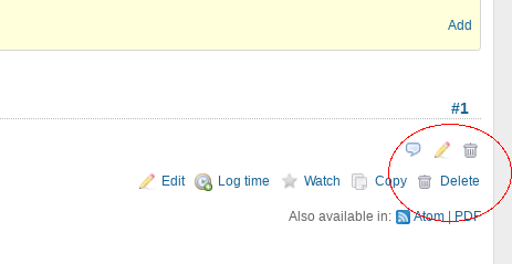
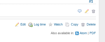
In 3.4.3, if your last issue history item is only one or two lines, you end up with the history item delete button (trashcan) directly above the whole-issue delete button (trash can plus "delete") so that it is really unclear whether the "delete" text button goes with the history item or the whole issue, leading to accidental issue deletion.
We should add a separator between the history list and the item action buttons.
To reproduce:
- Add a one line Note to an issue and save it.
- look at the delete buttons a the bottom right corner of the page.

If we put some <hr>'s in the issue show template (patch attached) it becomes obvious that the "delete" text does not go with the history item, but with the whole issue.

Files
Related issues
 Updated by Marc Mengel almost 8 years ago
Should note in the reproduce text above, you need to be Manager on the project to reproduce.
 Updated by Marius BĂLTEANU almost 8 years ago
- Is duplicate of Patch #26662: Add border around issue history to prevent accidental deletion of an issue added
 Updated by Marius BĂLTEANU almost 8 years ago
- Tracker changed from Defect to Feature
- Status changed from New to Closed
- Resolution set to Duplicate
A patch was submitted in the related ticket.