Actions
Defect #38448
closedThe margin below the Submit button on the issue edit page is too narrow
Start date:
Due date:
% Done:
0%
Estimated time:
Resolution:
Fixed
Affected version:
Description
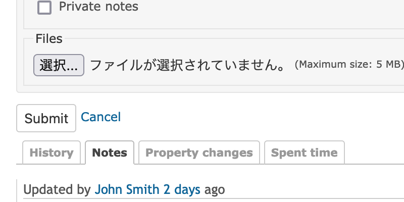
Since margin-bottom for the Submit button on the issue edit page is not set, the margin below the button is narrow when displaying the history in reverse chronological order. Therefore, the UI/UX is slightly spoiled.
The attached patch sets margin-bottom to the form area to improve the UI/UX.
Before:
After:
Files
Actions