Patch #13747
open
Issue Colors Patch for #4967
Description
Hi,
here is the first patch for issue #4967. I have some further additions to this but maybe you'll take a look at this.
The needed files where also attached. Please add the credits to http://www.famfamfam.com/lab/icons/silk/
I would appreciate some Feedback.
Best regards,
Daniel
Files
Related issues
") Updated by Jan Niggemann (redmine.org team member) about 13 years ago
Updated by Jan Niggemann (redmine.org team member) about 13 years ago
Just tried, I like it very much!
Just FYI, on my 2.3.0 the priorities are as follows:
normal is priority-4
urgent is priority-3
and so on...
 Updated by Daniel Felix about 13 years ago
Hi Jan,
well this priority is a little bit tricky. I can change this to set them with the speaking word "priority-highest" etc. But they will change too if you change your sort-order.
This patch just aims to fit the default values. I'm not sure how to prepare it for dynamic priorities.
Another thing is the higher line height. It seems to be better, as we could read each line easier. I'll provide a fine tuned patch later this day or on my weekend.
Thanks for your feedback!
Best regards,
Daniel
 Updated by Dipan Mehta about 13 years ago
Hi Daniel,
I am very happy to see work getting its way on this topic. The screen shots looks interesting - and now I kind'a hooked to the core question about how will it work for 'Arbitrary number of tracker X arbitrary number of status X different priorities' - it kind of now asking more basic questions.
let me crystallize my thoughts and I will come back here for sure.
BTW: should I post suggestions here or on the original issue?
Very glad!
Dipan
 Updated by
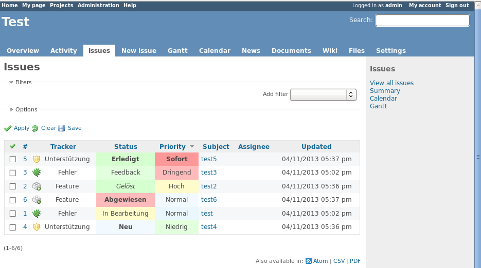
Updated by Daniel Felix about 13 years ago
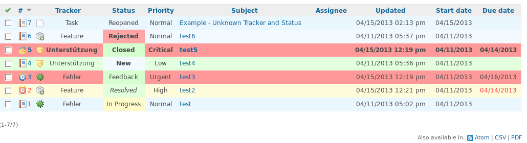
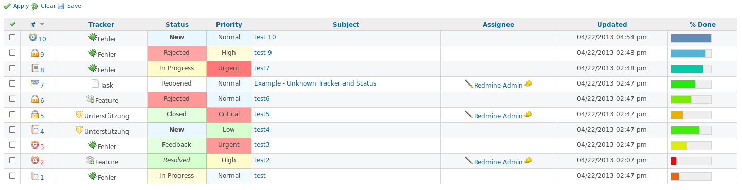
- File UnknownStatusTracker.png UnknownStatusTracker.png added
Hi Dipan,
I attached a Screenshot to show the behaviour if there is a unknown tracker or status. I'll provide another patch later this day.
Best regards,
Daniel
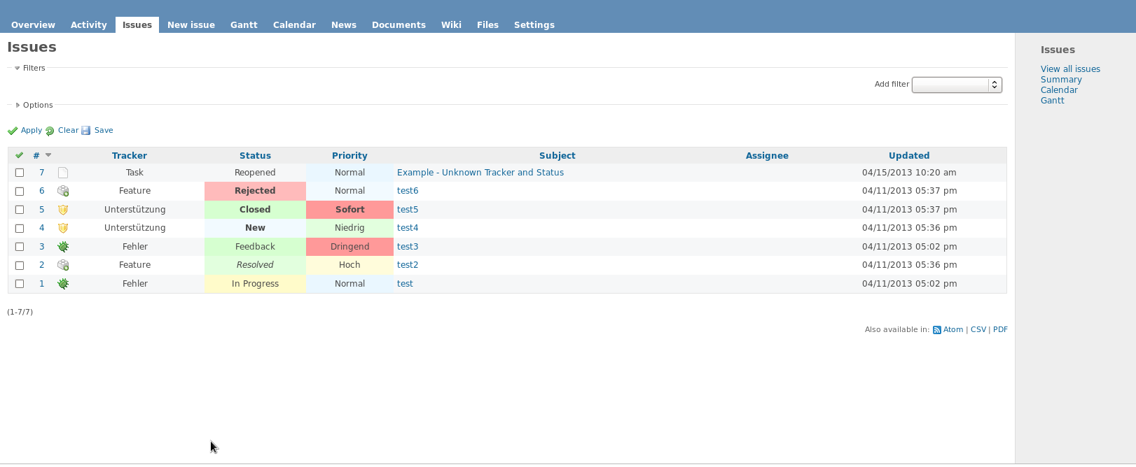
Updated by Daniel Felix about 13 years ago
- File redmine_issue_colors_and_icons_v2.diff redmine_issue_colors_and_icons_v2.diff added
- File clock.png clock.png added
- File clock_red.png clock_red.png added
- File screenshot_patch_v2.png screenshot_patch_v2.png added
Hi,
here is patch version 2, this one includes red due_date (and id if due_date isn't displayed) color, if the issue is overdue. There is a clock icon if the issue is timed and a red clock item if the issue is timed and overdue.
The two new icons are from the SILK-Icon Set as stated in the first post.
Next things could be:- Mark issues with assignments to myself
- Mark issues which were created by me
- Mark issues which were assigned to a group of people
- Highlight watched issues
What do you think?
Best regards,
Daniel
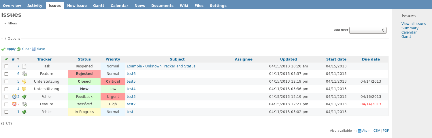
Updated by Daniel Felix about 13 years ago
- File issue.png issue.png added
- File lock.png lock.png added
- File redmine_issue_colors_and_icons_v3.diff redmine_issue_colors_and_icons_v3.diff added
- File screenshot_patch_v3.png screenshot_patch_v3.png added
Patch version 3.
Smaller fixes and general issue icon.
Updated by Dipan Mehta about 13 years ago
Good to see a lot of movement in this.
Ok, ever since I have read about this, it's kinda occupying my head - about many things! I would write this more as how things evolve in my head rather than putting things top-down. so this might be very crude as well as might be very lengthy!
Feedback -1: How the colors should be displayed.
There shouldn't be blocks of different color -the entire row should occupy the entire thing.
The principle is: the that color needs to bring an accute impression of 'something' when we see a red block (urgent) sitting next to a green block (feature as opposed to bug) - that kind of defeats the whole purpose of having colors. Many fields such as Author, target version is not going to have it's colors and they become white.
So the principle is that - the most essential use of the color is to make the UI effective rather than nice. This is very much like editors using syntax highlighting. It is not great because it looks nice - but it is great because programmer can quickly spot mistakes right whey he/she is typing rather than much later. So i think it's best that the entire row must have the constant the color that 'expresses' the overall context.
- A full consistent color in the entire row - in the issue listing or on roadmap.
- The same color will apply on the issue ticket space.
Feedback -2 :Where and what colors do we need?
In other words which attributes should be contributing when deciding the color? and why ?
- Tracker - because different trackers should be quickly identifiable for thier 'nature of work'
- Stauts - because as the issue moves over different status -mostly it represents progress and progress is best seen in color
- Priority - becuase that priority primarily seeks to drive the attention of people - and color can do best job for getting.
- Due dates being missed out - that is, tasks being late or if they are on track.
Apart from this, there could be some custom fields could bring up on critical status - however, lets, for a moment leave that aside.
Essentially the color should convey the status!
Feedback -3:No assumption about 'known/unknown' tracker, status or priority.
Yes, the fact that trackers, status and priorities are fully configurable makes Redmine a great tool. In no way, the 'design project' should defeat this. So by now way there should be fixed colors for the issues. Also, there is no assumption about the nature of tracker based on a name. For example, things like 'customer feedback' could mean most important fire-fighting for some companies getting top priority (more like fire- use red); where as for some it goes to introspective division only for the future roadmap to incorporate idea (more like feature - use green). So I really don't know what a particular tracker and status mean to the end orignation - be it fire(red) or peace(green)!
So there should be some way for admin to explicitly choose some of this; and as i am putting this, I am including that even going and editing CSS files manually amounts to 'hacking' for some - and hence there should be a way where we select colors and icons in the settings pane.
Since they all can be arbitrary - I presume there should be some what like a pallete from where user can select icon and color from the UI
Feedback -4:How do we deal with the above explosion?
Now: Assuming that 1 color represents all these asepcts put togther for the entire row, the number of possible color you could display is Trackers X Status X Priorty. For 5 trackers X 5 status X 4 priorities ~ 100+ colors - this is easily a big bloat in many ways
- if end user/admin has to select 100 such unique colors - it is going to be extremely time consuming
- also, a typical enduser will endup choosing random set of colors defeating the whole purpose of color conveying the status.
- you gotta have 100 css classes.
To make things effective, the users should make few choices but the overall presentation can be very detailed and yet very intuitive
haaa. now that's complicated!
.... ok - but let me put this - if there is a way to solve this issue - we have mostly covered every thing.
I will post some more ideas on how to solve it - in next post in a short while.
Updated by Daniel Felix about 13 years ago
Hi Dipan,
thanks for the Feedback.
Dipan Mehta wrote:
Feedback -1: How the colors should be displayed.
- A full consistent color in the entire row - in the issue listing or on roadmap.
Well I would agree, that coloring should be functional. But the entire row in one color wont be handy. A Software is chosen by two attributes. 1. Functions 2. Usability (which includes design). The Usability won't be better if the whole column is colored. Just think about icons or colors for status or tracker if the whole row is colored in many different ways. This will be very heavy. See the attached Screenshot (Screenshot_line_colored).
- The same color will apply on the issue ticket space.
Agree, I will provide a newer patch, which highlights the priority in the issue detail.
Feedback -2 :Where and what colors do we need?
Essentially the color should convey the status!
If you have some other default colors, please provide them.
In addition to the rest, I agree that there should be some additional setting in the issues to provide the fill- and bordercolor and icons. But this could be implemented in a following feature. This patch aims to add issue colors just as default values for the issue list, issue detail and the roadmap.
I'll provide some additional patch later this day.
Updated by Dipan Mehta about 13 years ago
- File pallete.2.png pallete.2.png added
- File pallete.1.png pallete.1.png added
- File pallete.3.png pallete.3.png added
Daniel Felix wrote:
Feedback -1: How the colors should be displayed.
- A full consistent color in the entire row - in the issue listing or on roadmap.
Well I would agree, that coloring should be functional. But the entire row in one color wont be handy. A Software is chosen by two attributes. 1. Functions 2. Usability (which includes design). The Usability won't be better if the whole column is colored. Just think about icons or colors for status or tracker if the whole row is colored in many different ways. This will be very heavy. See the attached Screenshot (Screenshot_line_colored).
Well, I didn't understood whether we agree here or disagree. Let me clarify - the very concept of "Color for Tracker" and independently "Color for Status" -as two different colors and for that matter - other independent "color other fields" WILL clutter things. So I strongly said that given the entire context there should be 1 color for it. so what I am saying is "no columns" should be colorless - and all columns of the given row should be same color.
So it must be 1 color representing ALL attributes - and that's the challenge. May be we should look at variety of style aspects with respective attributes.
Let me explain this in a more detail
Let's worry about Tracker and Status for now - (will add priority, lateness attribute later based on the same framework)
Representing Tracker and Status:
We can map this in a HSV space which is very natural in terms of perception. Essentially different trackers should imply 'different nature of work' - so they are well represented as different hue.
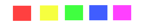
Take a look at the image pallet.1.png and pallet.2.png. In both images - the hue of all patches differs - where as saturation and V (intensity) are all same. So a given tracker can have 1 of this color - which I call 'Base color' -we can say that when the issue is 'New' this would be the color
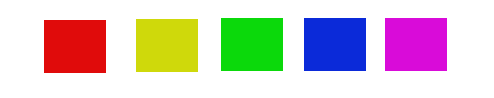
Regarding status: as the issue progresses over many statuses essentially it doesn't change the hue (nature of work) but changes are in saturation and intensity. So for example if you have blue color in the above for say tracker Feature - we can now have 'shades' of blue to represent change of status. Take a look at the pallete.3.png that displays this. Colors in pallete.3 are #193cff, #4d68ff, #8093ff, #b2beff, #e6e9ff
As I said earlier -
Essentially the color should convey the status!
So based on this, the independent 'hue' will represent the tracker and the corresponding 'shade' will represent the progress based on the status. The entire line will be represented by this 1 color which is the designated shade of the given hue.
If this makes sense - We can then extend this to deal with many cases:
- dealing with arbitrary number of statuses,
- dealing with different number of statuses per tracker,
- not to ask user for too many colors.
- highlighting priorities, delays etc.
Updated by Dipan Mehta about 13 years ago
Daniel Felix wrote:
Feedback -1: How the colors should be displayed.
- A full consistent color in the entire row - in the issue listing or on roadmap.
Well I would agree, that coloring should be functional. But the entire row in one color wont be handy. A Software is chosen by two attributes. 1. Functions 2. Usability (which includes design). The Usability won't be better if the whole column is colored. Just think about icons or colors for status or tracker if the whole row is colored in many different ways. This will be very heavy. See the attached Screenshot (Screenshot_line_colored).
Well, I didn't understood whether we agree here or disagree. Let me clarify - the very concept of "Color for Tracker" and independently "Color for Status" -as two different colors and for that matter - other independent "color other fields" WILL clutter things. So I strongly said that given the entire context there should be 1 color for it. so what I am saying is "no columns" should be colorless - and all columns of the given row should be same color.
So it must be 1 color representing ALL attributes - and that's the challenge. May be we should look at variety of style aspects with respective attributes.
Let me explain this in a more detail
Let's worry about Tracker and Status for now - (will add priority, lateness attribute later based on the same framework)
Representing Tracker and Status:
We can map this in a HSV space which is very natural in terms of perception. Essentially different trackers should imply 'different nature of work' - so they are well represented as different hue.
Take a look at the image pallet.1.png and pallet.2.png. In both images - the hue of all patches differs - where as saturation and V (intensity) are all same. So a given tracker can have 1 of this color - which I call 'Base color' -we can say that when the issue is 'New' this would be the color
Regarding status: as the issue progresses over many statuses essentially it doesn't change the hue (nature of work) but changes are in saturation and intensity. So for example if you have blue color in the above for say tracker Feature - we can now have 'shades' of blue to represent change of status. Take a look at the pallete.3.png that displays this. Colors in the palette.3 are #193cff, #4d68ff, #8093ff, #b2beff, #e6e9ff
As I said earlier -
Essentially the color should convey the status!
So based on this, the independent 'hue' will represent the tracker and the corresponding 'shade' will represent the progress based on the status. The entire line will be represented by this 1 color which is the designated shade of the given hue.
If this makes sense - We can then extend this to deal with many cases:
- dealing with arbitrary number of statuses,
- dealing with different number of statuses per tracker,
- not to ask user for too many colors.
- highlighting priorities, delays etc.
Updated by Daniel Felix about 13 years ago
- File private.png private.png added
- File redmine_issue_colors_and_icons_v4.diff redmine_issue_colors_and_icons_v4.diff added
- File screenshot_patch_v4.png screenshot_patch_v4.png added
Sorry for the later response. I've had a busy weekend.
See attached patch v4.
Regarding the hue variant, I've got your idea. But I'm not sure if this is really handy. I haven't seen this in any other issue tracker, a reason for this could be, that this won't help much and could mess up the userexperience.
If you going to use this with 10 trackers 8 status and 10 priorities or example you have a huge amount of variations. The user could be confused and wont find the right priority directly. In my opinion, this probably confuse the enduser.
Best regards,
Daniel
Updated by Daniel Felix about 13 years ago
- File screenshot_patch_v5.png screenshot_patch_v5.png added
- File assigned_to_me.png assigned_to_me.png added
- File created_by_me.png created_by_me.png added
- File redmine_issue_colors_and_icons_v5.diff redmine_issue_colors_and_icons_v5.diff added
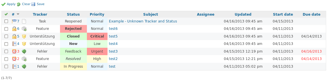
Patch Version 5.
Known issue: Icons for assigned_to_me and created_by_me will only appear if the issue is assigned. I must use the a-Tag to display them. If I assign them to the td itself, they have some display issues.
Some test/feedback would be helpful.
Best regards,
Daniel
Updated by Daniel Felix almost 13 years ago
Just a small cleanup of patch V5.
Anyone tested it or someone who wants to give feedback?
 Updated by dj jones almost 13 years ago
Dipan, sharing your thoughts is great to encourage us all also to think.
Feedback -1: How the colors should be displayed.
This idea is not good UI I feel.
There is a principle 'less is more' - and this means that it is good UI in general to have 'white space' or background-space as much as possible, and only the key things to stand out.
Having the whole row in the same colour is therefore wrong - too intrusive on the eye - if the colour is there to indicate say the 'Status' - then just that value should colour: so that the viewers' eye see the colour and at the same time they can see directly WHY the colour is set - they see it is due to column 'Status'.
Flexibility - let the end user decide!
-----------
I think Daniel is right to colour the 2 columns he had - but .... we cannot know what all users want!
So: can we allow the colour scheme to be enabled/disabled -right there in the page, by the user.
Enabled/disabled per column: so they choose which column to colour, or not.
How we make those toggle choices 'obvious' in the page UI - needs some thought.
Perhaps the UI has an icon link to a 'Colourising' pop-up: and the user can not only toggle on/off per column: but is also offered a link to 'change colour pallete' which is done in another page.
The administrator would set up 'Default Colours': and they maybe could have a checkbox to say 'users can / cannot change colours': so users would maybe only have the chance to turn colours on or off, not change them.
Good default values
--------------------
To ensure RedMine is intuitive, especially for new users: we could have default settings out-of-the-box:
- colors only on Status column
- default colour palette settings,
Updated by dj jones almost 13 years ago
Daniel
one litle request - for these UI things.
There are many, many PNGs in the issue!
It is hard to compare 1 version with the next - I have to clcik the latest PNG, then navigate manually, find the correct one before: then click on the other PNGs you've attached and etc - loads of windows open and confusing!
Suggestion: for each version, just attach 1 PNG - and in that PNG made it easy to compare.
- include for diecrt comparison a screenshot of 'current redmine version'
- include small png / icon pngs inside the same picture.
- include text - to say what each picture is
I use a very simple tool Kpaint, and this 'pasting of all PNGs' into one master, with some text ' is very easy.
----- Version PNG would look like ----------------------------------------------------------------------------
This is version X - see circled in red the changes in column X and at row Z
<PNG of the version X>
This is what it looks like now
< PNG of same view current redmine stable>
The new icons are:
<new icons pngs here>
------------ end of Version PNG ---------------------------------
Updated by dj jones almost 13 years ago
Patch 3 vs 3: the added 'issues.png' in V3 is not helping.
It is just more 'clutter' - breaks the 'less is more' rule - makes the other icons less visible : and they are more important, so it is bad that they are made less visible.
Updated by dj jones almost 13 years ago
sorry - I should have written "Patch 3 vs 2" not '3 vs 3'
Updated by dj jones almost 13 years ago
Date formatting - less is more
===============================
off-topic I know... But important to help this page become really good UI !
Daniel, look how many times the text '2013' occurs in your screenshots!
About 20 times! And in normal use, there is NO information in the year text - it is ALL this year anyway!
So in the interests of 'less is more': could the default dates change from:
04/15/2013 to '15 Apr' when it is this year
and 12/30/2012 - to - '30 Dec 2012' when it is not this year
Note that in UI terms '30 Dec 2012' is much more readable (for normal humans at least!) than '12/30/2012'
Updated by Dipan Mehta almost 13 years ago
Well, the idea of having full row with single color doesn't seem to be popular - so I dont quite have much say on this stuff. Though, I would personally find that when multiple columns can follow multiple scheme of colors it produces a kind of checker box pattern with red and green sitting side-by-side; i don't understand why that work and how it helps any better than the UI that is already there! To me both the screen shots v2 and v3 are quite a clutter as far as colors are concerned. I don't know why would you call it less and hence more!
Consider mantis http://www.mantisbt.org/bugs/view_all_bug_page.php which shows full row colors which certainly looks neater.
I agree that number of colors explosion needs simplification. I think I have got some clue there to deal with it. But may be we are not in the same page.
Updated by dj jones almost 13 years ago
Hi Dipan - UI is after all not simple.
The Mantis site - isusing just the Status column, to set the colour for the whole row - so it only can work for 1 column: but some users may want colours on two.
I don't know the Mantis tool - so I tried it like a 'new user':- nothing seems to change when I click on the column titles (I expecteded the sort order to change) - even though they are hyperlinks - confusing
- The big table at the top, shows the search settings being used - most of the fields are set to 'any', so it would be better to hide them altogether: right now I am forced to read all rows carefully - painful!
Are you a Mantis user? Does it allow Admin user to change the colour pallette? Any tips we could use for RedMine
Updated by Daniel Felix almost 13 years ago
dj jones wrote:
Patch 3 vs 3: the added 'issues.png' in V3 is not helping.
It is just more 'clutter' - breaks the 'less is more' rule - makes the other icons less visible : and they are more important, so it is bad that they are made less visible.
I can remove the the issue.png but this will break the layout if the timed or overdue image is displayed. But with this image, you can see which issue is timed or overdue. Even if the last columns won't be included.
Updated by Daniel Felix almost 13 years ago
dj jones wrote:
Date formatting - less is more ===============================
off-topic I know... But important to help this page become really good UI !Daniel, look how many times the text '2013' occurs in your screenshots!
About 20 times! And in normal use, there is NO information in the year text - it is ALL this year anyway!
So in the interests of 'less is more': could the default dates change from:
04/15/2013to'15 Apr' when it is this year
and 12/30/2012 - to - '30 Dec 2012' when it is not this yearNote that in UI terms '30 Dec 2012' is much more readable (for normal humans at least!) than '12/30/2012'
Yes, this maybe. But this won't be a goal for this. This patch just aims to improve the coloring. I think I have seen an issue regarding this topic somewhere in the tracker.
Updated by Daniel Felix almost 13 years ago
I just can tell it from our (my company) view. We had a tracker which uses full coloring but wasn't able to be configured. In this case, we decided to override them with monkey script, as no one in our company has some advantage in this. The coloring was more a disadvantage, as our supporter couldn't see 8hrs on the tracker as the full coloring has disturbed the eye too much.
Regarding your less is more paradigm. The screenshots just display all styles elements. You can remove unneeded columns. I won't use all of them too. But some people use these columns more excessive.
Updated by dj jones almost 13 years ago
I can remove the the issue.png but this will break the layout if the timed or overdue image is displayed.
What breaks?
... you can see which issue is timed or overdue.
But it is the two clock.png which show times or overdue.
The issue.png seems to contain no information - or am I misunderstanding?
(It seems to mean 'not timed' ?
(So if the only choices are timed, or not timed -there is no need of an icon for both: the absence of the one icon is enough?
Updated by dj jones almost 13 years ago
The screenshots just display all styles elements. You can remove unneeded columns. I won't use all of them too. But some people use these columns more excessive.
I agree 100%
Updated by Dipan Mehta almost 13 years ago
Daniel Felix wrote:
I just can tell it from our (my company) view. We had a tracker which uses full coloring but wasn't able to be configured. In this case, we decided to override them with monkey script, as no one in our company has some advantage in this. The coloring was more a disadvantage, as our supporter couldn't see 8hrs on the tracker as the full coloring has disturbed the eye too much.
Regarding your less is more paradigm. The screenshots just display all styles elements. You can remove unneeded columns. I won't use all of them too. But some people use these columns more excessive.
I am not sure, what is the real question here - (and hence did not dwell deep discussion in last note).
What is the real concern?
Is it that 'full row with single color' is BAD UI? OR
Is it that 'there will be too many color' is confusing? OR
Is it that 'configuring would be very pain' or impossible? OR
Any other view?
while Daniel and dj both has provided same vote - i see reasoning diferent.
Regarding my Mantis example - I am not a mantis user at all. I just wanted to make a case that full color row IS useful for regular user as just by looking at color one can infer information and you can even drop that column from listing still infer that variable.
If the single color row makes sense I can put forward ideas for make it simple enough without being explosive or complicated. Let me know if we should discuss that.
Other than that, frankly I don't quite understand 'less is more' in our context.
PS:my apologies - I do not intent to hurt anyone or be harsh.
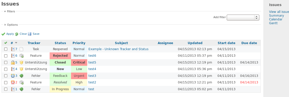
Updated by Daniel Felix almost 13 years ago
- File example_broken_id_line.png example_broken_id_line.png added
- File example_minimal_columns.png example_minimal_columns.png added
dj jones wrote:
I can remove the the issue.png but this will break the layout if the timed or overdue image is displayed.
What breaks?
The line intending will break if you have an ID-Field without an image. The issue.png will provide a spacer, and the line wont be disturbed.
See screenshot example_broken_id_line.png
... you can see which issue is timed or overdue.
But it is the two clock.png which show times or overdue.
 = timed icon
 = timed and overdue icon
The issue.png seems to contain no information - or am I misunderstanding?
(It seems to mean 'not timed' ?
Yes your right, issue.png = no informations beneath this issue.
Here is a complete history, with the precedence from highest precedence to the lowest: = Issue is closed, regardless if overdue or timed. = timed and overdue icon = timed icon
 = issue has no further informations behind him (no timing, not closed, no other maybe future icon-informations).
For a further example, please take a look at the screenshot example_minimal_columns.png.
You can remove the tracker column too if you want. In this configuration, you see if the issue is overdue , timed , closed , private  or (fallback) has no further information .
I hope this will clarify it a little bit? :-)
Updated by Daniel Felix almost 13 years ago
dj jones wrote:
The screenshots just display all styles elements. You can remove unneeded columns. I won't use all of them too. But some people use these columns more excessive.
I agree 100%
This will be more clear with the latest attached example_minimal_columns.png.
Updated by Daniel Felix almost 13 years ago
Hi Dipan,
Dipan Mehta wrote:
What is the real concern?
I try to differ my thoughts on this. Maybe someone else see this differently.
Is it that 'full row with single color' is BAD UI? OR
In my opinion, yes. I tried to read longer on the list, which is contained in your example link (http://www.mantisbt.org/bugs/view_all_bug_page.php).
I was a mantis user, but this is some time ago as there are many limitations and the overview was not always as good as it could be.
Try to read the links (which are blue) in the list and go over the unordered list. I experienced, that I get a little bit headache after a short while, as my eyes must refocus all the time. And the coloring is not as "natural" as it could be. Normally, the most people see red as a critical color (urgent priority, rejected, etc.), and green as a positive (closed, resolved, low priority, etc.). I know, that some cultures have anothre coloring scheme for critical or good situations, but the most cultures use this coloring as mentioned in the patch.
If I could provide a way to define the colors dynamicly, each culture could get their default coloring.
Is it that 'there will be too many color' is confusing? OR
Well, if there is a way that each user can define their own colors for each of their trackers, I'm pretty sure that there will be many colors in the list but the difference between all those colors should be great to differ each situation (open,resolved etc.).
If there is a HUE-Base coloring on different status in combination of priority, there could be some color-overflow. ;-)
My regression is just, that there are so many colors, that the enduser can't distinguish which color means what, which won't improve the workflow.
Is it that 'configuring would be very pain' or impossible? OR
Well I don't think that this would be impossible. But I'm sure that this will be hard to configure at he first step for new users.
Regarding my Mantis example - I am not a mantis user at all. I just wanted to make a case that full color row IS useful for regular user as just by looking at color one can infer information and you can even drop that column from listing still infer that variable.
I know that full line coloring could be useful. I use it in some other programms too, where I define if a job was successfully or unsuccessfully finished. But there are mostly limitations to 2-3 colors. Sometimes 4. And those colorings mostly won't have links or something else in it.
Other than that, frankly I don't quite understand 'less is more' in our context.
I think dj, means this as there could be many information provided with just a few columns instead of pushing 30 columns to the user and let him find the information he needs.
(see my previous note with the attached screenshot example_minimal_columns.png.)
PS:my apologies - I do not intent to hurt anyone or be harsh.
Well you haven't hurt anyone, I think. It's just a discussion to get the best project improvement. ;-)
By the way, I added the line-height to the new issue list, which consumes more space, but is more readable for the enduser.
Best regards,
Daniel
Updated by dj jones almost 13 years ago
Daniel
The line intending will break if you have an ID-Field without an image.
Good point - so the issue.png icon - should be plain transparent square ie not visible. That way it gives more emphasis to the eye to the other icons, which DO mean something - not just 'I am in issue, of course, because I am in a table containing only issues!
Dipan
Is it that 'there will be too many color' is confusing?
Yes, the human eye can't tell the difference the colours very well especially on computer screens which vary.
I don't know the science, but there's maybe only 3 or 4 'hues' of a colour we can easily seperate out, especially if they sure surrounded by other random colours, which change the eye's perception again.
Plus, it is hard for a human to keep a big set of legend matches in your head - after 6 or 7 you have to keep using the legend to remind yourself what each colour means.
So - 'less is more' and "don't make me think' are both good UI design principles.
 Updated by Toshi MARUYAMA about 12 years ago
- Related to Feature #15021: Service Level Agreement (SLA), more user-friendly email configuration, add any other notifications added