Actions
Feature #13842
closedSupport mobile phone users better
Status:
Closed
Priority:
Normal
Assignee:
-
Category:
Themes
Target version:
-
Start date:
Due date:
% Done:
0%
Estimated time:
Resolution:
Duplicate
Description
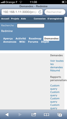
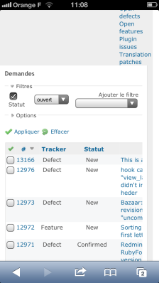
It turns out a very few changes to the style sheets seem to make
redmine look much better from phones; You can specify a media incantation for an added stylesheet, and go to a single column layout and have it look much better. One can test the layout in Chrome just by making your window narrow enough.
The attached are patches to 1.4.1, but I don't think these bits are much different in the latest.
Files
Related issues
Actions

