Feature #1575
closedToolbar button to insert a table
Description
When you open the formatting help popup it lacks info about tables. AFAIK with textile markup it is possible to create tables using markup like that:
|cell|cell|cell|
|another cell|merged cell||
Output:
| cell | cell | cell |
| another cell | another cell | another cell |
So as you see it is possible to create tables - too bad that help does not mention it - I needed to look after textile documentation to get that info. For me it is no problem but I manage Redmine for less technical people and they probably dont even look at help but strictly at the toolbar - when there is no table icon it means there is no tables. ;)
Files
Related issues
 Updated by Paul Rivier over 17 years ago
- number of rows
- number of columns
- use headers ? (checkbox)
Once the template syntax is inserted, it probably becomes more natural to fill the cells and tweak it by hand.
 Updated by Konrad Kosmowski over 17 years ago
Paul Rivier wrote:
I agree, but what would a "table" button insert ?
It could work like in MS Word or OpenOffice.
 Updated by Jean-Philippe Lang over 17 years ago
- Tracker changed from Defect to Feature
 Updated by Go MAEDA over 10 years ago
- Related to Feature #12734: Add table reference to textile help added
 Updated by Go MAEDA about 6 years ago
- Subject changed from Markup help and toolbars lacks tables to Toolbar button to insert a table
- Category changed from Wiki to Text formatting
- Priority changed from Low to Normal
Since markup help already has information about tables (#12734), I am changing the subject of this issue.
 Updated by Mizuki ISHIKAWA about 6 years ago
- File feature-1575.patch feature-1575.patch added
- File use-table-generator.gif use-table-generator.gif added
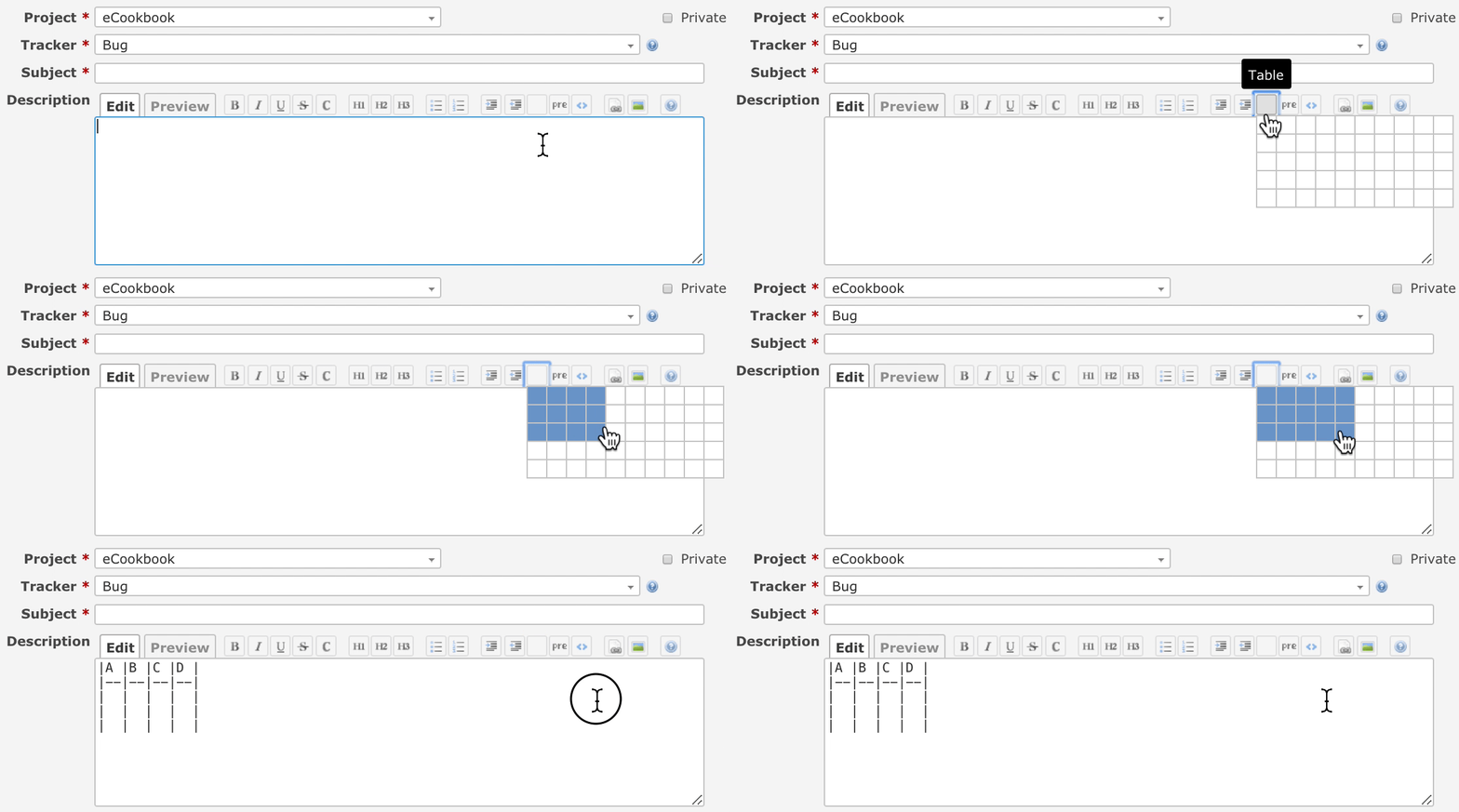
The attached patch adds a button to insert a table into the wiki toolbar.
The button create a table with rows / columns according to the selected range.

Markdown:
|A |B |C |D |E |
|--|--|--|--|--|
|  |  |  |  |  |
|  |  |  |  |  |
|  |  |  |  |  |
Textile:
|_.A|_.B|_.C|_.D|_.E|
|  |  |  |  |  |
|  |  |  |  |  |
|  |  |  |  |  |
Currently no icon image is set for the button. It is necessary to create a new appropriate icon image.
 Updated by Go MAEDA about 6 years ago
- Target version set to Candidate for next major release
 Updated by Hiroyuki ENDO about 6 years ago
I made a new icon image.
 Updated by Mizuki ISHIKAWA about 6 years ago
 Updated by Mizuki ISHIKAWA about 6 years ago
- File 0001-feature-1575-patch-with-table-icon.patch 0001-feature-1575-patch-with-table-icon.patch added
Fixed a patch.
 Updated by Kevin Fischer about 6 years ago
- File Screen Shot 2020-02-26 at 9.27.58 AM.png Screen Shot 2020-02-26 at 9.27.58 AM.png added
- File Screen Shot 2020-02-26 at 9.32.36 AM.png Screen Shot 2020-02-26 at 9.32.36 AM.png added
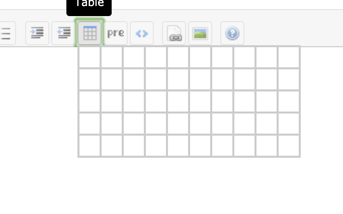
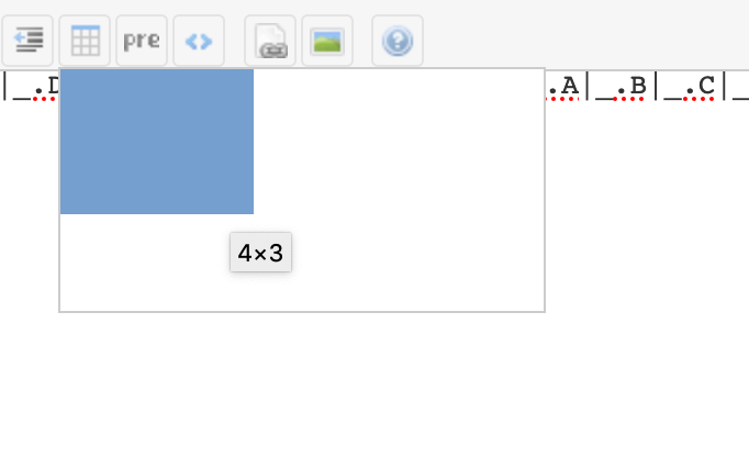
Unfortunately the grid lines of the selection UI are not properly displayed in Firefox.
Chrome:
Firefox:
This seems to be a long running bug of Firefox though: https://bugzilla.mozilla.org/show_bug.cgi?id=688556
There seem to be workarounds, like using
background-clip: padding-box;on the cells... But then it looks a little bit strange on Chrome on the other hand
 Updated by Mizuki ISHIKAWA about 6 years ago
- File 0002-Firefox-support.patch 0002-Firefox-support.patch added
- File 0003-IE11-support.patch 0003-IE11-support.patch added
Kevin Fischer wrote:
Unfortunately the grid lines of the selection UI are not properly displayed in Firefox.
Thanks for sharing the information!!
Operation verification on browsers other than Chrome was insufficient.
Since a problem was found not only in Firefox but also in IE11, a patch that solves the problem is attached.
0002-Firefox-support.patch resolves Firefox by removing `td { position: relative; }`.
0003-IE11-support.patch avoids using repeat function that did not work in IE11.
 Updated by Go MAEDA about 6 years ago
- Target version changed from Candidate for next major release to 4.2.0
Setting the target version to 4.2.0.
 Updated by Jan from Planio www.plan.io about 6 years ago
I really like this patch. Great work!
For the icon, I think famfamfam should be used to stay consistent with the style of other icons in Redmine.
 Updated by Go MAEDA about 6 years ago
- File table-icon-1.png table-icon-1.png added
- File table-icon-2.png table-icon-2.png added
Jan from Planio www.plan.io wrote:
For the icon, I think famfamfam should be used to stay consistent with the style of other icons in Redmine.
Thank you for the feedback. I think the suggested table icon is better than famfamfam's table icon because famfamfam's table icon looks like a document.
The suggested icon:![]()
famfamfam's table icon:![]()
 Updated by Mizuki ISHIKAWA about 6 years ago
I also prefer image.png.
The famfamfam's icon does not look like a table because each cell is too small to identify.
 Updated by Go MAEDA about 6 years ago
- Status changed from New to Closed
- Assignee set to Go MAEDA
- Resolution set to Fixed
Committed the patch. Thank you for improving Redmine.