Jean-Philippe Lang wrote:
I agree that all the "New xxx" links should be at the same place but I think it would be more convenient (and more consistent with the screens other than in project settings) to have them above the list, no need to scroll down when there are meny items.
Is that OK for you?
That is fine for me. I will leave three new patches implementing the change, of which the first replaces the one I previously posted:
- 0001-Move-New-.-links-to-above-item-tables-in-project-set.patch: moves the new links to above the item tables;
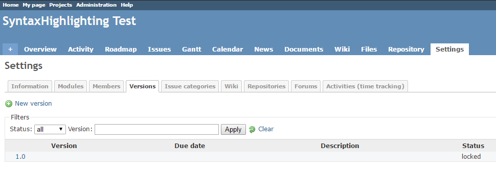
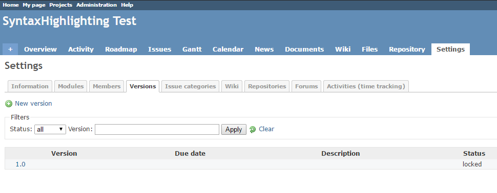
- 0002-Add-nbsp-below-project-settings-version-filter-secti.patch: after the link relocation to the top-left of the versions tab, it became pretty crowded / densely packed over there. I fixed this in line with the other two places that use comparable filter sections (admin/projects and admin/users) by adding a non-breaking space just below the filter fieldset. See the following screenshots:
- before:

- after:

- 0003-Remove-superfluous-spaces-before-colon.patch: pretty self-explanatory, I noticed them while at the code related to the UI fix.
It may be good to mention that I've also explored the (re-)use of the contextual div class for this purpose (as such tightening the consistency of new links throughout the app in both the front- ánd back-end) but found that it led to a, for me unacceptable, increase of traveled mouse distance. Besides that, I also think that a relocation of project settings' new links from the bottom-left to the top-left alone is better suited fixing the initial small UI inconsistency than a relocation from the bottom-left all the way to the top-right.
I switched to using the Git mirror again for patch creation instead of the SVN source and as such is this patch serial, against current source:/trunk@16156, produced using git format-patch which makes the individual patches apply-able using "patch -p1 < 0001-...".

