Feature #27314
open
Remove the 'Administration' index page and jump right into settings
Added by Bernhard Rohloff over 7 years ago.
Updated over 5 years ago.
Description
At the moment, If you click on the Administration link, you get a list of all subsections which the admin section has to offer.
There is no further information on this view. When you select a section (Users, Projects, etc.) the whole list jumps from the left of the screen to the right which is very confusing and not consistent to the following views.
It would be better to enter directly into the "Information" section. This is the best start page for the administration panel because no settings are made on this view. It's providing the same functionality as the "Administration" view plus all the information about the installation and perhaps more active information in the future. The list of sections is consistently placed in the sidebar on the right and doesn't "jump around".
I've rethought this issue and I think it's better to jump right into the settings because adding a project or user is the most frequent task in this view.
Files
- Subject changed from Make "Information" the default view in the Admininstration section. to Make "Information" the default view in the Admininstration section
- File omit_admin_index_page.diff omit_admin_index_page.diff added
- Subject changed from Make "Information" the default view in the Admininstration section to Remove the 'Administration' index page and jump right into settings
- Description updated (diff)
- Category changed from UI to Administration
I've changed my proposal. Patch is available, too.
Bernhard Ganslmeier +1 go for it! This adds on to the rule of "less clicks to get to desired destination". The index view would also be unnecessary then.
P.S. As you mentioned on Discord once, and I think it was your idea as well. If "ditching the sidebar and giving Redmine a proper menu toolbar instead" will happen, will this patch have to be kind of rethought again then? Thinking sidebar in this case might need to act differently on admin page then.
Antonio McDeal wrote:
P.S. As you mentioned on Discord once, and I think it was your idea as well. If "ditching the sidebar and giving Redmine a proper menu toolbar instead" will happen, will this patch have to be kind of rethought again then? Thinking sidebar in this case might need to act differently on admin page then.
The sidebar isn't generally a bad thing. In case of the Administration section it makes much sense to navigate the settings through a list. In my opinion this would be the right place for the projects menu, too. I'm not a fan of the sidebar in the issues list and gantt view in particular. There it takes too much vertical space for what it offers. It also makes hard to navigate queries with long names.
I don't prefer the proposed change. The index is intuitive for users, and they don't always want to create a project.
Go MAEDA wrote:
I don't prefer the proposed change. The index is intuitive for users, and they don't always want to create a project.
I don't think that the index page is intuitive at all. It's an empty white page with only a few choices on it. As I wrote in another issue earlier I additionally think that the movement of the menu from the left side of the screen to the right is tremendously confusing.
If you open a settings menu nowadays it's not unusual to welcome the user with the most used functions. I find it very convenient to jump right into solving my problem.
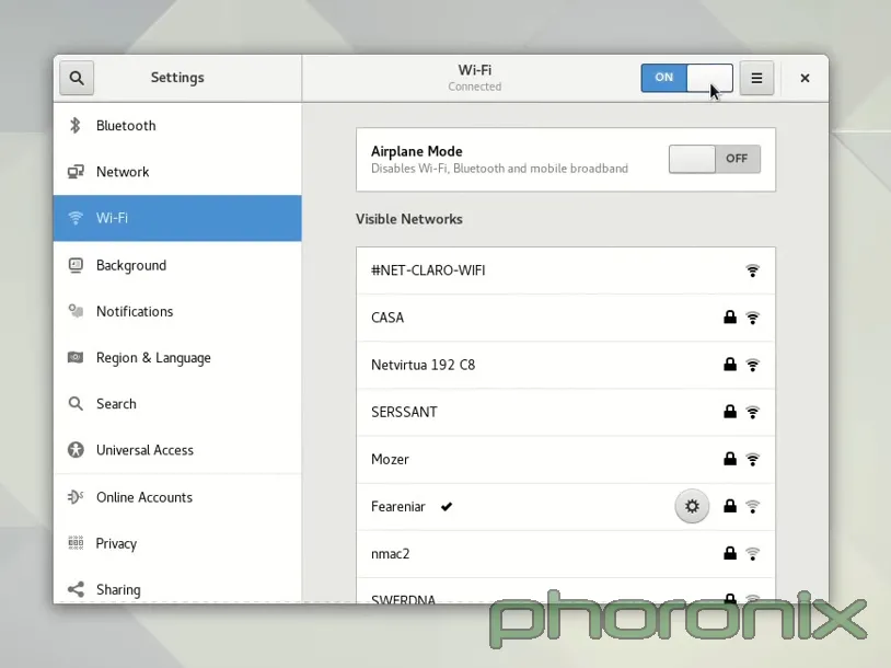
Gnomes settings panel is a good example of this. You can choose your option conveniently in the sidebar without the need of making a decision on a blank screen.

Also available in: Atom
PDF