Actions
Feature #29183
closedMove "Latest news" above "Members" on project overview page
Start date:
Due date:
% Done:
0%
Estimated time:
Resolution:
Fixed
Description
I think it would be better to show "Latest news" box above "Members" box.
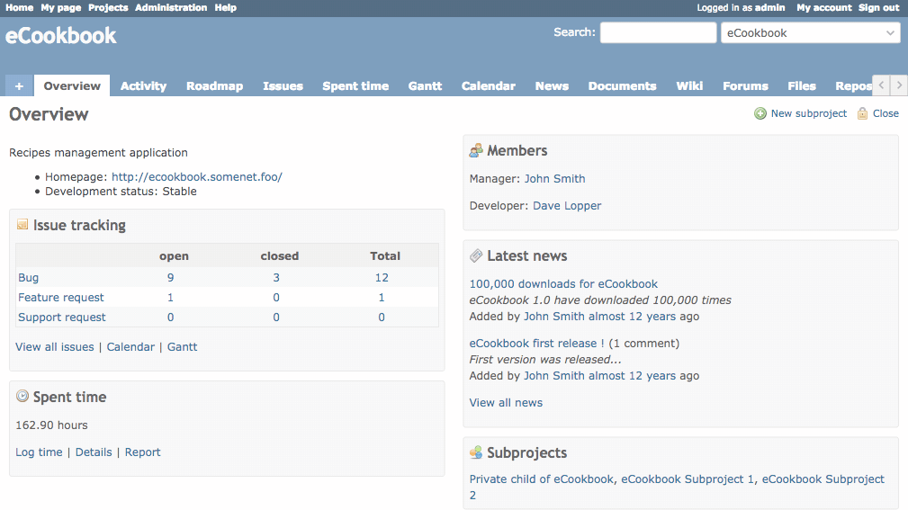
Currently, "Latest news" box is displayed under the Members page. I think we can resolve the following problems by swapping positions.
- "Members" box may become longer if the project has dozens of members. As a result, members cannot see Latest news" box without scrolling
- The frequency of updates and importance of information is higher in "Latest news" box than in "Members box".
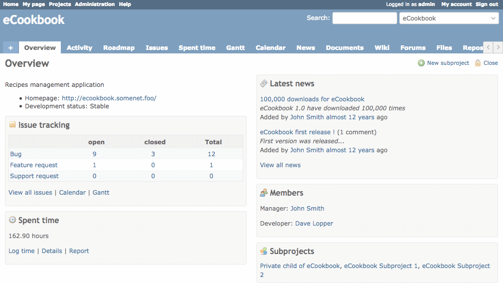
Therefore, I suggest switching positions of those boxes.
Before:
After:
Files
Actions