Patch #30451
open
Move #main-menu outside of the #header to follow directly after the #header insetad
Description
- It probably shouldn't be a part of the #header and it would probably make more sense for it to follow right after it.
- #header acts as another wrapper for the #main-menu, which can spawn a blocking behaviour I mentioned in the issue #30448 and first and foremost concerns achieving sticky design without using JavaScript.
Files
Related issues
 Updated by Marius BĂLTEANU about 7 years ago
- Related to Patch #30231: Operation: "Unwraping The Mine" or conerns about how elements are wrapped added
 Updated by Bernhard Rohloff about 7 years ago
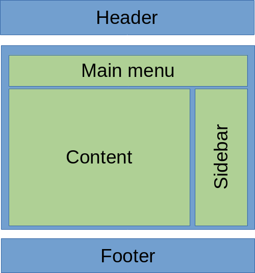
In my opinion it's a "historical" chance to bring a bit more basic structure into the core of Redmine. For this reason I would like to suggest to have some conceptual discussion and planning on the topic. What do you think about including the "main menu" div inside the main container as it's more related to the content and sidebar than to the header and footer section? This feels more logical to me.

 Updated by Anonymous about 7 years ago
- File concept.html concept.html added
It seems like a challenge to form the layout of the flexbox as:
column 1 to be strictly just the main-menu with full width
column 2 to be two rows of content and sidebar blocks
There will be some major complex changes to the #main block if we will decide to put #main-menu into the #main block, because now it will be containing 3 unique tiles.
Currently, with sticky footer implemented, I stumbled upon the issue that column 2 of the flexbox ends up far from the column 1 for some reason, but only until you will insert some Lorem ipsum. XD
If somebody can suggest a fix, then I will have nothing against moving the #main-menu block even into the #main block as well.
I'm attaching the HTML concept to take a look :)
Also, notice how I used semantic blocks and how we could get rid of many class definitions in html tags, since we could just refer to elements by their tags. :)
 Updated by Bernhard Rohloff about 7 years ago
Yes, unfortunately you are right. This doesn't seem to be achievable at the moment. I had a hard time yesterday getting your concept fixed and succeeded... well... on Firefox, Chrome was a f***in b****. It seems like flexbox isn't that flexible when it comes to mixed layouts. So right now it seems to be the best leaving the structure as it is and when CSS grid becomes a common standard (in a century or so) we can overthink it again.
 Updated by Anonymous about 7 years ago
Yep, that's why in the subject of this ticket I propose something like this (see the attachment), as a temporary solution until we will find how to move #main-menu into the #main block without additional wrappers if possible.
But both concepts will definitely work if a theme designer to choose to set #main-menu sticky (position: sticky; top: 0;), it's just that, keeping #main-menu in the header is imho not an option, since in case of sticky design, it won't be able to push beyond the #header container, and the method with moving #main-menu as a first node of the #main isn't sufficient (for now, since flexbox method seems broken) if we re to create a sticky footer patch for Remdine later, which I think Redmine also could use, and even if not, IMHO we still should think about other people who create themes for Redmine and could definitely have it easier to set footer sticky :)
 Updated by Anonymous about 7 years ago
Bernhard, I was able to get concept for your proposal fixed by using grid box instead, I'm thinking if gridbox could actually be something better now, rule definitions for it are also more straight forward imho :)
 Updated by Anonymous about 7 years ago
Anyhow, I get both flexbox and gridbox version to be displayed incorrectly in IE11, so I will be trying to find out why, I have a feeling it's just the problem with semantic tag names. I created glitch.com container, so anyone can anonymously edit to propose whatever changes.
https://glitch.com/edit/#!/join/8ea142cb-8340-4278-a149-fe3e24fa5b2e
For preview: https://layout-concepts.glitch.me