Actions
Patch #31079
openClean up login form with placeholders
Status:
New
Priority:
Normal
Assignee:
-
Category:
UI
Target version:
-
Description
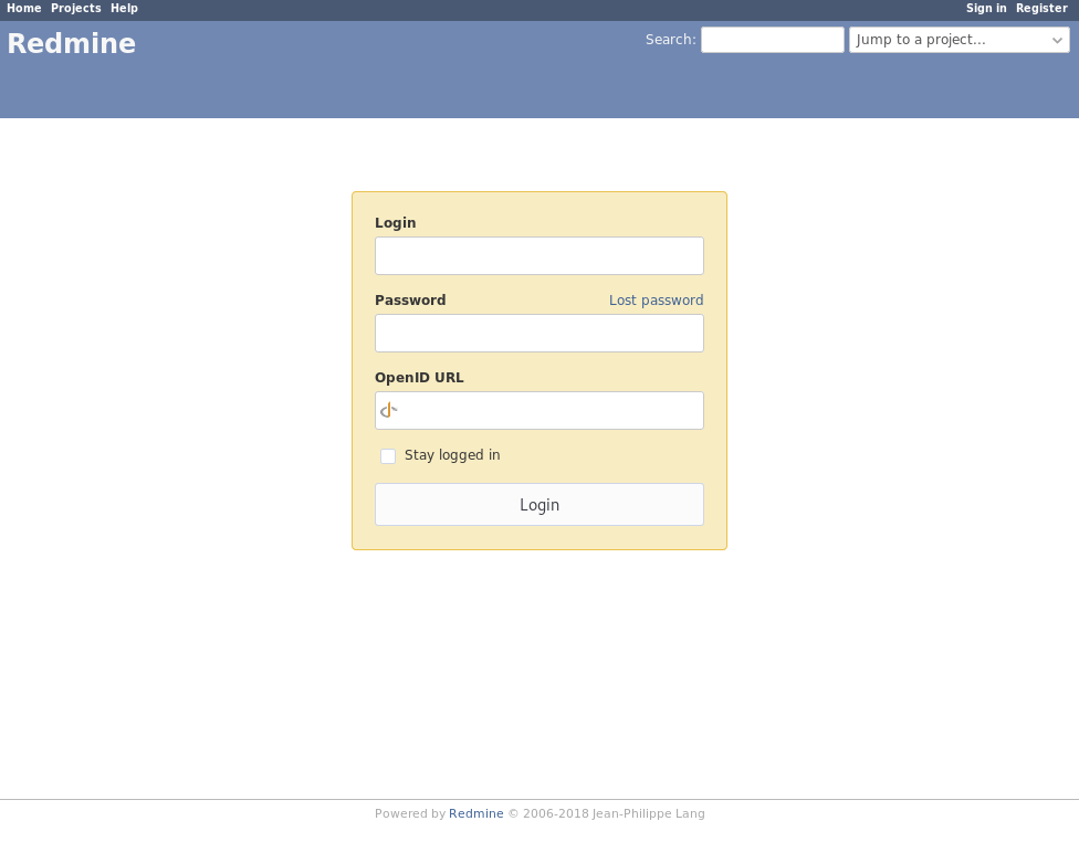
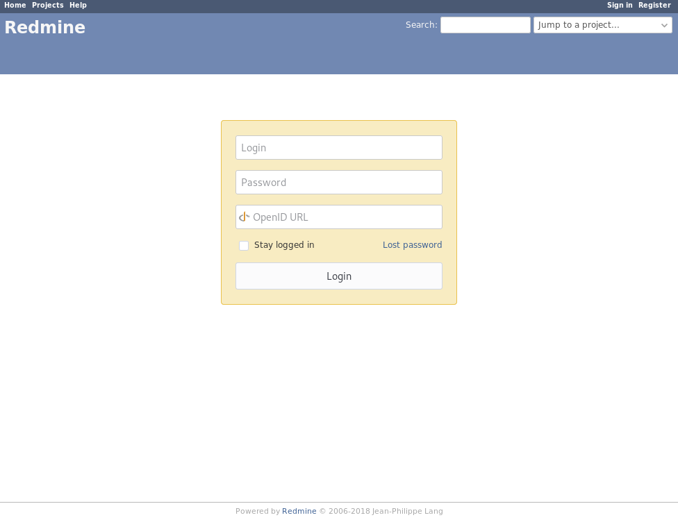
I propose to replace the labels of the input fields with placeholders. The login form appears much cleaner and it works better with logo banners.
| before | after |
|---|---|
 |
 |
Files
 Updated by Go MAEDA almost 7 years ago
I wonder if the proposed change improves UX. Please see the following article.
 Updated by Bernhard Rohloff almost 7 years ago
A login form isn't that big and people are quite used with placeholders because nowadays many login forms are designed this way.
I would argue that it's not a big deal, but I'm also concerned about accessibility issues for people who have to rely on a screenreader.
The idea with floating labels sounds very interesting. I think I'll give them a try.
Actions