Patch #32021
open
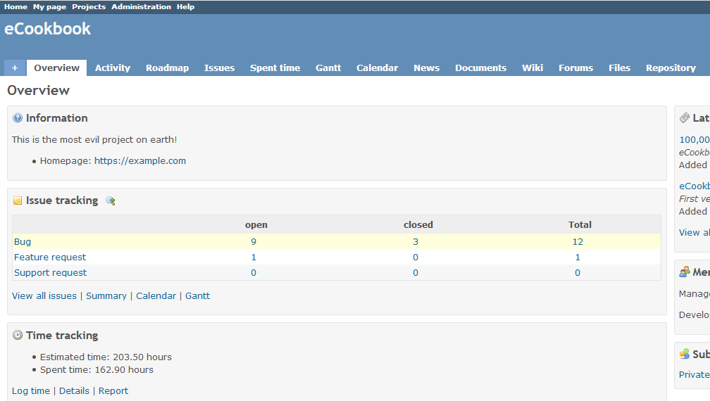
Give project description, homepage and custom fields an own box too
Description
This patch wraps project information like description, homepage, custom fields in the box if they exist.
Couple of very minor problems with this patch, but aren't catastrophic to not consider proceeding:
1. If a custom field exists and assigned to the project, the box will be displayed even if it's in the unset state (aka selected empty), I couldn't figure out how to quickly check length of the fields to make suitable logic.
2. This will need localization for all languages in the future, perhaps Information isn't suitable label title as well, and something more universal might need to be found.
On the other hand, now the per project views feel more like something complete and consistent.
Files
Related issues
 Updated by Anonymous over 6 years ago
Bump! Please share any feedback when/if you can.
 Updated by Go MAEDA over 6 years ago
- Subject changed from Give project description, homepage and custom fields an own box too! :D to Give project description, homepage and custom fields an own box too
 Updated by Bernhard Rohloff over 6 years ago
- Related to Patch #16042: Nicer overview boxes added
 Updated by Bernhard Rohloff over 6 years ago
+1
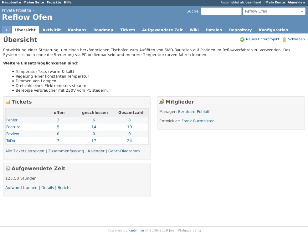
I like the proposal. The 'unboxed' description looks quite awkward in the current layout. I think it should get boxed, too. Or if not, the description should get it's own dedicated row in the layout.
 Updated by Go MAEDA over 6 years ago
Bernhard's suggestion in #32021#note-4 looks nice for me.
 Updated by Anonymous over 6 years ago
Yes, #32021#note-4 the idea of full-width first box is also quite good, but still looks awkward when actually visually unboxed unlike the rest of the grid. I think it feels very empty in the beginning and then throws tons of weight at your eyes after the project description. There is project list page which looks like a full grid with project cards, there is my page which looks like a full grid with custom widgets, and only per project overview page is the one that's left which doesn't look fully boxed.
Feels like an unfinished dashboard tbh.