Patch #32115
open
Move search bar and project selector to the top bar
Description
I made this quick patch more as some kind of preparation for #31353 (you may also add to this ticket to #31353 as related).
I think search bar and project selector elements will make more sense in the top bar, if avatar with user options fly-out will be added to the top bar. That's because top bar will have to become larger, hence to utilize available space more efficiently search bar and project selector might need to be moved to the top bar.
How it will look after the patch is applied
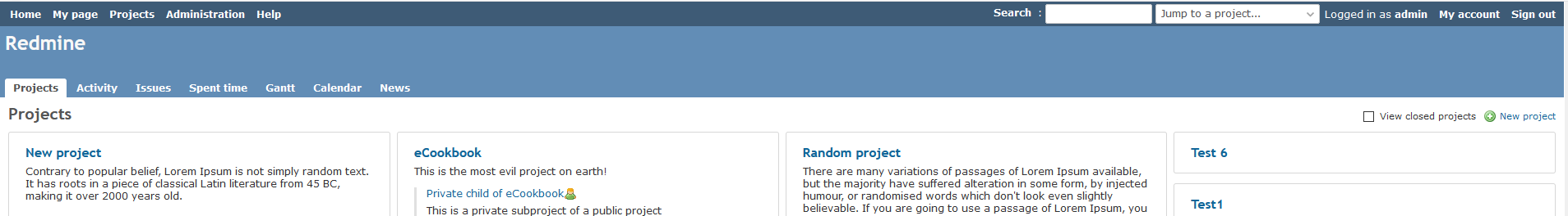
To win back some vertical space, we could also reduce the height of header later on, and even more space could be won if, as Bernhard suggested, we could combine the application header title with project breadcrumbs later on.
P.S. I didn't mess with floating rules in this patch, so bars are still floating left for now. I think floating could then also be adjusted a bit later.
Files
Related issues
 Updated by Go MAEDA almost 7 years ago
- File 1024px.png 1024px.png added
Thank you for posting the patch.
But it does not look so nice in medium-sized windows. At 1024px width, the top menu is very crowded.
Updated by Anonymous almost 7 years ago
- File move-search+projectselector-to-topbar-decreased-margins.patch move-search+projectselector-to-topbar-decreased-margins.patch added
Go MAEDA wrote:
Thank you for posting the patch.
But it does not look so nice in medium-sized windows. At 1024px width, the top menu is very crowded.
Thanks for the feedback, but as I mentioned, this patch is a "preparation for #31353" which means, no way will it not look crowded in medium-sized windows until something like latest patch from Marius in #31353 would be committed (it pretty much packs all user links into avatar fly-out menu, which obviously saves alot of horizontal space in the top bar).
Then hiding Search link into a button by the search bar as Bernhard proposed in Discord would also give a bit extra space.
Anyhow, here is slightly changed patch, with a bit smaller gaps between links :D
 Updated by Mischa The Evil over 5 years ago
- Related to Feature #31353: Replace user related links in the top menu bar with a proper user menu. added