Actions
Feature #35758
closedAdd some space around the versions on the Roadmap
Start date:
Due date:
% Done:
0%
Estimated time:
Resolution:
Fixed
Description
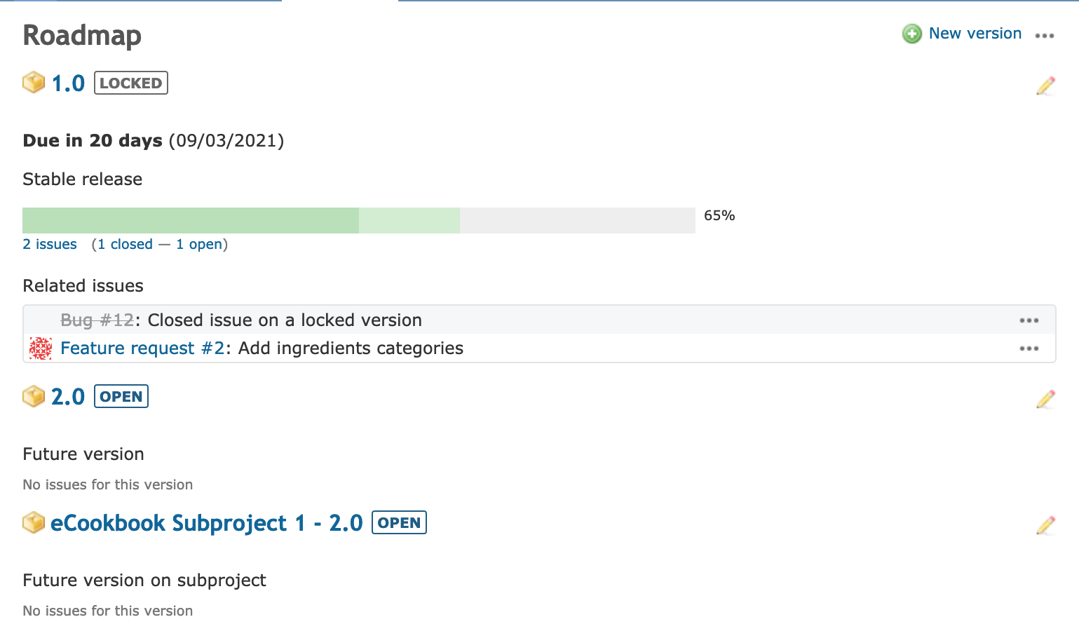
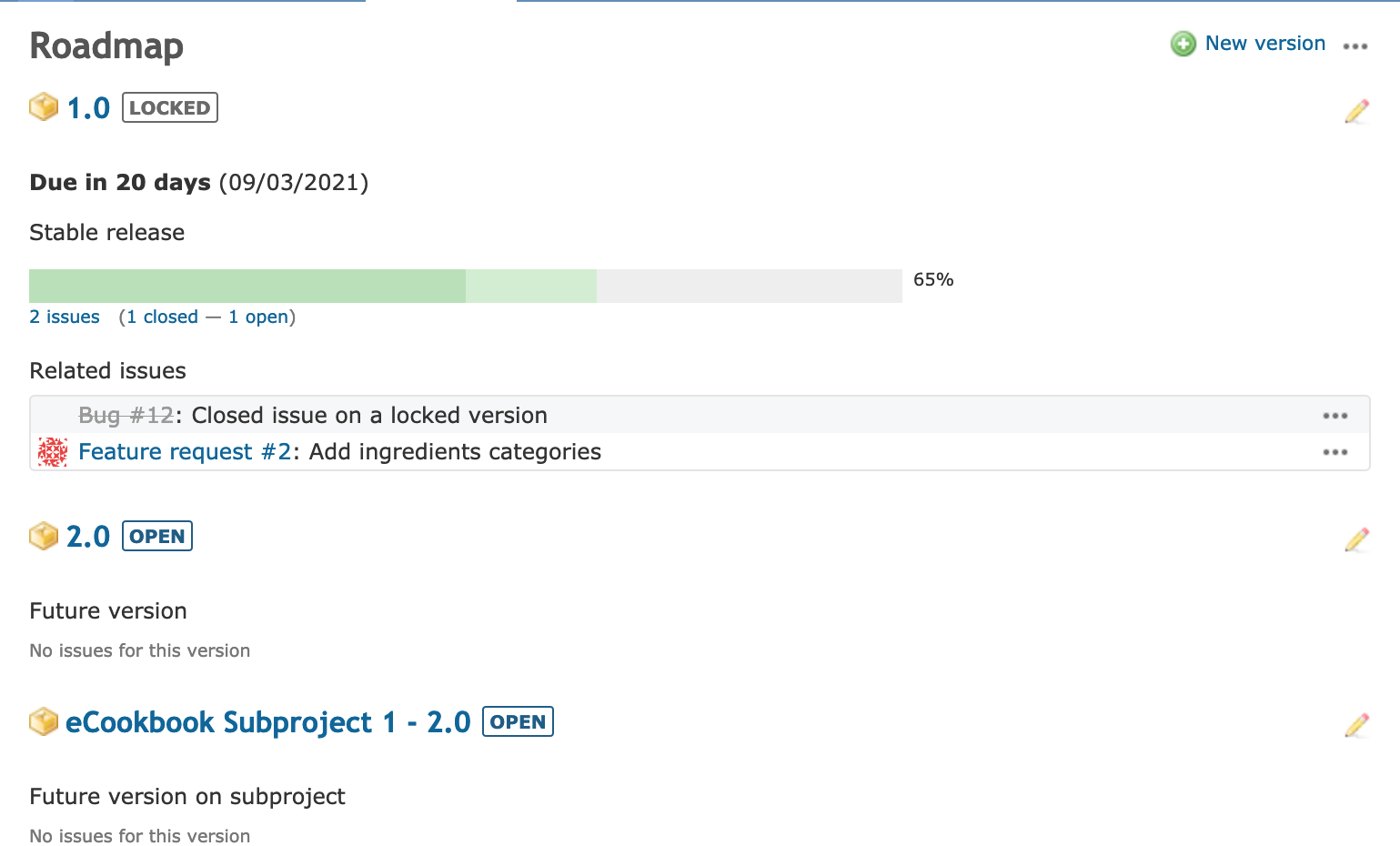
Currently it somewhat looks like versions are crammed together one after another on the Roadmap. I think it would be good to give them some additional space.
This can easily be accomplished with some additional CSS like:
 public/stylesheets/application.css | 2 ++
 1 file changed, 2 insertions(+)

diff --git a/public/stylesheets/application.css b/public/stylesheets/application.css
index e117bc1d0..d09310581 100644
--- a/public/stylesheets/application.css
+++ b/public/stylesheets/application.css
@@ -640,6 +640,8 @@ div#roadmap .wiki h2 { font-size: 110%; }
 div#roadmap h2, div#roadmap h3 {padding-right: 0;}
 body.controller-versions.action-show div#roadmap .related-issues {width:70%;}

+div#roadmap .version-article {padding-bottom: 12px;}
+
 div#version-summary { float:right; width:28%; margin-left: 16px; margin-bottom: 16px; background-color: #fff; }
 div#version-summary fieldset { margin-bottom: 1em; }
 div#version-summary fieldset.time-tracking table { width:100%; }
Note: the above given diff is against trunk @ r21131.
Files
Actions

