Feature #41298
closed
Refine UI with updated box styling and border colors
Added by Go MAEDA about 1 year ago.
Updated 11 months ago.
Description
The attached patch improves the user interface cleaner by updating border colors and box styling.
- Update the style of the
.box, used across multiple screens, by changing the background color and border style to give it a lighter and cleaner impression
- Aligned the border styles of many elements with the updated
.box style, improving contrast and color consistency
- Updated the sidebar background color to match the new background color of the
.box
Screenshots:
Files
|
overview-new@2x.png (307 KB)
overview-new@2x.png |
|
Go MAEDA, 2024-09-23 10:27
|
|
|
overview-current@2x.png (299 KB)
overview-current@2x.png |
|
Go MAEDA, 2024-09-23 10:27
|
|
|
issues-list-current@2x.png (366 KB)
issues-list-current@2x.png |
|
Go MAEDA, 2024-09-23 10:29
|
|
|
issues-list-new@2x.png (367 KB)
issues-list-new@2x.png |
|
Go MAEDA, 2024-09-23 10:29
|
|
|
issue-current@2x.png (315 KB)
issue-current@2x.png |
|
Go MAEDA, 2024-09-23 10:30
|
|
|
issue-new@2x.png (315 KB)
issue-new@2x.png |
|
Go MAEDA, 2024-09-23 10:30
|
|
|
spent-time-list-current@2x.png (264 KB)
spent-time-list-current@2x.png |
|
Go MAEDA, 2024-09-23 10:31
|
|
|
spent-time-list-new@2x.png (265 KB)
spent-time-list-new@2x.png |
|
Go MAEDA, 2024-09-23 10:31
|
|
|
improve-appearance-with-updated-box-styling-and-border-colors.patch (6.55 KB)
improve-appearance-with-updated-box-styling-and-border-colors.patch |
|
Go MAEDA, 2024-09-23 10:38
|
|
|
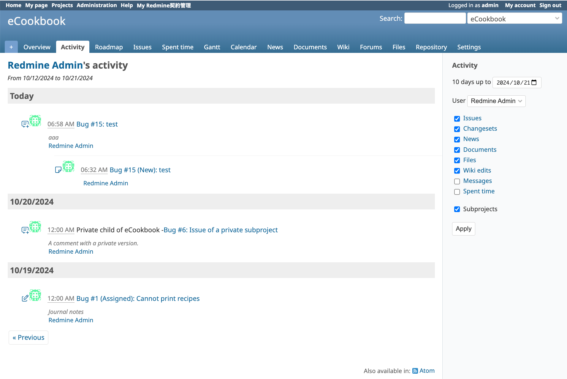
before.png (256 KB)
before.png |
|
Mizuki ISHIKAWA, 2024-10-21 09:01
|
|
|
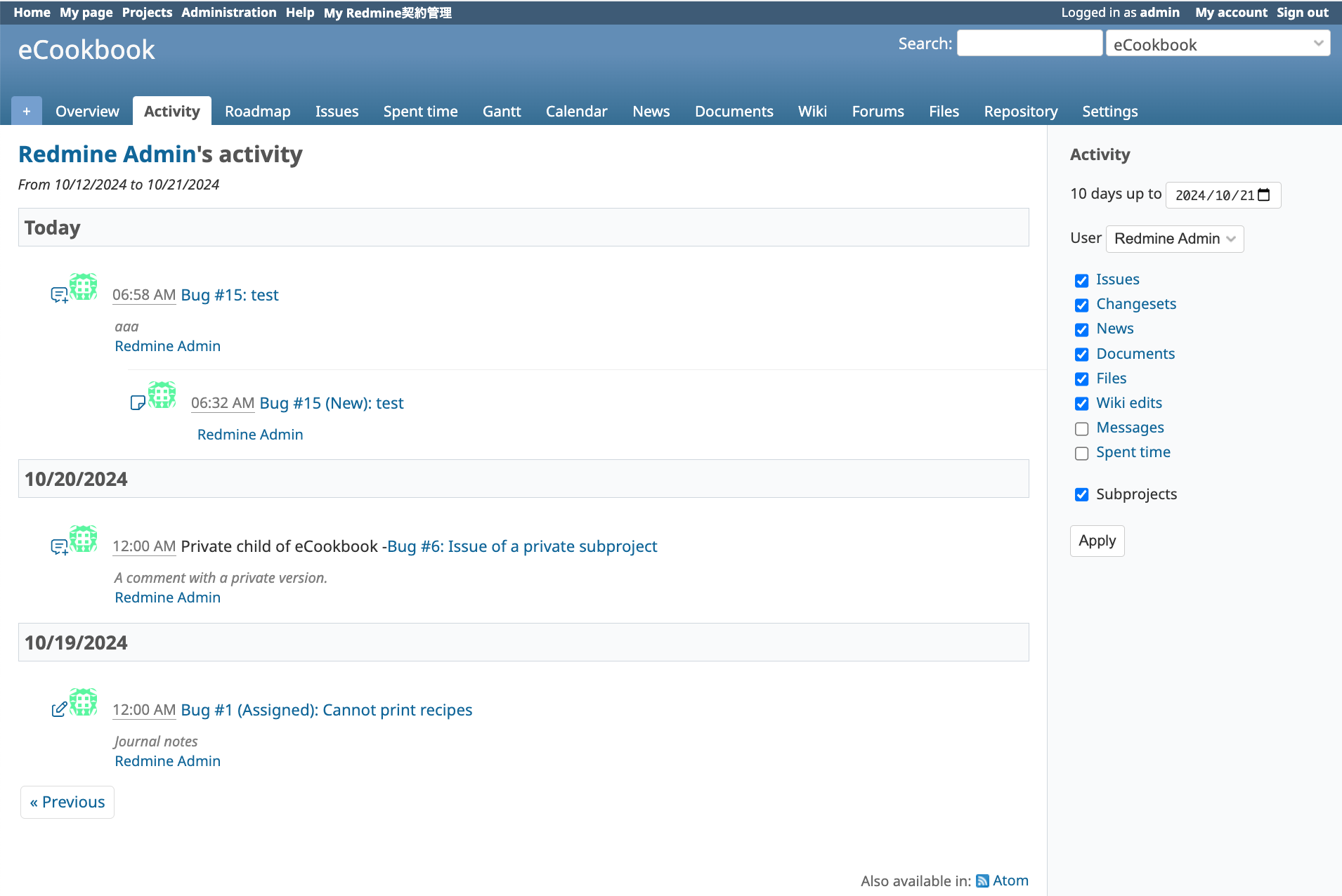
after.png (257 KB)
after.png |
|
Mizuki ISHIKAWA, 2024-10-21 09:01
|
|
- Status changed from New to Resolved
- Resolution set to Fixed
Committed the patch in r23070.
- Related to Defect #32167: Inconsistent border coloring of UI elements? added
- Status changed from Resolved to Closed
The color of the activity page headings was originally determined to match the sidebar. Therefore, how about also changing the color of the activity headings accordingly?
diff:
diff --git a/app/assets/stylesheets/application.css b/app/assets/stylesheets/application.css
index 9bff4f48f..98177f1c8 100644
--- a/app/assets/stylesheets/application.css
+++ b/app/assets/stylesheets/application.css
@@ -723,7 +723,8 @@ div#activity dt.grouped {margin-left:5em;}
 div#activity dd.grouped {margin-left:9em;}
 div#activity h3 {
   padding: 5px;
-  background-color: #eeeeee;
+  background-color: #f9fafb;
+  border: solid 1px #d0d7de;
 }
 div#activity dt {
   padding-top: 10px;
Mizuki ISHIKAWA wrote in #note-4:
The color of the activity page headings was originally determined to match the sidebar. Therefore, how about also changing the color of the activity headings accordingly?
I think the headings should not have a border because it is too obvious and a heading with a border looks like a box.
Also available in: Atom
PDF

