Defect #41401
closedHours column in "Details" tab of Spent time is not right-aligned
Description
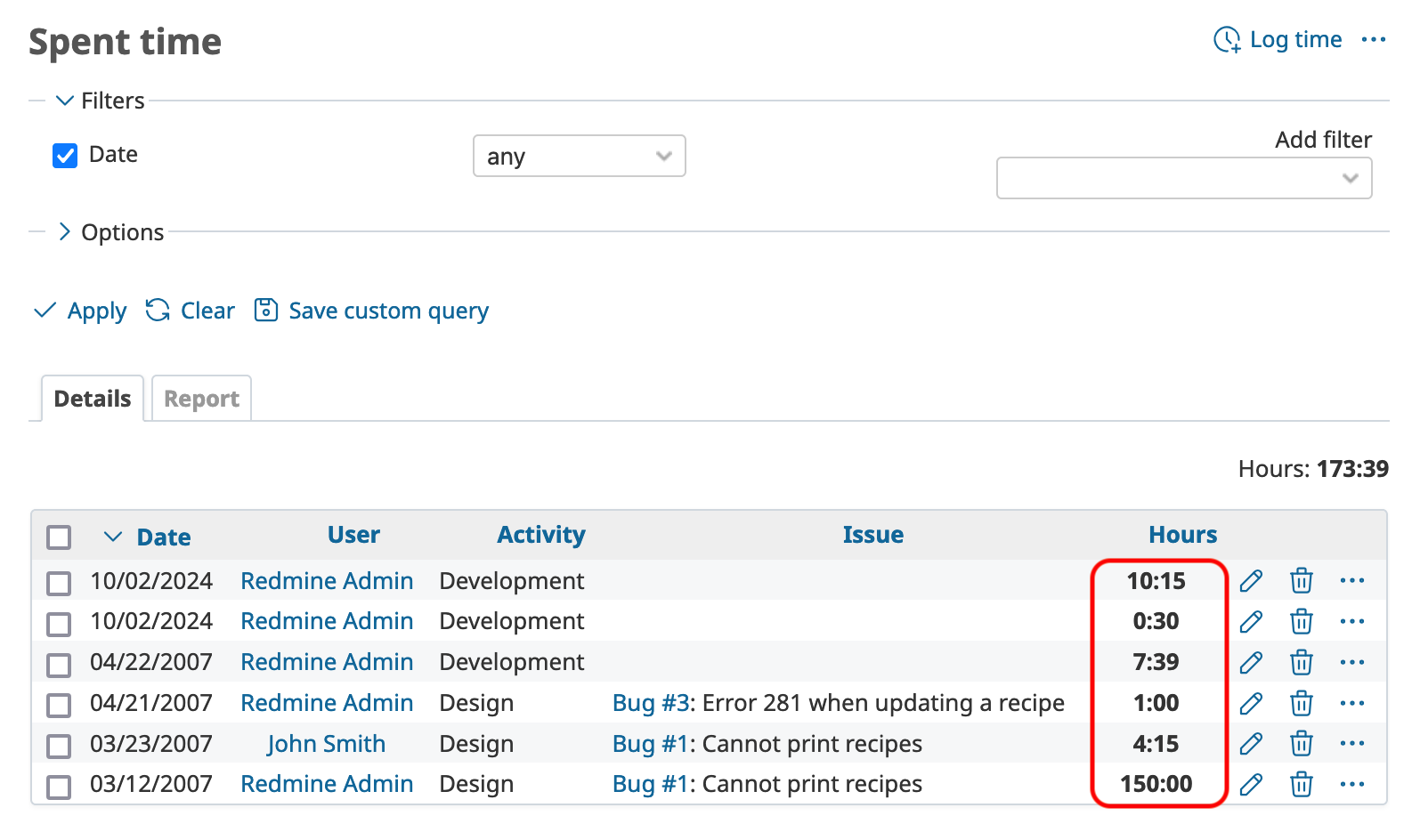
The "Hours" column in the "Details" table of the Spent time is not correctly right-aligned. This is inconsistent with the alignment in the "Report" table, where the "Hours" column is properly right-aligned.
The issue arises from a conflict with existing CSS rules. The CSS rule table.list td applies text-align: center to all table cells, overriding the td.hours rule that is intended to align the "Hours" column to the right.
The attached patch fixes the issue.

Files
 Updated by Holger Just over 1 year ago
I'm not actually sure if the default font used by Redmine supports this, but we may also want to set font-variant-numeric: tabular-nums there to make sure that the numbers align nicely within the table.
https://developer.mozilla.org/en-US/docs/Web/CSS/font-variant-numeric
 Updated by Go MAEDA over 1 year ago
Holger Just wrote in #note-1:
I'm not actually sure if the default font used by Redmine supports this, but we may also want to set
font-variant-numeric: tabular-numsthere to make sure that the numbers align nicely within the table.
What are your thoughts on applying font-variant-numeric: tabular-nums globally?
I think that tabular-nums might be preferable for many use cases in Redmine.
By the way, it appears that in the Noto Sans font used by Redmine after r23096, all numbers already have the same width even without setting font-variant-numeric: tabular-nums;.
diff --git a/app/assets/stylesheets/application.css b/app/assets/stylesheets/application.css
index f5b47e388..de15e4590 100644
--- a/app/assets/stylesheets/application.css
+++ b/app/assets/stylesheets/application.css
@@ -24,7 +24,15 @@

 html, body { min-height: 100vh; }
 html {overflow-y:scroll;}
-body { font-family: "Noto Sans", sans-serif; font-size: 0.875rem; color:#333; margin: 0; padding: 0; min-width: 900px; }
+body {
+  font-family: "Noto Sans", sans-serif;
+  font-variant-numeric: tabular-nums;
+  font-size: 0.875rem;
+  color: #333;
+  margin: 0;
+  padding: 0;
+  min-width: 900px;
+}

 h1, h2, h3, h4, h5, h6 {font-family: "Noto Sans", sans-serif;padding: 2px 10px 1px 0px;margin: 0 0 10px 0;}
 #content h1, h2, h3, h4, h5, h6 {color: #555;}
 Updated by Holger Just over 1 year ago
Thank you for checking. It seems in fact that Noto Sans is designed to have lining-nums and tabular-nums by default. Thus, it actually appears there is nothing we need to do here for the tables.
Generally, non-tabular numbers look nicer inside paragraphs as narrower numbers such as 1 don't have that much whitespace around them compared to wider numbers such as 8. This additional whitespace is acceptable in tabular contexts where its more important that numbers line up vertically. In Noto Sans (and pararently many other "modern" sans-serif fonts), the font-designers have settled on tabular numbers by default for its intended audience of app-developers.
However, Noto Sans does in fact also support proportional-size numbers. Thus, conversely it may be a good idea to define font-variant-numeric: proportional-nums for div.wiki at least (and to override it again to tabular-nums at least for table, pre, code, and numbered list headers within wiki texts). But I can see that this may be a lot of hassle. So I would be also fine with keeping the font default of tabular-nums everywhere for now.
 Updated by Go MAEDA over 1 year ago
- File 0001-Right-align-Hours-column-in-spent-time-details-table.patch 0001-Right-align-Hours-column-in-spent-time-details-table.patch added
- File 0002-Apply-proportional-nums-for-wiki-text-except-for-tab.patch 0002-Apply-proportional-nums-for-wiki-text-except-for-tab.patch added
Holger Just wrote in #note-3:
However, Noto Sans does in fact also support proportional-size numbers. Thus, conversely it may be a good idea to define
font-variant-numeric: proportional-numsfordiv.wikiat least (and to override it again totabular-numsat least fortable,pre,code, and numbered list headers within wiki texts).
Thank you for detailed explanation. I now understand that using proportional-nums for paragraphs can improve appearance especially in western languages.
To address this, I propose commiting 0001-Right-align-Hours-column-in-spent-time-details-table.patch that applies tabular-nums only for table.list to fix the original issue and then commiting 0002-Apply-proportional-nums-for-wiki-text-except-for-tab.patch that applies proportional-nums for contents within div.wiki except for tables and code blocks, as shown below, as a part of #41321.
div.wiki {
  font-variant-numeric: proportional-nums;
  & table, & pre, & code, & ol>li::marker {
    font-variant-numeric: tabular-nums;
  }
}