Feature #29027
openAdd more structure to the issues view by using tabs
Description
I've tested the patch series in #3058 on the latest trunk revision and it works as described and it's a great feature.
However, I would like to propose to go a step further with the idea of tabbed views for the issues content.
In my opinion, it would be great to rework the whole issue page and convert it to a tabbed view. There is so much
information on this single view that it's tends to overwhelm many less experienced and less tech savvy users e.g managers or clients.
A more structured presentation could help such users a lot and would lead to more acceptance for Redmine in those user circles.
This also has the following advantages:
- Faster switching between issue history and details
- Less scrolling needed on small screens
- Much cleaner and more intuitive UI/UX
- Great entry point for plugin support (additional tabs) in future development
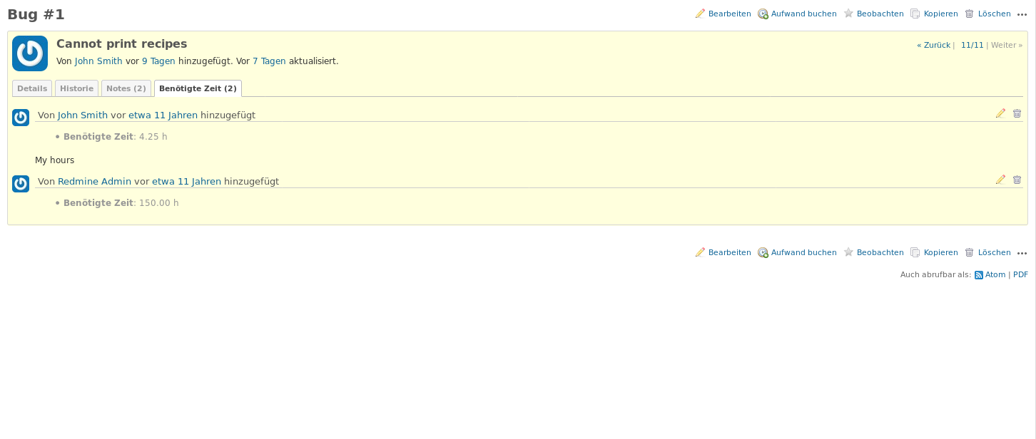
I've played a bit with the HTML and came up with a first mocked view.
I would spent more design effort on a real implementation but I think the screenshots show my basic intention.
As you can see, no horizontal scrolling is needed to access the latest information on the issue.
The sections 'Subtasks' and 'Related issues' could move to their own tabs, too.


Files
Related issues
 Updated by Marius BĂLTEANU almost 8 years ago
- File expand_collapse.png expand_collapse.png added
First of all, thanks for testing the patches from #3058.
Second of all, I'm not sure what to say about having also the issue attributes in a tab. For me, it is more easier and useful to have the possibility to scroll a little bit up to see some attributes/fields values.
Regarding this subject, I've 2 ideas in mind that I've already implemented in our environment and I can easily extract them as patches for the core:
1. Expand/collapse on each section from the issue page (Issue attributes, Description, Full width fields, Subtasks, Relations, History). In addition, we can add a remember state in order to have some sections collapsed by default.
A print screen with this feature where we can observe that the description and subtasks sections are collapsed. 
2. A sticky subject bar (Gravatar, Issue subject, Parent task, Added by, Updated and Next/Previous) in order to know on which issue you are wherever are you on the page.
 Updated by Bernhard Rohloff almost 8 years ago
Marius BALTEANU wrote:
First of all, thanks for testing the patches from #3058.
No, I have to thank for getting access to such nice improvements. ;-)
Regarding this subject, I've 2 ideas in mind that I've already implemented in our environment and I can easily extract them as patches for the core:
1. Expand/collapse on each section from the issue page (Issue attributes, Description, Full width fields, Subtasks, Relations, History). In addition, we can add a remember state in order to have some sections collapsed by default.
This is also a good idea. Most of the time I'm interested in one particular detail of an issue and it would be very convenient if Redmine could just show me the options and I could choose what looks tasty to me. Just like like the menu in a restaurant only shows me the meals without listing all ingredients and recipes. It would also be great if the users could select their preferred view (collapsed/expanded) in their account settings and a way to collapse/expand all groups (like in the issues table) would be the icing on the cake. :-D
However if you could extract a patch for this it would be a pleasure for me to try it out and give feedback on it.
A print screen with this feature where we can observe that the description and subtasks sections are collapsed.
...
2. A sticky subject bar (Gravatar, Issue subject, Parent task, Added by, Updated and Next/Previous) in order to know on which issue you are wherever are you on the page.
This makes sense, too. I've tested this by splitting the issue in two divs for the issues "header" and "body" and making the body scrollable. This also had the advantage that only the issues content moved down and the links in the sidebar stayed accessible.
 Updated by Marius BĂLTEANU almost 8 years ago
Bernhard Rohloff wrote:
This is also a good idea. Most of the time I'm interested in one particular detail of an issue and it would be very convenient if Redmine could just show me the options and I could choose what looks tasty to me. Just like like the menu in a restaurant only shows me the meals without listing all ingredients and recipes. It would also be great if the users could select their preferred view (collapsed/expanded) in their account settings and a way to collapse/expand all groups (like in the issues table) would be the icing on the cake. :-D
For now I've added two proposals in #29034, please take a look and let me know what do you think.
 Updated by Marius BĂLTEANU almost 8 years ago
- Related to Feature #29034: Option to collapse/expand issue sections added