Feature #29027
openAdd more structure to the issues view by using tabs
0%
Description
I've tested the patch series in #3058 on the latest trunk revision and it works as described and it's a great feature.
However, I would like to propose to go a step further with the idea of tabbed views for the issues content.
In my opinion, it would be great to rework the whole issue page and convert it to a tabbed view. There is so much
information on this single view that it's tends to overwhelm many less experienced and less tech savvy users e.g managers or clients.
A more structured presentation could help such users a lot and would lead to more acceptance for Redmine in those user circles.
This also has the following advantages:
- Faster switching between issue history and details
- Less scrolling needed on small screens
- Much cleaner and more intuitive UI/UX
- Great entry point for plugin support (additional tabs) in future development
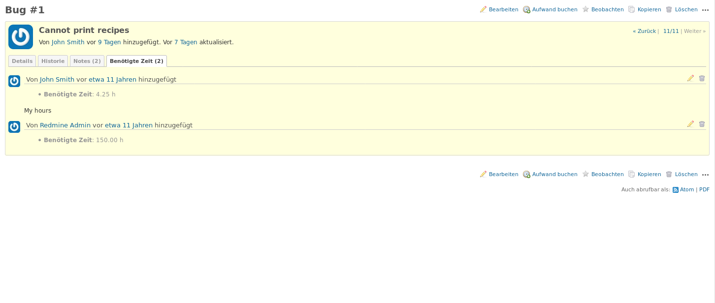
I've played a bit with the HTML and came up with a first mocked view.
I would spent more design effort on a real implementation but I think the screenshots show my basic intention.
As you can see, no horizontal scrolling is needed to access the latest information on the issue.
The sections 'Subtasks' and 'Related issues' could move to their own tabs, too.


Files
Related issues
