Defect #30287
closed
The tooltip layout of the calendar is broken
Added by Mizuki ISHIKAWA over 6 years ago.
Updated about 6 years ago.
Description
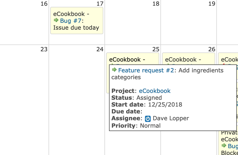
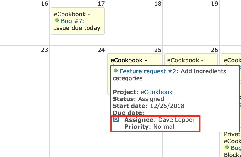
The layout of the assignee icon in the tooltip of the calendar is broken.
| Expected output |
Actual output |
 |
 |
Files
I think that it will be fixed by adding the following CSS.
diff --git a/public/stylesheets/application.css b/public/stylesheets/application.css
index 039cc07a9d..bff156820a 100644
--- a/public/stylesheets/application.css
+++ b/public/stylesheets/application.css
@@ -962,6 +962,11 @@ p.cal.legend span {display:block;}
 .tooltip span.tip{display: none; text-align:left;}
 .tooltip span.tip a { color: #169 !important; }

+.tooltip span.tip img.gravatar {
+  float: none;
+  margin: 0;
+}
+
 div.tooltip:hover span.tip{
 display:block;
 position:absolute;
- Target version set to 4.0.1
What do you think if we refactor the tooltip and use a list or div elements (like in the issue page) to render the issue attributes instead of the current implementation and proposed fix?
- Status changed from New to Closed
- Assignee set to Jean-Philippe Lang
- Resolution set to Fixed
Patch committed, thanks.
Marius BALTEANU wrote:
What do you think if we refactor the tooltip and use a list or div elements (like in the issue page) to render the issue attributes instead of the current implementation and proposed fix?
If it simplifies the css, that would be great. Please feel free to submit a patch for next release.
Also available in: Atom
PDF

