Patch #32100
open
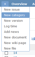
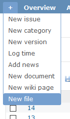
Fixed and added roundiness to the "plus" (+) flyout menu and it's child elements
Added by Anonymous almost 6 years ago.
Updated almost 6 years ago.
Description
This patch is a follow up to #32013 and fixes the look of the "plus" fly-out menu.


Files
Alternative, simpler patch which only adds roundness to the bottom of the fly-out menu and removes on-hover roundness from children elements inside it.
I like the rounded tabs for the main menu, but I don’t see a real benefit for making also the hover element rounded in the fly-out menu. That menu is more like a select/dropdown.
Marius BALTEANU wrote:
but I don’t see a real benefit for making also the hover element rounded in the fly-out menu.
Hence why I also added the fix-roundiness-on-plus-menu-without-menuchild-roundiness.patch, in case menu child roundness would seem like a lame idea. I think it should be committed either way, because at least it fixes what's caused in that fly-out menu, by patch #32013 :D
Else it feels kinda a bit inconsistent... because
- Project selector box on the other side is rounded.
- Issue context menu is also rounded.
and this fly-out is not rounded...
- Related to Patch #32013: Rounded corners of the main menu added
Due to Bernhard's fix in r18543, I'm attaching the new revision compatible version of this patch.
This patch also adds "hidden overflow" this time, to avoid child element's corners to stick outside, and preserve proper roundness
P.S. I think we should rename this ticket to "added roundness to the bottom of "plus" (+) fly-out menu"
Also available in: Atom
PDF
