Defect #32981
closed
Unable to distinguish disabled input fields
Description
Although it is a text box with disabled set, it is difficult to identify because the background color does not change.
(The cursor changes when you mouse over, so we can identify it.)
Below is the [Settings] > [Incoming emails] tab.
Disabled is set for [Incoming email WS API key], but it is difficult to identify that input is not possible because the background color does not change.

This is because the following style is set in application.css.
input, select, textarea, button { color: #333; background-color: #fff; border:1px solid #ccc; border-radius:3px; box-sizing: border-box;}
The background-color is #fff, but the background-color for disabled is not specified.
Suggested fix
There are two ways to fix this.
1. Add a style for disabled
The setting of "input:disabled, select:disabled, textarea:disabled" already exists, so add the background-color there.
input:disabled, select:disabled, textarea:disabled {
  cursor: not-allowed;
  color: graytext;
+  background-color: #ebebe4;
}
However, since there are various types of input, it is not clear whether there is no problem in specifying it uniformly like this.
It may be safer to specify only the required type, such as input[type="text"].
input[type="text"]:disabled,
input[type="password"]:disabled,
input[type="date"]:disabled,
input[type="number"]:disabled,
select:disabled,
textarea:disabled {
  background-color: #ebebe4;
}
2. Remove "background-color: #fff"
I think the need to reset the background-color is low.
- input, select, textarea, button { color: #333; background-color: #fff; border:1px solid #ccc; border-radius:3px; box-sizing: border-box;}
+ input, select, textarea, button { color: #333; border:1px solid #ccc; border-radius:3px; box-sizing: border-box;}
By not resetting, disabled will also be displayed in the default style.

Files
Related issues
 Updated by Bernhard Rohloff over 6 years ago
- Related to Patch #31147: Add custom styles for all fields added
Updated by Bernhard Rohloff over 6 years ago
- Status changed from New to Confirmed
We styled the input fields background in #31147 to get a consistent look of Redmine and fix problems with dark themed desktops.
I think your first solution is the most appropriate one.
 Updated by Go MAEDA about 6 years ago
Onozato-san, thank you for reporting this issue.
Just out of curiosity, how did you pick the color #ebebe4?
 Updated by Hirokazu Onozato about 6 years ago
- File chrome-css.png chrome-css.png added
Go MAEDA wrote:
Just out of curiosity, how did you pick the color #ebebe4?
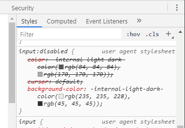
Using Chrome's DevTools, I checked with Chrome default CSS.
On my Windows PC, it was rgb(235, 235, 228) = #ebebe4.
Updated by Go MAEDA about 6 years ago
- Target version set to 4.1.1
The first patch provided by Hirokazu Onozato looks good. Setting the target version to 4.1.1.
diff --git a/public/stylesheets/application.css b/public/stylesheets/application.css
index e04091a10..815bd4e15 100644
--- a/public/stylesheets/application.css
+++ b/public/stylesheets/application.css
@@ -423,6 +423,7 @@ span.add_attachment a {padding-left:16px; background: url(../images/bullet_add.p
 input:disabled, select:disabled, textarea:disabled {
   cursor: not-allowed;
   color: graytext;
+  background-color: #ebebe4;
 }
Updated by Go MAEDA about 6 years ago
- Status changed from Confirmed to Resolved
- Assignee set to Go MAEDA
- Resolution set to Fixed
Committed the patch. Thank you for reporting and fixing the issue.
Updated by Go MAEDA about 6 years ago
- Subject changed from Difficult to identify a text box that is disabled to Unable to distinguish disabled input fields