Feature #28392
closedImprove wiki headings style
0%
Description
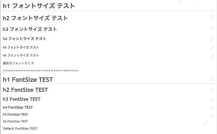
In the current versions of Redmine, styles for h4, h5, and h6 are not defined in application.css. As a result, you sometimes see an unnatural appearance of wiki pages. Please see the screenshot below.

Files
Related issues
 Updated by Go MAEDA about 7 years ago
- Related to Defect #28331: h4, h5 and h6 headings on wiki pages should have a paragraph mark added
 Updated by Go MAEDA almost 7 years ago
- Related to Defect #23103: Wiki in Markdown syntax mode improperly renders successive headers. added
 Updated by Takayuki Yoshioka about 6 years ago
English
I wrote a patch.
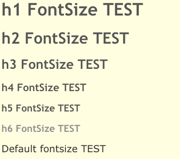
The display has been corrected as shown in the attached image.
I referred to the display of Github wiki.
日本語
Githubのwikiの表示を参考にして、パッチを書きました。
添付の画像のように表示を修正しました。

 Updated by Takayuki Yoshioka about 6 years ago
 Updated by Go MAEDA about 6 years ago
- Target version set to Candidate for next major release
 Updated by Go MAEDA about 6 years ago
- Status changed from New to Needs feedback
Thank you for posting the patch.
Takayuki Yoshioka wrote:
I referred to the display of Github wiki.
Do you mean that you copied the styles from GitHub? I am concerned that it may violate their intellectual property rights.
 Updated by Takayuki Yoshioka about 6 years ago
Go MAEDA wrote:
Do you mean that you copied the styles from GitHub? I am concerned that it may violate their intellectual property rights.
English
I used a simple look for reference, but I wrote the CSS code by myself.
I have not copied it.
日本語
シンプルな見た目を参考にしましたがCSSコードは自分で書きました。
コピーはしていません。
 Updated by Go MAEDA about 6 years ago
- Status changed from Needs feedback to New
Takayuki Yoshioka wrote:
I used a simple look for reference, but I wrote the CSS code by myself.
I have not copied it.
Thank you for clarification.
The table below is a comparison between the patch and GitHub. I think the patch shares some ideas with GitHub. The ideas are (1) using a brighter color only for h6 and (2) the color code for h6.
Although I am not familiar with intellectual property rights, in my humble opinion, I think it is better to change the style for h6 to make the patch legally safer.
| the patch | GitHub | |
|---|---|---|
| h1 | font-size: 2em; border-bottom: 1px solid #ccc; | font-size: 2em; border-bottom: 1px solid #eaecef; |
| h2 | font-size: 1.8em; | font-size: 1.5em; border-bottom: 1px solid #eaecef; |
| h3 | font-size: 1.5em; | font-size: 1.25em; |
| h4 | font-size: 1.2em; | font-size: 1em; |
| h5 | font-size: 1em; | font-size: 0.875em; |
| h6 | font-size: 1em; color: #6a737d; | 0.85em; font-size: #6a737d; |
 Updated by Takayuki Yoshioka about 6 years ago
English
Although I am not familiar with intellectual property rights, I think that it is a general style with regard to the following two points.
If this is a problem, I think that there are intellectual property rights issues with most of the sites in the world.
1. font-size and border-bottom
2. Change the font-size specification from px to em (I think this is better because I think that relative specification is more resistant to change)
You may want to change the color of h6 as you mentioned, so I will try to make a patch.
日本語
私も知的財産権に詳しいわけではありませんが、以下の2点に関しては一般的なスタイルだと私は考えています。
これが問題であれば、世の中のサイトのほどんとは知的財産権の問題があると思います。
1. font-sizeの強弱 と border-bottom
2. font-sizeの指定をpxからemに変更(相対的な指定の方が変更に強いと考えたため、こちらの方が良い思います)
h6のカラーに関してはおっしゃる通り変更した方が良いかもしれませんので、修正したパッチを作成しようと思います。
 Updated by Takayuki Yoshioka about 6 years ago
English
The patch has been fixed, so please check.
I think that the purpose of this ticket is to solve the problem that the display of wiki is not consistent because h4, h5 and h6 are not set.
So, with this ticket, I think that style consistency is important, not making major changes to the display.
(Result is a simple style.)
If there is a problem with the above idea, it is safe to have the patch rejected.( I can remake it. )
日本語
パッチを修正しましたのでご確認をお願いいたします。
このチケットの目的はwiki の表示で h4, h5, h6 の設定が行われていないため表示に整合性がないという問題を解決するチケットだと考えています。
ですので、このチケットでは表示を大きく変更するのではなく、スタイルの整合性が重要だと考えます。
(結果シンプルなスタイルになっています。)
上記考えに問題があればパッチをリジェクトされても問題ありません。(作り直しでも良いです。)
 Updated by Go MAEDA almost 6 years ago
Jean-Philippe Lang has removed border-bottom property for headings in r10102. I think it is better not to add a bottom border on ".wiki h1".
 Updated by Mizuki ISHIKAWA over 4 years ago
- File ScreenShot_2020-07-14_17.20.59.png ScreenShot_2020-07-14_17.20.59.png added
- File change-wiki-stylesheets20200714.patch change-wiki-stylesheets20200714.patch added
Go MAEDA wrote:
Jean-Philippe Lang has removed border-bottom property for headings in r10102. I think it is better not to add a bottom border on ".wiki h1".
I attach the patch made from change-wiki-stylesheets20190325.patch with h1 underline removed.
I hope this change is committed early as it will make the wiki page bigger and easier to read.

 Updated by Bernhard Rohloff about 4 years ago
- Target version changed from Candidate for next major release to 4.2.0
I've tested Mizuki's patch and it applies flawless on the current trunk.
It's a great improvement in UX and readability. I personally don't use the smaller headings because of the current size.
+1
This would be a great patch to ship with v4.2.0. What do you think?
 Updated by Go MAEDA about 4 years ago
- Tracker changed from Defect to Feature
- Subject changed from Styles for h4, h5 and h6 wiki headings are not defined to Improve wiki headings style
- Status changed from New to Closed
Committed the patch. Thank you for your contribution.
 Updated by Go MAEDA about 4 years ago
- Category changed from Wiki to UI
- Resolution set to Fixed