Feature #28829
open
Add right-click context menu to the contextual area of an issue
Description
Patch #26655 has added icons to open the context menu on the issues list. The button is very helpful and I really like it. It would be great if issues#show page has the same button as well. It allows users to update various fields (e.g. assignee, status, priority, category, custom fields, ...) easily and quickly.
Assume that you are about to update the assignee field. In the current version, you need 4 clicks to complete the operation (click "Edit", open "Assignee" drop-down, select a user, and click "Submit"). However, if the button is implemented, all you need is just 2 clicks ( click the context menu icon and then click a user).
I think the button greatly improves UX and productivity.

Files
Related issues
 Updated by Go MAEDA almost 8 years ago
- Related to Patch #26655: Additional icon for contextmenu added
Updated by Go MAEDA almost 8 years ago
- Related to Feature #729: Issues: (semi-)inline issue editing added
Updated by Go MAEDA almost 8 years ago
- Related to Feature #28086: Add context menu for attributes in issue details added
 Updated by Mizuki ISHIKAWA almost 8 years ago
I attached a patch that realizes this feature.
I think it is very convenient to be able to change some items without opening the edit panel.
Updated by Go MAEDA almost 8 years ago
- File 28829-screenshot@2x.png 28829-screenshot@2x.png added
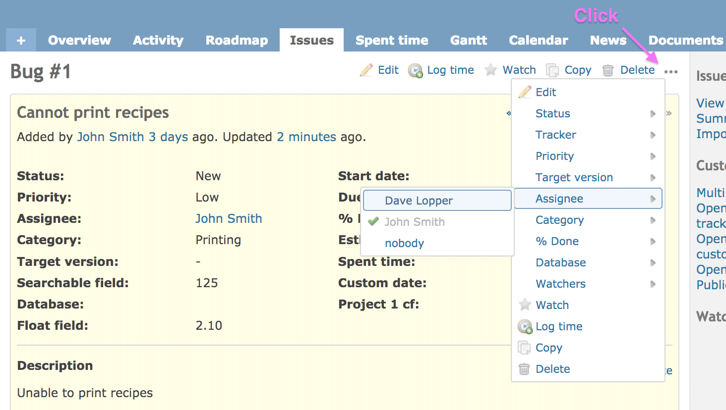
Mizuki, thank you for writing the patch so quickly.
This is a screenshot of the patch. Users can update various fields with the context menu, without moving to "Edit" form.
Issues list already has the 3-bullets button to show the context menu. I think that adding the button to the issue page is very reasonable and makes the UI consistent.
Updated by Go MAEDA almost 8 years ago
I noticed the following points. Please check.
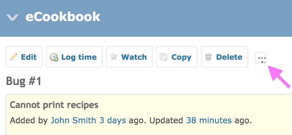
- The patch works without
icon-only-context-menuCSS class. We can pinpoint the icon with.contextual span.hascontextmenu. - The button looks ugly on mobile screens. Please see the screenshot below.
 Updated by Yuuki NARA almost 8 years ago
+1
I applied this patch and 26655 to my 3.4 environment.
LGTM
Updated by Mizuki ISHIKAWA almost 8 years ago
Go MAEDA wrote:
I noticed the following points. Please check.
- The patch works without
icon-only-context-menuCSS class. We can pinpoint the icon with.contextual span.hascontextmenu.- The button looks ugly on mobile screens. Please see the screenshot below.
I fixed about points you pointed out.
This feature seems to be wanted by many people.
Thank you for a great idea, Go MAEDA.
Updated by Mizuki ISHIKAWA almost 8 years ago
I fixed the test a little.
Updated by Go MAEDA almost 8 years ago
- Target version set to Candidate for next major release
 Updated by Bernhard Rohloff almost 8 years ago
I also think that it makes sense to place the editing options inside the already existing contextual area. This is a place people already know and would search for a feature like that. Good job!
That said I have just two things which bother me:
- The context menu replicates the entire list of buttons which are already shown in the contextual area which feels very odd to me. Perhaps they can be hidden with some CSS magic.
- The three dot icon is the only button in the list which has no label what makes it difficult to recognize it as a clickable item. I think a descriptive label like "More options" would helpful in that case.
Updated by Go MAEDA almost 8 years ago
Bernhard Rohloff wrote:
- The context menu replicates the entire list of buttons which are already shown in the contextual area which feels very odd to me. Perhaps they can be hidden with some CSS magic.
I can understand your opinion. However, some users, including me, may expect seeing same menu items with the context menu in other pages. In my opinion, context menus should always have the same set of items for the same object. It is very consistent.
- The three dot icon is the only button in the list which has no label what makes it difficult to recognize it as a clickable item. I think a descriptive label like "More options" would helpful in that case.
I think we don't have to add a label for the icon. The contextual area is already crowded with many icons, especially when you have admin privilege. I think there is no problem even without a label for the icon because the 3-dots icon will be displayed in issues list in Redmine 4.0.0 (see #26655). In addition, people see similar icon in many applications, so they are familiar with the kind of icons.
Updated by Bernhard Rohloff almost 8 years ago
Bernhard Rohloff wrote:
That said I have just two things which bother me:
...
Oh I forgot to say that I'm totally fine with the current implementation, anyway. My 2cts shouldn't be a show stopper for this patch. :-)
1+
Updated by Go MAEDA almost 8 years ago
- Target version changed from Candidate for next major release to 4.1.0
Thanks, Bernhard!
I am setting target version to 4.1.0.
Updated by Go MAEDA almost 8 years ago
- Subject changed from Add context menu icon to issue's contextual area to Add right-click context menu to the contextual area of an issue
- Status changed from New to Closed
- Assignee set to Go MAEDA
- Target version changed from 4.1.0 to 4.0.0
- Resolution set to Fixed
Committed. Thank you for your contribution.
 Updated by Enziin System almost 8 years ago
Please push to Github mirror.
Thanks.
 Updated by Marius BĂLTEANU almost 8 years ago
- File only_add_notes.png only_add_notes.png added
- File all_permissions.png all_permissions.png added
Even if this feature is committed, I want to share my feedback:
1. I agree with Bernhard Rohloff regarding the entire list of buttons which looks very odd to me in some cases. I'm adding some examples below:
User only with permissions to add notes: 
2. User with full permissions have 5 duplicated items: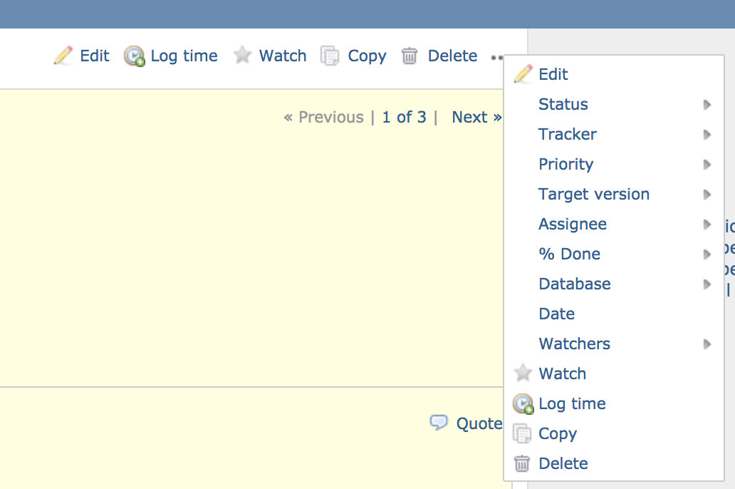
3. Edit, Copy and Delete items are rendered in all cases.
4. Some fields (ex: Description) cannot be changed from this "menu".
5. Issue status cannot be changed if the new status has some fields mandatory which are not already completed. You'll be thrown in the issue edit page with some validations messages.
I'm not saying that this feature is not a step forward, but IMHO is insufficient considering that we are in the issue page context.
As I said in #28086#note-2, I'm considering that an inline editing feature for editable attributes (excepting status) is a better solution and for status changes, a mechanism to show the next X possible statuses and on click on the next status, the mandatory fields should be shown in order to allow the user to fill them in.
Again, I don't mind if this issue will be delivered in version#4.0.0, but I would like to find a better UI/UX solution in the near feature.
Updated by Mizuki ISHIKAWA almost 8 years ago
Thank you for your feedback.
This issue is closed, but I attach a patch to fix about some of the contents pointed out in this issue.
- Do not display elements such as duplicate watch and copy on the issues/show context menu
- Do not display icon for unauthorized users in issues / show
- Fix to prevent icon style from collapsing
- Add test
 Updated by Jean-Philippe Lang over 7 years ago
- Target version deleted (
4.0.0)
Thanks for your contributions. I agree that displaying duplicate actions in the dropdown menu is really odd. And there are still some issues even with the last patch applied. For example, the menu will only be displayed if the user is allowed to change the issue status. Besides, if we introduce a dropdown in this place, I think it would be nice to move some actions in the dropdown (eg: copy, delete) to free up some space in the contextual area.
All in all, I prefer to remove this from 4.0 and give it a bit more work.
Updated by Marius BĂLTEANU about 6 years ago
- Related to Feature #33153: UI feature to quickly change issue status added