Patch #30435
closed
Replace float rules with flexbox for content and sidebar block
Description
What this patch does:
1. It moves the sidebar to be rendered after the content block in base.html.erb, since natural flow of HTML should be from left to right, so no point in rendering sidebar before the content block, because it doesn't match our base layout.
2. It sets the #main block to a flexbox and removes a redundant background color definition rule from it.
3. It changes the % based width of the sidebar to a fixed 220px (if you think it should be wider, feedback is welcome), because on wide screens 22% is quite a lot of space!
4. #content block is the only one that will stretch now.
Files
Related issues
 Updated by Marius BĂLTEANU about 7 years ago
- Subject changed from Change #main block to a flexbox + additional minor fixer to it's direct children. to Change #main block to a flexbox + additional minor fixes to it's direct children.
 Updated by Go MAEDA about 7 years ago
- Target version set to 4.1.0
It looks nice. Setting the target version to 4.1.0.
Updated by Marius BĂLTEANU about 7 years ago
Please do not commit because I want to test more these changes. I looked yesterday for few seconds and I saw some problems.
 Updated by Bernhard Rohloff about 7 years ago
The patch looks good to me, although I'm not sure if the width is sufficient for the text length of everbody's saved queries. It also wraps the heading of "Custom queries" if you choose German ( it's "Benutzerdefinierte Abfragen" ) as interface language. No big deal to me but I think it's worth mentioning.
Overall, I think the patch is a great improvement.
+1
Updated by Anonymous about 7 years ago
I'm also wondering about the nature of this rule, does anybody have idea what it should do?
* html #content{ width: 75%; padding-left: 0; margin-top: 0px; padding: 6px 10px 10px 10px;}
because in the default version, just one line above it would already be defined as:
#content{ width: 75%; padding-left: 0; margin-top: 0px; padding: 6px 10px 10px 10px;}
I have a feeling, Internet Explorer is guilty :)
Updated by Marius BĂLTEANU about 7 years ago
In my environment, the #content loads first with 100% width and right after, the sidebar which makes the screen "shakes".
Updated by Anonymous about 7 years ago
Marius BALTEANU wrote:
In my environment, the #content loads first with 100% width and right after, the sidebar which makes the screen "shake".
Marius, I looked into it, so I'm attaching alternative patch without element swapping in base.html.erb to see if this one will not spawn shaking, the previous patch must be reverted before applying this one.
The alternative method could as well be to set #main a flow-direction: row; instead of row-reverse and than add order: 1; for the #content and order: 2; for the #sidebar, but I guess this isn't needed now, because we only have 2 containers, but it could be useful if we re to spawn an additional tile under the sidebar in the future for instance, else in the favor of less rules, it is imho just be simpler to reverse it. :)
Updated by Marius BĂLTEANU about 7 years ago
- File sidebar.png sidebar.png added
Thanks Max for updating the patch, it works well with row-reverse.
I agree with Bernhard, the sidebar width (220px) is too small even for small screens, please see the below screenshot from my 13 inch screen:
1. width: 220px;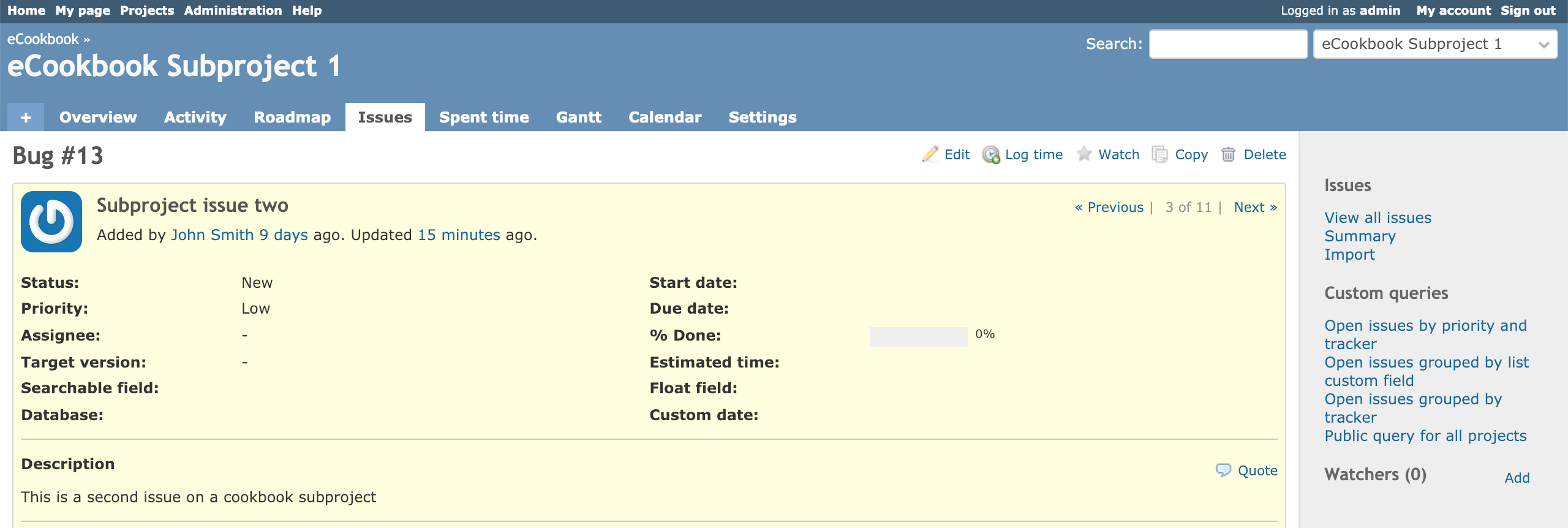
What do you think if we keep the existing width: 22% rule and we add a max-width of 280px or 300px?
Updated by Anonymous about 7 years ago
I think width: 22% will anyway often exceed it's maximum limitation of max-width, maybe we could try min-width: 220px and max-width: 280px or 300px?
In theory sidebar's content should then expand the sidebar in width within these margins a bit depending on what it contains. :)
Updated by Anonymous about 7 years ago
There is a gridbox design suggestion now pending for further discussion, so this ticket will be affected if we will decide to move #main-menu inside #main container, ultimately making this patch obsolete, because it will then become a 3 tiled gridbox instead of a flexbox. Please see #30451#note-6 for reference.
Updated by Marius BĂLTEANU about 7 years ago
- Assignee deleted (
Marius BĂLTEANU)
Updated by Anonymous about 7 years ago
I think it will be better to ignore #30451 for now, so attaching the patch with min-width and max-width rules for the sidebar, the content of the sidebar will now expand it up to 340px if contains long elements, if there is no need, it will reduce up to 220px. I think it's the most suitable resolution for everyone.
I also removed some redundant rules this time, like:
* html #sidebar{ width: 22%; }
* html #content{ width: 75%; padding-left: 0; margin-top: 0px; padding: 6px 10px 10px 10px;}
Updated by Go MAEDA about 7 years ago
Max Johansson wrote:
I think it will be better to ignore #30451 for now, so attaching the patch with min-width and max-width rules for the sidebar, the content of the sidebar will now expand it up to 340px if contains long elements, if there is no need, it will reduce up to 220px.
Thank you for the patch. Narrower sidebar than the current implementation should be nice for many people.
I tried the patch but I found that the sidebar hardly expands even if there is a custom query with a long name and the width of the browser window is around 1800px. With my Firefox, the width of the sidebar is 261px at 1024px window and 271px at 1800px window.
How can I see a sidebar with a width of 340px?
Updated by Bernhard Rohloff about 7 years ago
- File main-block-fixes-no-swap-min-max_no_shrink.diff main-block-fixes-no-swap-min-max_no_shrink.diff added
Go MAEDA wrote:
I tried the patch but I found that the sidebar hardly expands even if there is a custom query with a long name and the width of the browser window is around 1800px. With my Firefox, the width of the sidebar is 261px at 1024px window and 271px at 1800px window.
How can I see a sidebar with a width of 340px?
I can confirm the behavior you described. I think is an issue with the flexbox constraints.
Here is a modified version of Max's patch which prevents the sidebar from shrinking. Can you check if it's working now?
Updated by Go MAEDA about 7 years ago
I tested main-block-fixes-no-swap-min-max_no_shrink.diff.
When there is a query with a long name, the sidebar became too large even in small screens and the left side of the page is cropped.
Updated by Marius BĂLTEANU about 7 years ago
Go MAEDA wrote:
I tested main-block-fixes-no-swap-min-max_no_shrink.diff.
When there is a query with a long name, the sidebar became too large even in small screens and the left side of the page is cropped.
It is because of the missing width: 22%; rule.
Updated by Bernhard Rohloff about 7 years ago
The patch sets a min-width of 220px and a max-width of 340px for longer query names as it was constrained by Max in #30435#note-13.
By setting the width to 22% again we're loosing space on higher resolutions as the sidebar grows to its max-width even if there's no need to.
It can make a difference up to 120px which can give you an extra column in the issues list or an extra month on the gantt chart.
On the other hand I have to admit that 340px can be too big on small screens (37% @900px). It affects resolutions between 900px and around 1500px.
It just slightly affects the higher resolutions e.g. 1377px so should we consider to set the width only for smaller resolutions? What are your thoughts on this?
Updated by Anonymous about 7 years ago
Bernhard Rohloff wrote:
By setting the width to 22% again we're loosing space on higher resolutions as the sidebar grows to its max-width even if there's no need to.
What I tried to explain in #30435#note-10, but thanks for doing it more clearly. :)
On the other hand I have to admit that 340px can be too big on small screens (37% @900px). It affects resolutions between 900px and around 1500px.
It just slightly affects the higher resolutions e.g. 1377px so should we consider to set the width only for smaller resolutions? What are your thoughts on this?
I propose to either:
1. Create adaptive rules then where we d set max width of the sidebar for different screen sizes/resolutions like so:
Иван Савенко screen and (min-width: 1400px) {#sidebar{max-width:340px;}
Иван Савенко screen and (min-width: 1200px) {#sidebar{max-width:280px;}
Иван Савенко screen and (min-width: 1000px) {#sidebar{max-width:220px;}
I don't have different displays at the moment to test this, perhaps I'll have to do it with setting other lower resolutions of my 1920x1080 native display, I will post an update when tests will be done then and post the patch.
2. Limit the length of the names of custom queries instead and then skip all the adaptive rules.
3. Or move queries away from the sidebar into a more lucky location and again skip all the adaptiveness, because frankly IMHO sidebar isn't the most successful place for the menu objects which allow for ridiculously ultra-long titles.
Updated by Bernhard Rohloff about 7 years ago
Max Johansson wrote:
I propose to either:
1. Create adaptive rules then where we d set max width of the sidebar for different screen sizes/resolutions like so:
Иван Савенко screen and (min-width: 1400px) {#sidebar{max-width:340px;}
Иван Савенко screen and (min-width: 1200px) {#sidebar{max-width:280px;}
Иван Савенко screen and (min-width: 1000px) {#sidebar{max-width:220px;}I don't have different displays at the moment to test this, perhaps I'll have to do it with setting other lower resolutions of my 1920x1080 native display, I will post an update when tests will be done then and post the patch.
Don't bother with fiddling around in your screen settings. You can test it easily with the builtin dev tools of you browser of choice. Nowadays they all have an option to test multiple screen sizes.
This is IMHO my prefered solution.
2. Limit the length of the names of custom queries instead and then skip all the adaptive rules.
I think this doesn't meet the requirements.
3. Or move queries away from the sidebar into a more lucky location and again skip all the adaptiveness, because frankly IMHO sidebar isn't the most successful place for the menu objects which allow for ridiculously ultra-long titles.
As im not a fan of the sidebar at all this would be my favorite solution. But it requires a lot more effort and discussion so I think this can't be an option for this feature, right now.
Updated by Marius BĂLTEANU almost 7 years ago
- File current.png current.png added
- File after.png after.png added
- File flex_for_content_and_sidebar.patch flex_for_content_and_sidebar.patch added
Let move the discussions about the sidebar width to another ticket and commit the other changes that replace the float rules with flex. In this way, we fix an annoying bug on issue page that reproduces when the sidebar height is greater than the content height.
Current: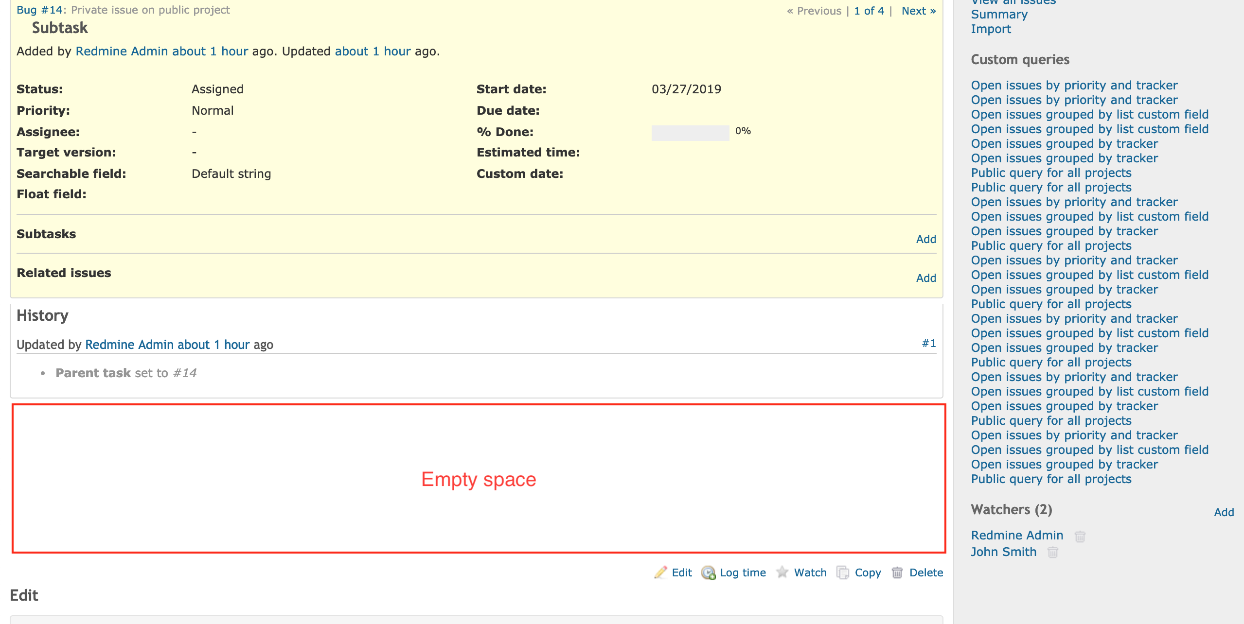
With the patch applied: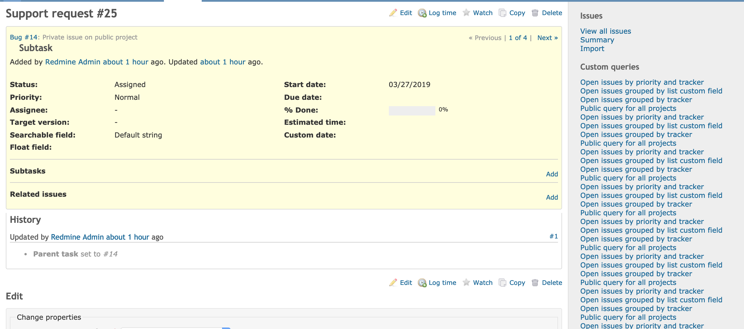
I'm attaching the patch that I would like to be committed, it contains the work done by Max and a small fix for the sidebar padding.
Updated by Go MAEDA almost 7 years ago
- Subject changed from Change #main block to a flexbox + additional minor fixes to it's direct children. to Change #main block to a flexbox + additional minor fixes to it's direct children
Marius BALTEANU wrote:
In this way, we fix an annoying bug on issue page that reproduces when the sidebar height is greater than the content height.
Nice. I have been bothered by the bug for years.
Updated by Go MAEDA almost 7 years ago
- Subject changed from Change #main block to a flexbox + additional minor fixes to it's direct children to Replace float rules with flexbox for content and sidebar block
- Status changed from New to Closed
- Assignee set to Go MAEDA
Committed the fix. Thank you for working on this.
Updated by Go MAEDA almost 7 years ago
- File table-bug@2x.png table-bug@2x.png added
- Status changed from Closed to Reopened
The change made in r18033 breaks the layout of some pages on medium-sized screens.
To reproduce the problem, open /users page in a 1024px wide browser. The left side of the table is cropped and you cannot see the first name column.
Updated by Marius BĂLTEANU almost 7 years ago
The below patch fixes the problem for me:
diff --git a/public/stylesheets/application.css b/public/stylesheets/application.css
index 09bcd5b..79cf1d0 100644
--- a/public/stylesheets/application.css
+++ b/public/stylesheets/application.css
@@ -92,7 +92,7 @@ pre, code {font-family: Consolas, Menlo, "Liberation Mono", Courier, monospace;}
 #sidebar div.wiki ul {margin:inherit; padding-left:40px;}
 #sidebar div.wiki ul li {list-style-type:inherit;}

-#content { flex-grow: 1; background-color: #fff; margin: 0px; padding: 6px 10px 10px 10px; }
+#content { flex-grow: 1; background-color: #fff; margin: 0px; padding: 6px 10px 10px 10px; overflow-x: auto;}
 html>body #content { min-height: 600px; }
 * html body #content { height: 600px; } /* IE */
Bernhard Ganslmeier, is it ok for you this fix?
 Updated by Yuichi HARADA almost 7 years ago
Marius BALTEANU wrote:
The below patch fixes the problem for me:
[...]
Bernhard Ganslmeier, is it ok for you this fix?
Thank you for sharing the patch.
I confirmed that the layout on medium-sized screens( #30435#note-24, /issues and /time_entries pages) does not break by applying your patch.
Updated by Bernhard Rohloff almost 7 years ago
I also tested the fix and it works for me, too.
Updated by Go MAEDA almost 7 years ago
- Status changed from Reopened to Closed
Committed the fix submitted as #30435#note-25 in r18135. Thank you.
Updated by Anonymous over 6 years ago
To conclude the major point behind this issue, which never got resolved back then, here is a patch to try out as a reference to #30435#note-19
Updated by Go MAEDA over 6 years ago
- Status changed from Reopened to Closed
Antonio McDeal wrote:
To conclude the major point behind this issue, which never got resolved back then, here is a patch to try out as a reference to #30435#note-19
Thank you for posting the patch. I think the width of the sidebar should be discussed in another issue because the topic is really controversial as we experienced in this issue and it will be difficult to close this issue for a long time. In my opinion, I don't like the sidebar width with the patch applied because the width of the sidebar is wider than the current style at 1024px window width (I usually set the browser width to about 1000px - 1100px).
So, I close this issue. If anyone thinks the sidebar width should be improved with the approach suggested by the patch in #30435#note-29, please open a new issue.
Updated by Anonymous over 6 years ago
I created a new issue #32037, please add it as related to this one, because part of important discussion was started in here. :)
Updated by Go MAEDA over 6 years ago
- Related to Patch #32037: Constrain sidebar width on different resolutions added