Feature #30471
openMove "Default columns" checkbox on the query edit page from "Options" to "Columns" fieldset
Added by Go MAEDA about 7 years ago. Updated about 5 years ago.
Description
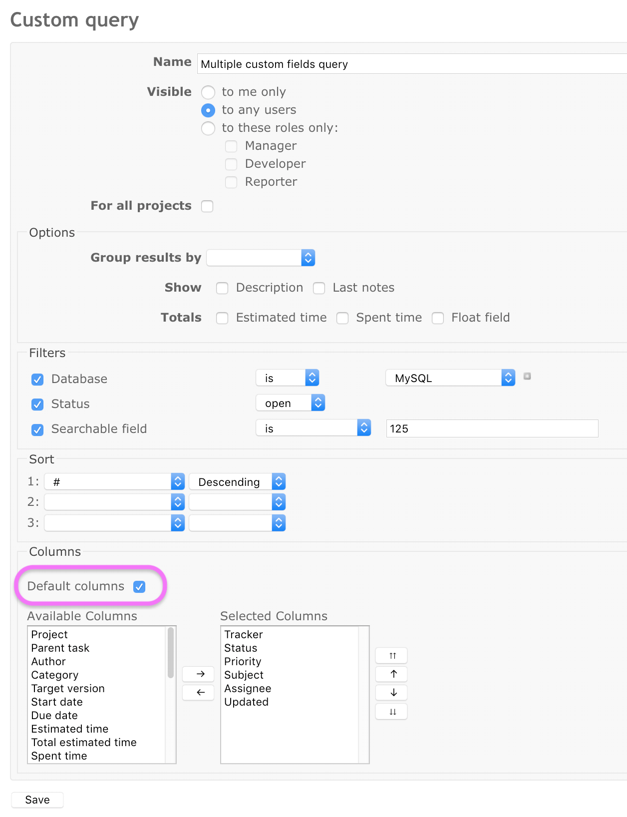
Currently, the "Default columns" checkbox on the query edit page is placed in the "Options" fieldset. I think that we can improve the UI more intuitive if we move the checkbox to "Columns" fieldset. Reasons are as follows:
- The checkbox is obviously related to "Columns"
- Since the checkbox switches enabled/disabled status of "Available columns" and "Selected columns" list boxes, it should be placed close to those.

Files
| move-default-columns-checkbox@2x.png (65.5 KB) move-default-columns-checkbox@2x.png | Go MAEDA, 2019-01-21 09:54 | ||
| screenshot_2021-01-15_11.34.36.png (121 KB) screenshot_2021-01-15_11.34.36.png | Mizuki ISHIKAWA, 2021-01-15 03:44 | ||
| screenshot_2021-01-15_11.38.31.png (190 KB) screenshot_2021-01-15_11.38.31.png | Mizuki ISHIKAWA, 2021-01-15 03:44 | ||
| screenshot_2021-01-15_11.38.46.png (189 KB) screenshot_2021-01-15_11.38.46.png | Mizuki ISHIKAWA, 2021-01-15 03:44 | ||
| 30471.patch (3.39 KB) 30471.patch | Mizuki ISHIKAWA, 2021-01-15 03:44 |
 Updated by Bernhard Rohloff about 7 years ago
It would make sense but please notice that this checkbox also disables the checkboxes for descriptions and last notes.
I have no clue why they should get disabled, too. There are no default settings for these two options so perhaps they where included by mistake.
 Updated by Mizuki ISHIKAWA about 5 years ago
- File screenshot_2021-01-15_11.34.36.png screenshot_2021-01-15_11.34.36.png added
- File screenshot_2021-01-15_11.38.31.png screenshot_2021-01-15_11.38.31.png added
- File screenshot_2021-01-15_11.38.46.png screenshot_2021-01-15_11.38.46.png added
- File 30471.patch 30471.patch added
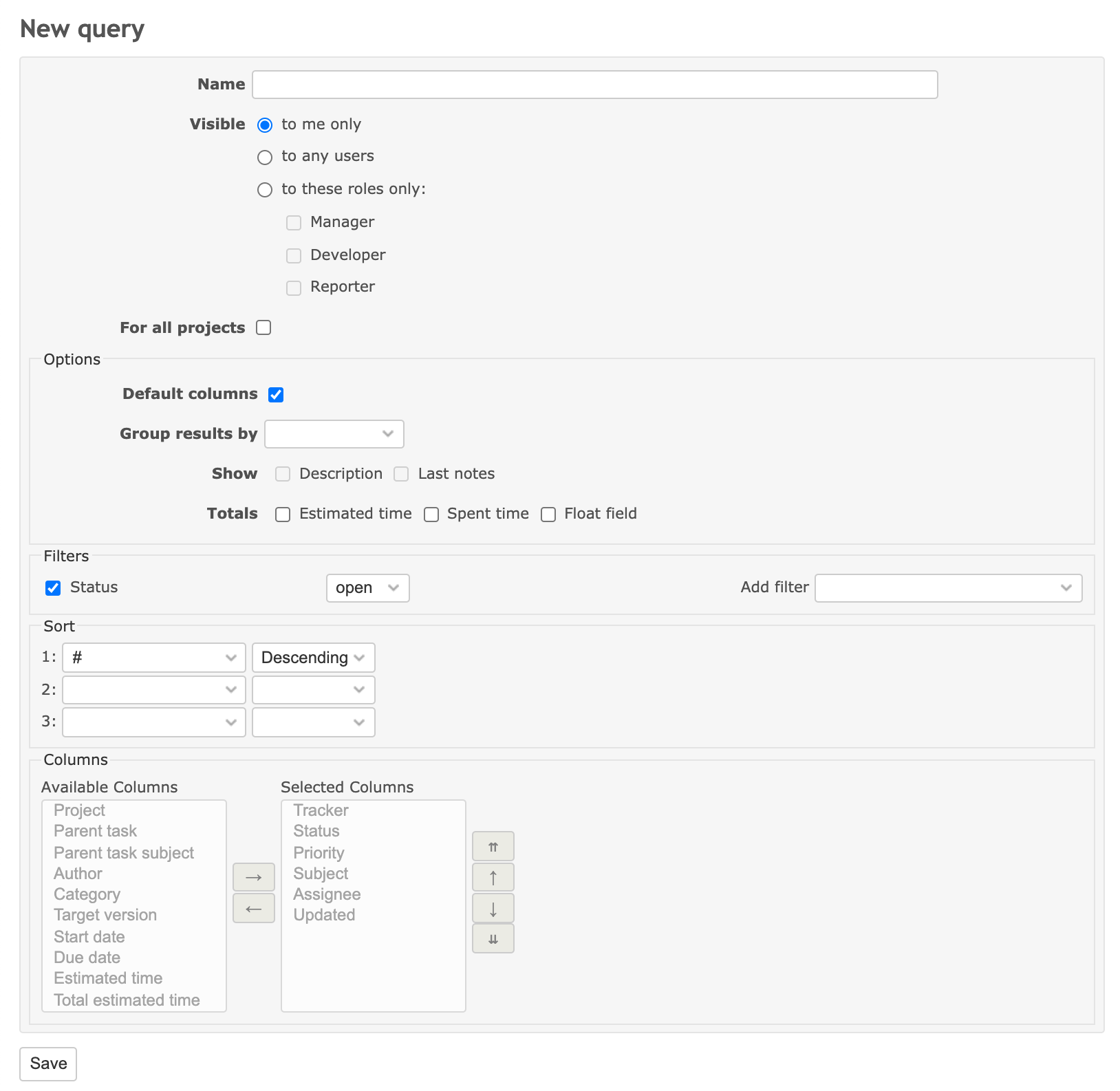
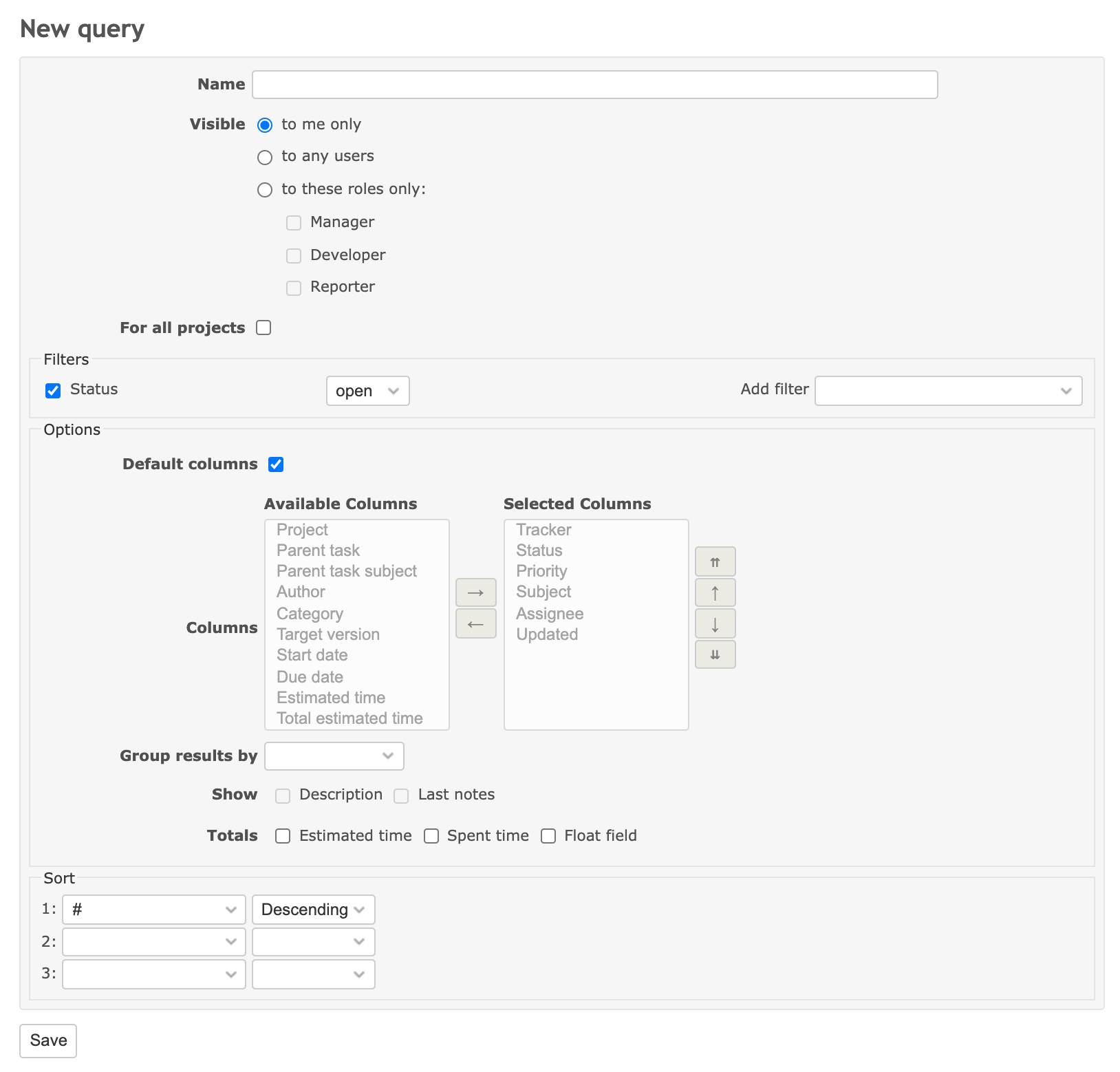
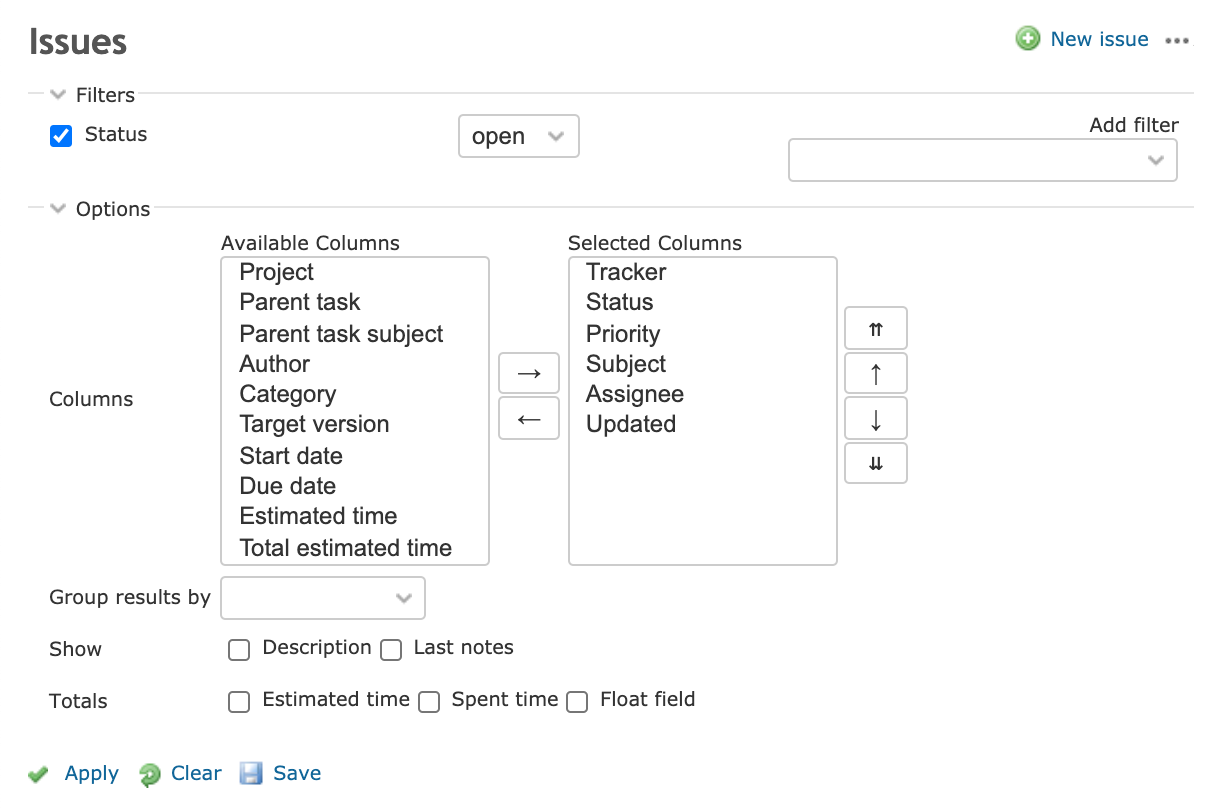
How about arranging it similar to query form at the top of the list?
| Change before | Change after |
 |
 |
Arrangement of List query form for reference
This will also place the checkboxes for descriptions and last notes nearby.
 Updated by Go MAEDA about 5 years ago
- Target version set to Candidate for next major release
Mizuki ISHIKAWA wrote:
How about arranging it similar to query form at the top of the list?
+1
It makes the UI less confusing and consistent.
 Updated by Mischa The Evil about 5 years ago
+1 from me too for the proposal by Mizuki ISHIKAWA. Nevertheless, some remarks and comments (in reply to others in chronological order):
Go MAEDA wrote:
- The checkbox is obviously related to "Columns"
Somewhat OT-nitpicking; I see what you mean and I agree to a large extent. However, I can equally-easily take the opposite stance in a way that the columns selection can also be perceived as being a(n) (display) option of/for the query.
Bernhard Rohloff wrote:
It would make sense but please notice that this checkbox also disables the checkboxes for descriptions and last notes.
I have no clue why they should get disabled, too. There are no default settings for these two options so perhaps they where included by mistake.
This is a separate thing and it is not a defect. Given that the descriptions and last notes options are actually implemented as block columns, which are, along with the inline columns (and which are both query columns), reset by enabling the default columns option, selecting these options wouldn't affect the resulting query as their state would not persist. To prevent confusion about this, these options are disabled along with the inline column selection. See #24907 for reference.
Besides the above, it might be worth opening a separate feature request to implement default settings for at least just these two options.
Go MAEDA wrote:
Mizuki ISHIKAWA wrote:
How about arranging it similar to query form at the top of the list?
[...]
This will also place the checkboxes for descriptions and last notes nearby.+1
It makes the UI less confusing and consistent.
I agree with Go MAEDA. Additionally, these views were originally already supposed to look like each other. See #4272#note-9 and #4272#note-10 for the history of this.
Now with the above in mind (as in the code), I looked at the new query form on redmine.org itself and again at the screenshots posted by Mizuki ISHIKAWA in note-3, and noticed that the column selection was initially hidden from display, which brought me back to #24907 again.
The fix for it also has a side-effect (intentional or unintentional) that the inline column selection now only remains disabled instead of being hidden. I honestly prefer the pré-#24907 behavior where the whole field-set is (also) hidden from display completely.
Maybe this can be re-added with this current re-ordering of query elements with an extension to implement the same hidden behavior for the block column selection. Looking at it from a strictly functional standpoint it might even be a good idea to place the show description, last notes, full width layout custom fields line(s) directly after (and grouped with?) the inline column selection, to be followed by the group-by element (AFAIK these columns are not group-able nonetheless). Although that might not look good from a more visual standpoint.
Lastly, I'd like to point out that this code is currently used within at least six different contexts (ProjectQuery, TimeEntryQuery details, TimeEntryQuery report, IssueQuery, IssueQuery in gantt and IssueQuery in calendar, which is already troublesome in cases: see e.g. issue #15167 which I reported myself a long time ago) and with related, corresponding JavaScripts, which makes that any element re-ordering/re-grouping should be done with care and precision.