Feature #32944
closedAlways preserve the tree structure in the project jump box
Description
#31355 is really a nice thing. But one thing is a bit distracting: When a project gets to the list of recently used projects, it gets removed from the list of other projects. Understandable, but from an UX perspective IMO it is not so nice if the project has disappeared where one would expect it. Then you have to take a look: might it be in the recently used project list? Or did I bookmark it?
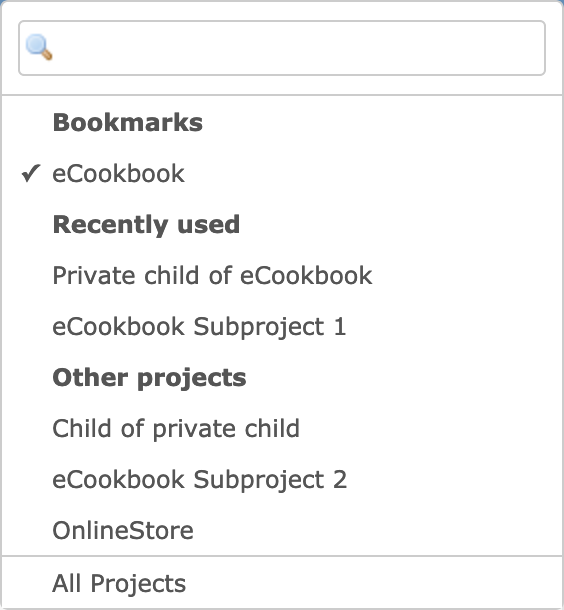
Not such a big issue. However, if you have a project structure with nested projects and you have a parent project in the recently used project list, than the other projects are rendered a bit differently. I find that confusing.
I have about 100 projects with such a structure. I'd be happy if the list of other projects look always the same. In order to find projects faster on scrolling.
If you consider this, then 'Other Projects' should probably need to be renamed to 'All projects'.
Files
Related issues
 Updated by Jens Krämer over 5 years ago
- File 0001-project-jump-box-usability-enhancements.patch 0001-project-jump-box-usability-enhancements.patch added
Actually a few of our customers at Planio had the exact same complaints, attached is a patch against current master which implements the following changes:
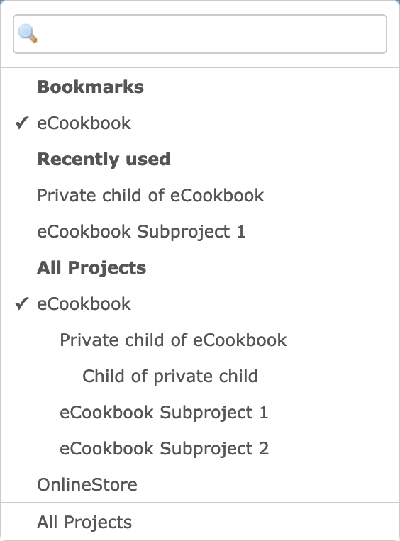
- always renders the full project tree in the third section of the jump box (that is, it does not exclude favorites and recently used projects)
- in case the user enters a query, only one "Results" section is rendered instead of filtering all three sections
 Updated by Go MAEDA over 5 years ago
- File 32944-before.png 32944-before.png added
- File 32944-after.png 32944-after.png added
- Target version set to Candidate for next major release
+1
I am sometimes confused by the behavior, too. Thank you for posting the patch.
Here are screenshots of the patch.
Before:
After:
 Updated by Bernhard Rohloff over 5 years ago
1+ I stumbled upon the same issue several times.
 Updated by Fernando Hartmann over 5 years ago
+1 Some of my users, complaint on this behavior too.
 Updated by Go MAEDA over 5 years ago
- Target version changed from Candidate for next major release to 4.2.0
Setting the target version to 4.2.0.
 Updated by Go MAEDA over 5 years ago
- Related to Feature #31355: Bookmarks and recently used projects for the project jump box added
 Updated by Go MAEDA over 5 years ago
- Tracker changed from Defect to Feature
- Subject changed from Jump box issue caused by Recently used projects and Other projects to Always preserve the tree structure in the project jump box
- Status changed from New to Closed
- Assignee set to Go MAEDA
- Resolution set to Fixed
Committed the patch. Thank you for further improving the UI.
 Updated by Bernhard Rohloff over 5 years ago
- Has duplicate Defect #33766: #31355 breaks project tree added
 Updated by Go MAEDA over 5 years ago
- Related to Defect #34357: Fix Capybara::Ambiguous: Ambiguous match, found 2 elements matching visible link or button "eCookbook" added
 Updated by Heiko Robert almost 5 years ago
Just came across the same issue after upgrading to 4.1
In our use case the patch in this ticket does not solve the issue. We have a quite complex hierarchical project structure.
before introducing #31355 the user had always in the project jump box the current project in the hierarchy preselected and could just select a sub project using the up and down keys. Now the user has to scroll down thru the whole tree to find the real node to see the childs the user wants to switch to.
#31355 is not ideal/wanted for every installation. Introducing two leaves for the same node makes things different but still confusing/not as expected so I would suggest to make that feature (#31355) configurable to optionally turn it off again.
should I create another ticket since this one is already closed?