Feature #5711
openMake Bulk Edit menu more apparent...
0%
Description
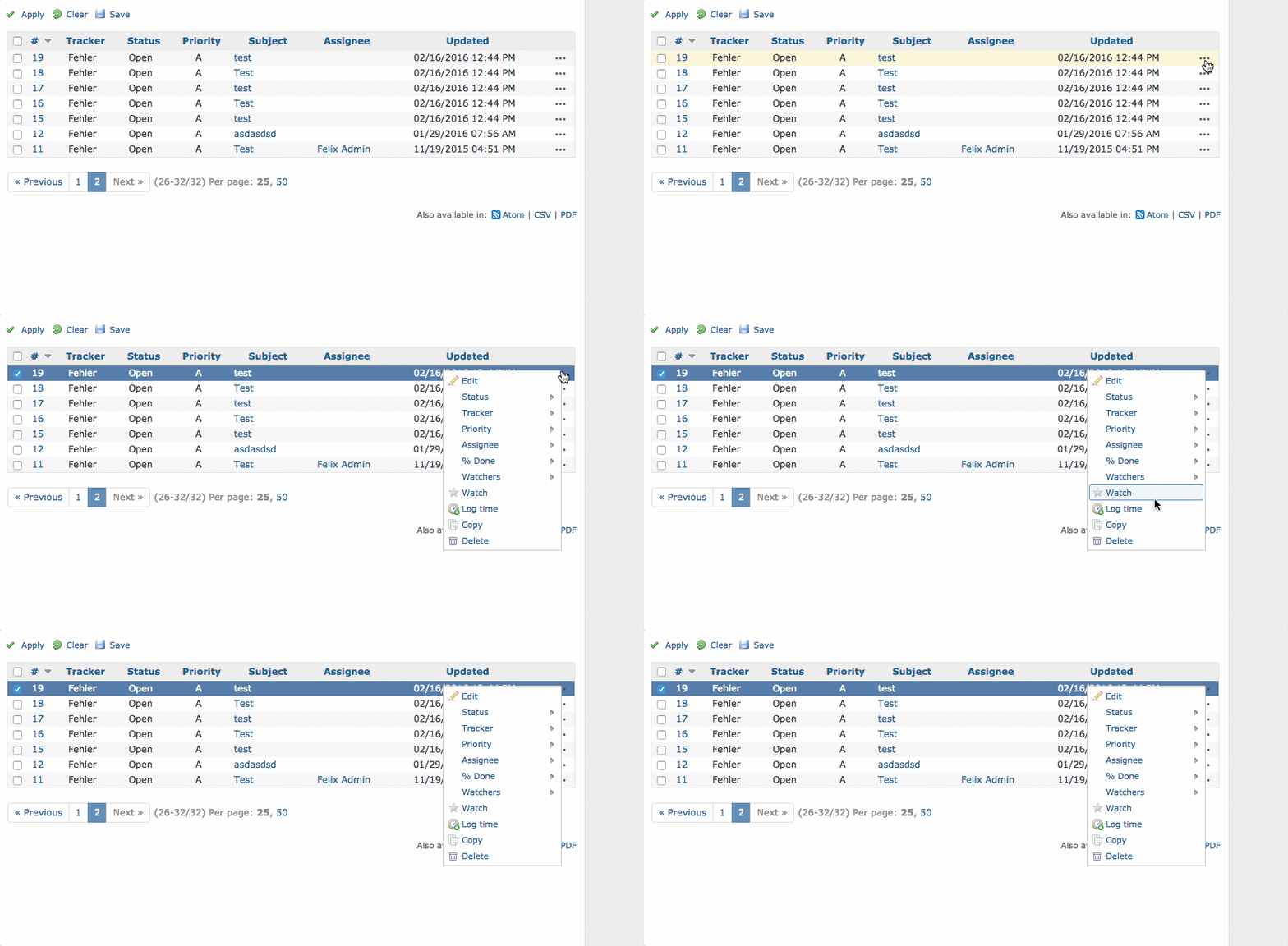
For the Issues list in any project, once you know that the bulkedit menu is a right click away, it seems so obvious, but for new non-programmer users (ie. analysts and support staff), this can be frustrating. It would be nice to have the bulk edit features available at the top and bottom of the list, or at the very least add in a (Right-click to bulk edit) text blurb at the top and/or bottom to make the process more apparent.
Using right click as the only way to access those features might also make things slightly more complicated for Mac users who do not use a 3rd party mouse or don't have the two-finger tap option turned on. The obvious counterpoint is that users can just Control click, but I don't think that's a reason not to have multiple avenues to a feature and let the user decide which best suits their abilities/workflow/usage patterns.
Related issues
 Updated by Nick Peelman over 15 years ago
I will add that it makes doing bulk edits from an iPad impossible. :)
 Updated by Nick Peelman about 15 years ago
Somewhat related to #2924. The fix in 1.0 does make it more obvious, which was Eric's goal, but still does nothing for the accessibility / handicapped / no-support-for-touch-devices angle.
 Updated by Ewan Makepeace almost 15 years ago
+1
Got accidentally discussed here as well: #6608
 Updated by Daniel Felix over 12 years ago
Well, maybe there could be some type of condition.
If theres a multiselection, there could be a bulk edit button. But anyway... working from ipad could be handled with some app (which work pretty good).
What do you think? Any suggestion how to integrate this?
 Updated by Mischa The Evil almost 8 years ago
- Related to Patch #26655: Additional icon for contextmenu added
 Updated by Mischa The Evil almost 8 years ago
A patch to implement an icon for the context menu has been proposed as #26655:

 Updated by Go MAEDA almost 7 years ago
- Has duplicate Feature #8553: Help text for bulk actions added