Defect #26853
closedFix hardcoded project-index width for webkit and mozilla browsers
Added by Ilya Malahovskiy about 8 years ago. Updated over 6 years ago.
0%
Files
| Fix_hardcoded_project-index-width.diff (634 Bytes) Fix_hardcoded_project-index-width.diff | Ilya Malahovskiy, 2017-09-07 13:55 | ||
| before.png (11.8 KB) before.png | Toshi MARUYAMA, 2017-09-07 18:04 | ||
| after.png (13.2 KB) after.png | Toshi MARUYAMA, 2017-09-07 18:04 | ||
| redmine_before.png (47.6 KB) redmine_before.png | Before fix | Ilya Malahovskiy, 2017-09-25 13:20 | |
| redmine_after.png (44.7 KB) redmine_after.png | After fix | Ilya Malahovskiy, 2017-09-25 13:21 |
Related issues
 Updated by Toshi MARUYAMA about 8 years ago
- File after.png after.png added
- File before.png before.png added
- Status changed from New to Needs feedback
 Updated by Ilya Malahovskiy about 8 years ago
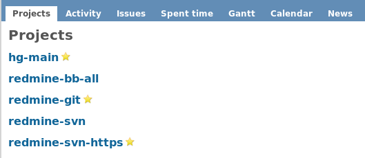
Please add descriptions to projects and check this page on hight resolution(1080p for example), and you will see the problem.
 Updated by Ilya Malahovskiy about 8 years ago
- File redmine_before.png redmine_before.png added
- File redmine_after.png redmine_after.png added
Before
After
 Updated by Toshi MARUYAMA about 8 years ago
Why do you keep "column-width: 400px;"?
 Updated by Ilya Malahovskiy about 8 years ago
Please view diff file. In source code "400px", I changed it to auto.
What are you do not understand?
 Updated by Toshi MARUYAMA about 8 years ago
You changed "-webkit-column-width:" and "-moz-column-width:" but not "column-width:".
 Updated by Ilya Malahovskiy about 8 years ago
I tried to change "column-width:", but it is not affected on this issue. May be it affect on old browsers, I do not know for what it. Or may be it affect on mobile view.
 Updated by Toshi MARUYAMA almost 8 years ago
- Has duplicate Defect #27174: Projects page show incorrect format when I use firefox and use bitnami Version 3.4.2-4 redmine setup. added
 Updated by Toshi MARUYAMA almost 8 years ago
Ilya Malahovskiy wrote:
What information do you need?
Did you try Windows IE and Edge?
 Updated by Toshi MARUYAMA almost 8 years ago
- Has duplicate Defect #27399: Issue in project list added
 Updated by Marius BĂLTEANU almost 8 years ago
- Has duplicate Defect #27556: Changes in the project view, the information is displayed in the form of columns. added
 Updated by Marius BĂLTEANU almost 8 years ago
- Has duplicate Defect #27558: Project view looks like is a bug in v3.4.3 added
 Updated by Toshi MARUYAMA over 7 years ago
- Has duplicate Defect #28005: Broken Project page added
 Updated by Isaiah Lim over 7 years ago
Got the same issue on a fresh install of v3.4.4-stable on Raspbian.
Anyway, here is my $0.02, after analyzing and playing with it.
This feature works as intended when the 'Projects' page is heavily populated with content. An example would be: https://www.r-labs.org/projects
But for a page that has a few projects/sub-projects, when the descriptions are split into multiple columns, it looks really ugly.
Is there a way to only split the content into columns if the browser height is exceeded?
Another alternative is to add an option to enable/disable columns?
 Updated by Mischa The Evil over 7 years ago
- Related to Feature #26494: Add ability to enable\disable multiple columns on project list page added
 Updated by Go MAEDA over 7 years ago
- Has duplicate Feature #28473: Using the classical 'list' view on projects added
 Updated by Go MAEDA over 7 years ago
- Related to Defect #28708: Project display should have text belonging to project in same column added
 Updated by Marius BĂLTEANU about 7 years ago
- Related to Feature #29482: Query system for Projects page added
 Updated by Marius BĂLTEANU almost 7 years ago
- Related to Patch #29951: Quick design fix/proposals for projects index page added
 Updated by Marius BĂLTEANU almost 7 years ago
I've added some design proposals for the projects page in #29951.
 Updated by Marius BĂLTEANU over 6 years ago
- Has duplicate Defect #28122: Organization of Projects added
 Updated by Marius BĂLTEANU over 6 years ago
- Tracker changed from Patch to Defect
- Status changed from Needs feedback to Closed
- Resolution set to Fixed
This problem was fixed in latest Redmine versions (3.4.8 and 4.0.1), please see #29951 for more details. Now root projects with their subprojects are shown in their own box without breaking on multiple columns. Any feedback is welcome regarding the new projects page design.
In #29482 we discuss the possibility to let users to chose the view (between the current projects page with multi columns and classical table list), please watch that ticket for updates.
I'll close this issue because I think the root problem was fixed, please reopen if I'm wrong.

