Patch #29216
openReplace the searchbox label in the header with a placeholder
Added by Bernhard Rohloff almost 7 years ago. Updated over 5 years ago.
0%
Description
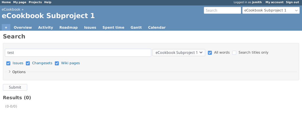
This results in a cleaner UI and feels more "state of the art".
The label is just hidden so the accesskey (4) works as expected.
I've also added some horizontal padding similar to the jump-box.
Before:
After:
Files
| search_box_with_label.png (30 KB) search_box_with_label.png | Bernhard Rohloff, 2018-07-10 06:34 | ||
| search_box_with_placeholder.png (30.2 KB) search_box_with_placeholder.png | Bernhard Rohloff, 2018-07-10 06:34 | ||
| replace_search_box_label_with_placeholder.diff (1.56 KB) replace_search_box_label_with_placeholder.diff | Bernhard Rohloff, 2018-07-10 06:50 | ||
| search_mobile.png (8.82 KB) search_mobile.png | Marius BĂLTEANU, 2019-10-01 09:23 | ||
| search.png (7.6 KB) search.png | Marius BĂLTEANU, 2019-10-01 09:23 | ||
| 0001-Compact-search-input.patch (5.11 KB) 0001-Compact-search-input.patch | Marius BĂLTEANU, 2019-10-01 18:00 | ||
| x_icon.png (9.82 KB) x_icon.png | Marius BĂLTEANU, 2019-10-01 18:03 | ||
| discordsearch.png (1.89 KB) discordsearch.png | Anonymous, 2019-10-03 14:27 | ||
| discordsearch2.png (1.57 KB) discordsearch2.png | Anonymous, 2019-10-03 14:27 |
Related issues
 Updated by Go MAEDA almost 7 years ago
- Related to Feature #13153: Show search scope as a placeholder in quick search field added
 Updated by Go MAEDA almost 7 years ago
I wonder whether we can hide the "Search" label. The label is hyperlinked to the search page. After applying the patch, there will be no way to go to the page.
 Updated by Bernhard Rohloff almost 7 years ago
Go MAEDA wrote:
... After applying the patch, there will be no way to go to the page.
I could imagine that dropping this feature isn't a huge thing for the vast majority of Redmine users. I'm using Redmine on a daily basis and it took me three years to discover that this label actually links to a page. And even after that I think this is not the usual method for people searching in Redmine. The "Google" way to search something is hacking words into a box and hit enter and that's what most users are used to do. After "hitting enter" you are on the same view that the link provides plus you have first results to look at and you can refine your search afterwards.
We can also design the placeholder more functional in a second step so it can provide information about the default scope of the search e.g. "Search in Redmine" or "Search in eCookbook".
 Updated by Mizuki ISHIKAWA over 6 years ago
+1
Bernhard Rohloff wrote:
Go MAEDA wrote:
... After applying the patch, there will be no way to go to the page.
I could imagine that dropping this feature isn't a huge thing for the vast majority of Redmine users.
I noticed now that the search label is a link.
I think that this proposal is good.
 Updated by Marius BĂLTEANU over 5 years ago
- File search_mobile.png search_mobile.png added
- File search.png search.png added
- File 0001-Compact-search-input.patch 0001-Compact-search-input.patch added
What about of using the same search input available for mobile version, but with the magnifier icon clickable?
Non-mobile:
Mobile:
 Updated by Marius BĂLTEANU over 5 years ago
- File x_icon.png x_icon.png added
Also, switching to a search input field, it'll add the nice clear input icon (HTML 5 feature).
![]()
 Updated by Bernhard Rohloff over 5 years ago
I've tried Marius's patch and it works very nice. IMHO this would be a nice improvement. LGTM!
 Updated by Anonymous over 5 years ago
- File discordsearch.png discordsearch.png added
- File discordsearch2.png discordsearch2.png added
I like the idea with clear button, but I think it wastes horizontal space of the bar when typing while appearing from the other side, the search icon is really useless after you already began typing in the bar anyway. I think search icon and clear button should be unified into one, for instance like on Discord.
