Defect #29694
openSome buttons in wiki toolbar are hidden in responsive layout
0%
Description
#27758#note-8 by Marius BALTEANU:
on responsive mode, when the screen resolution width in less than the total width of the js toolbar (tabs + buttons), some buttons become hidden. I'm not happy with the current solution, but is not a blocker from my point of view and we can improve this later when we have a better solution.
#27758#note-53 by Takeshi Nakamura:
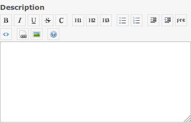
Toolbar buttons are not wrapped when the screen is narrow.
Redmine 4.0

Redmine 3.4

Files
Related issues
 Updated by Go MAEDA almost 7 years ago
- Related to Feature #27758: Adds preview option to the wiki toolbar added
 Updated by Takenori TAKAKI over 5 years ago
- File scrollable-css.patch scrollable-css.patch added
- File scrollable-css.gif scrollable-css.gif added
- File move-left-right-buttons.patch move-left-right-buttons.patch added
- File move-left-right-buttons.png move-left-right-buttons.png added
I made two patterns of patches to make wiki-toolbar scrollable.
Attach the patches with the screenshot.
(1) scrollable-css.patch
Add scroll setting with css to wiki-toolbar.

(2) move-left-right-buttons.patch
Add buttons to move the wiki-toolbar left and right like the setting screen.

 Updated by Go MAEDA over 5 years ago
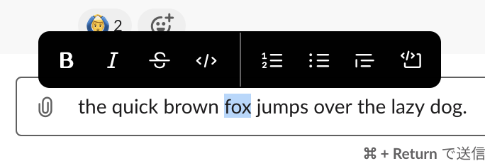
- File slack-popup-menu.png slack-popup-menu.png added
It may be one of the solutions to reduce buttons by implementing a context menu like Slack. In Slack, the menu is displayed when you select text. We can remove some buttons from the current toolbar with the popup menu.

 Updated by Bernhard Rohloff over 5 years ago
- File github_small.png github_small.png added
- File github_wide.png github_wide.png added
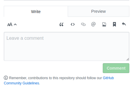
Github also has an interesting solution for this issue. They simply put their toolbar under the tab if there's not enough space left next to it.
On wide screens the toolbar is next to the tabs.
On narrow screens it moves under the tabs in the input field area.