Feature #27758
closedAdds preview option to the wiki toolbar
Description
I'm working on a patch that adds the Preview functionality to the wiki toolbar. I find it more friendly to have the preview option for each individual field, instead of the bottom link. Most of the time, when I'm writing the description of an issue, I need to scroll down to the preview link, click it, view the preview and then scroll up to continue writing.
I want to share some screenshoots in order to take some feedback from the community.
1. Write/Preview tabs:

When the preview tab is opened, the textarea field is replaced with the formatted text. In this way, you can easily switch between write/preview modes.
2. Preview button
Instead of the tabs, we can have just a button that toggles between Preview and Write.
Files
Related issues
 Updated by Marius BĂLTEANU over 8 years ago
- Subject changed from Adds preview tab to the wiki toolbar to Adds preview option to the wiki toolbar
 Updated by Holger Just over 8 years ago
I really like this proposal as it makes it much more apparent when a preview is available. Using a tab directly besides the respective text field helps users to not lose focus of their work.
UI-wise, I like the tab-approach (your first screen shot) mich better than the button since the tabs make it clear that you change between different views of the same thing (the entered text). This idiom is also common in other software like GitHub or Wordpress. I'd like to propose some slight changes though:
- We should use the exact visual design of the existing tabs elements already used elsewhere, e.g. in the revision view of the repository where it's possible to switch between the list of changes and the diff or the project's settings tab.
- I think those edit icons above the text box should be part of the the "Write" tab itself so that they are removed when you switch to the "Preview" tab. Here, we might need to be a bit creative since it is probably desirable to not introduce another "row" of text (tab, icons, tex box). It might be possible to combine the icons and the tabs somehow while still sticking to the existing components used elsewhere in Redmine.
Generally, the layout should also work when there is no explicit preview option for the text box available since this might not strictly be the case for all fields; the welcome text in the settings comes to mind, as well as e.g. text custom fields or stuff added by plugins. It would however be awesome if this preview / tab bar would be as versatile as the existing icon bar, preferably it could even be added with exactly the same code (or just small changes).
All in all though, I like this very much!
 Updated by Marius BĂLTEANU over 8 years ago
Holger Just wrote:
I really like this proposal as it makes it much more apparent when a preview is available. Using a tab directly besides the respective text field helps users to not lose focus of their work.
Thanks for your feedback, Holger.
UI-wise, I like the tab-approach (your first screen shot) mich better than the button since the tabs make it clear that you change between different views of the same thing (the entered text). This idiom is also common in other software like GitHub or Wordpress. I'd like to propose some slight changes though:
- We should use the exact visual design of the existing tabs elements already used elsewhere, e.g. in the revision view of the repository where it's possible to switch between the list of changes and the diff or the project's settings tab.
Totally agree.
- I think those edit icons above the text box should be part of the the "Write" tab itself so that they are removed when you switch to the "Preview" tab.
Yes, I've already implemented this feature.
Here, we might need to be a bit creative since it is probably desirable to not introduce another "row" of text (tab, icons, tex box). It might be possible to combine the icons and the tabs somehow while still sticking to the existing components used elsewhere in Redmine.
For now, I chose to create the tabs from javascript, in the same way how the toolbar buttons are created and most of the changes are made in the jstoolbar.js file. If you think that is better to create the tabs using the existing render_tabs method, I think that I can find a solution.
Generally, the layout should also work when there is no explicit preview option for the text box available since this might not strictly be the case for all fields; the welcome text in the settings comes to mind, as well as e.g. text custom fields or stuff added by plugins. It would however be awesome if this preview / tab bar would be as versatile as the existing icon bar, preferably it could even be added with exactly the same code (or just small changes).
In the current implementation, the Preview works wherever the wikitoolbar_for method is called because I've added a default method preview#text.
All in all though, I like this very much!
I'm going to post this weekend a fist version of my patch and I think that we can discuss more about the technical solution after that.
 Updated by Marius BĂLTEANU over 8 years ago
- File write.png write.png added
- File preview.png preview.png added
- File write_preview_tabs_wip.patch added
Holger, attached is an working version (only for markdown) of my patch. I still have some things to do (like adding support for textile, removing preview links, add tests), but if you're interested to test it, is enough. The functionality and the design are the final one (attached also 2 screenshots). I'm not 100% happy which the results from UI perspective, but is the best that I can do which my current CSS skills, using the existing Redmine components and not adding to many changes.
Any feedback is really appreciated. My intention is to have a final version of this patch until 21.12.
Write tab:
Preview tab:
 Updated by Go MAEDA over 8 years ago
- File 27758-many-lines.png 27758-many-lines.png added
Thank you for working on this feature. I think that this is an awesome improvement.
But I noticed that the preview is not perfectly displayed when I enter text with many lines. Maybe we need a vertical scroll bar or a responsive preview area.
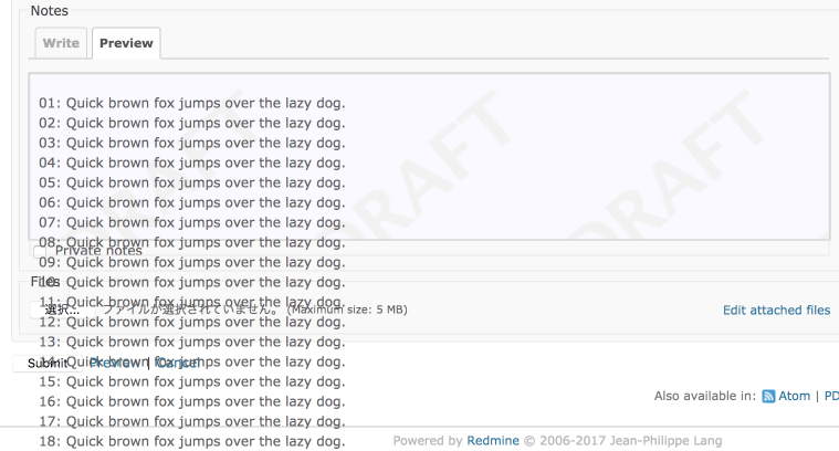
 Updated by Marius BĂLTEANU over 8 years ago
Go MAEDA wrote:
But I noticed that the preview is not perfectly displayed when I enter text with many lines. Maybe we need a vertical scroll bar or a responsive preview area.
Thanks. I've fixed the issue on my local development.
 Updated by Mischa The Evil over 8 years ago
- Write tab:

- Preview tab:

- I think that a UI-design like provided by your patch is preferred, for the same reasons as mentioned by Holger in note#2;
- your patch is already more complete/polished (think e.g. access-keys);
- your patch is a bit less JavaScript heavy;
- your approach of implementing this in a similar fashion as (other) toolbar buttons is interesting, creative and (visually) neat.
Nice job. I'm interested in seeing subsequent iterations of this patch.
 Updated by Marius BĂLTEANU over 8 years ago
- File drop-jstoolbar-textile.min.patch added
- File replace_preview_link_with_a_write_preview_tabs.patch added
I've finished most of the work for this feature. UI tests are missing currently, but I'll add a new patch with them next days. Until then, the patches can be tested and/or reviewed.
1. drop-jstoolbar-textile.min.patch:
This patch removes the jstoolbar-textile.min.js file and uses for textile formatting the same jstoolbar.js file. I chose to remove this file because I wasn't able to figure out which is the "official" way to generate a new merged and minified version from the new jstoolbar. In the same time, if it is desired to use a minified version (which is a good idea), we should document the tools and the steps to generate it and we should apply the same logic also for markdown formatting (at least).
2. replace_preview_link_with_a_write_preview_tabs.patch:
- adds the write preview tabs to the text formatting toolbar
- removes all the existing Preview links
- adds a default preview url that can be used to preview simple texts (eg: project description from the project settings)
- on responsive mode, when the screen resolution width in less than the total width of the js toolbar (tabs + buttons), some buttons become hidden. I'm not happy with the current solution, but is not a blocker from my point of view and we can improve this later when we have a better solution.
Considering that the changes are quite big, I think that it is a good opportunity to discuss the implementation of this feature in Redmine 4.0.0.
 Updated by Marius BĂLTEANU over 8 years ago
- Related to Feature #27368: Make preview for comments for news added
 Updated by Marius BĂLTEANU over 8 years ago
- Related to Feature #2604: Preview comment on news / bulk edit added
 Updated by Marius BĂLTEANU over 8 years ago
- Related to Feature #22015: A side by side textile preview would by very helpful added
 Updated by Marius BĂLTEANU over 8 years ago
- Related to Feature #9174: Suggestion - Preview on Documents added
 Updated by Marius BĂLTEANU over 8 years ago
- Related to Feature #7157: Content Editor Preview at the same place where text is added
 Updated by Marius BĂLTEANU over 8 years ago
- Related to Feature #4252: Move preview button to before "submit" added
 Updated by Marius BĂLTEANU over 8 years ago
- File deleted (
replace_preview_link_with_a_write_preview_tabs.patch)
 Updated by Marius BĂLTEANU over 8 years ago
- File deleted (
write_preview_tabs_wip.patch)
 Updated by Marius BĂLTEANU over 8 years ago
- File write.png write.png added
- File preview.png preview.png added
Attached is a new version of the patch which includes:
- fixes for the existing tests
- new system tests for the write/preview feature in various screens
- small fixes
This version of the patch is final from my point of view.
Some screenshots:
Write tab:
Preview tab:
 Updated by Marius BĂLTEANU over 8 years ago
- File replace_preview_link_with_write_preview_tabs.patch added
 Updated by Bernhard Rohloff about 8 years ago
I've played around with your latest patches and I haven't found any flaw, or unexpected behavior. Except for the missing accesskey 'r' to switch to the preview.
It's definitely better than the mentioned plugin which I have installed on my private Redmine and a great improvement to Redmine's UX.
I'm looking forward to see this merged, soon.
 Updated by Mischa The Evil about 8 years ago
- Assignee set to Marius BĂLTEANU
- Target version set to Unplanned backlogs
Marius BALTEANU wrote:
1. drop-jstoolbar-textile.min.patch:
This patch removes the jstoolbar-textile.min.js file and uses for textile formatting the same jstoolbar.js file. I chose to remove this file because I wasn't able to figure out which is the "official" way to generate a new merged and minified version from the new jstoolbar. In the same time, if it is desired to use a minified version (which is a good idea), we should document the tools and the steps to generate it and we should apply the same logic also for markdown formatting (at least).
I agree completely on this. See eg. #14937 where this became troublesome too.
Bernhard Rohloff wrote:
[...] Except for the missing accesskey 'r' to switch to the preview.
This seemed to be working in the patch I reviewed looked at as posted in note#4.
Marius Ionescu: can you take a look at this?
 Updated by Marius BĂLTEANU about 8 years ago
Bernhard Ganslmeier, thanks for testing these patches.
Regarding the missing accesskey 'r', I'm aware, but I can't make it work correctly (using only the native accesskey attribute) when we have more than one JS Toolbar in the page (like in the issue#edit mode). Hitting the 'r' key when the focus is in the textarea, will switch the preview tab from the next JS Toolbar because is the next element in the page that has the respective accesskey. To make it more clear, look at the HTML structure (illustrated below) from the issue#edit and observe that the textarea is always after its own Preview element.- ...
- write tab
- preview tab with accesskey 'r'
- textarea for description field
- ...
- write tab
- preview tab with accesskey 'r'
- textarea for notes field
To make it work as expected, I need to override the native functionality using javascript, but this is something bigger and I want to do it in the future because:
- I would like to add some shortcuts for accessing the jstoolbar buttons (Control/Command + B for bold, Control/Command + I for italic, etc..).
- I will propose to use a JS library that implements a consistent shortcut key between the browsers. I find it very difficult to use the current implementation that depends on the browser and OS.
From my point of view, this missing accesskey should not be a blocker for this ticket.
 Updated by Bernhard Rohloff about 8 years ago
I think the missing accesskey is no big deal, because this patch lets you access the previews easier than the mostly unknown accesskey did. I also injected the accesskey in the tab with the development tools of Firefox to get a feeling for the UX and it wasn't good overall. You have no possibility to switch back to the editor tab via accesskey so you have to use the mouse anyway.
It would be great if we could get this merged in 4.0.0 or 4.1.0.
 Updated by Mischa The Evil about 8 years ago
Marius BALTEANU wrote:
[...] (using only the native accesskey attribute) [...]
Yeah, I consider them as pretty rudimentary ;)
Marius BALTEANU wrote:
- I would like to add some shortcuts for accessing the jstoolbar buttons (Control/Command + B for bold, Control/Command + I for italic, etc..).
- I will propose to use a JS library that implements a consistent shortcut key between the browsers. I find it very difficult to use the current implementation that depends on the browser and OS.
Both sound good, but especially the second is something that could help wide(r) adoption of accesskey use. The current dependency on browser and OS (by using the native attribute) is pretty horrific, if you'd ask me.
Though, I'd like to know first (as in before applying code that is knowingly breaking the preview accesskey functionality) if Jean-Philippe would accept any patches implementing accesskeys using JS at all.
Btw: issue #6846 is related to this.
Marius BALTEANU wrote:
From my point of view, this missing accesskey should not be a blocker for this ticket.
I tend to agree in this case. However we should not forget that this particular accesskey has been available for over 10 years (since 0.6), so users could be very accustomed to it, making it a potentially hard change (like we've seen too with e.g. #19468, which, partially, obsoleted the 'Start calendars on' setting).
Bernhard Rohloff wrote:
[...] the mostly unknown accesskey [...]
Well, I think this statement is mostly true, but we can't say for sure. The only fact that we know of is that the feature has been long available but that it never has been documented properly before #27412 (it's not even covered in popular English books1). I know Redmine admins, superusers and a small amount of managers (i.e. people who actually read the source code) who have been actively advocating to their users to make use of these accesskeys to up their productivity...
1 like "Lesyuk, Andriy (2013). Mastering Redmine. Packt Publishing. ISBN 978-1-849519-14-4.", although I don't know if it changed with its second edition.
 Updated by Bernhard Rohloff about 8 years ago
Mischa The Evil wrote:
Though, I'd like to know first (as in before applying code that is knowingly breaking the preview accesskey functionality) if Jean-Philippe would accept any patches implementing accesskeys using JS at all.
Yes, I agree. It would be great to have JP's opinion/vision on this topic.
I'm a heavy user of the shortcuts, too. And although I would miss this feature, I think this patch would gain the productivity of the majority of users who are not so familiar with the accesskeys. One can have a quick look at the preview without scrolling the page up and down. The editor always stays in its position which is also less distracting.
 Updated by Marius BĂLTEANU about 8 years ago
@Go Maeda, is something missing from my patch in order to set the target version to 4.1.0? I really want to see this change in the next major release.
 Updated by Go MAEDA about 8 years ago
- File 27758-padding@2x.png 27758-padding@2x.png added
- Target version changed from Unplanned backlogs to Candidate for next major release
Marius, thank you for working on this feature, I think it is a big improvement.
But there is one worrisome thing. Please see the following screenshot. I think we can improve padding value. 1em of padding before the first line is too much. And the left side of the paragraph is too close to the border on the left. What do you think?
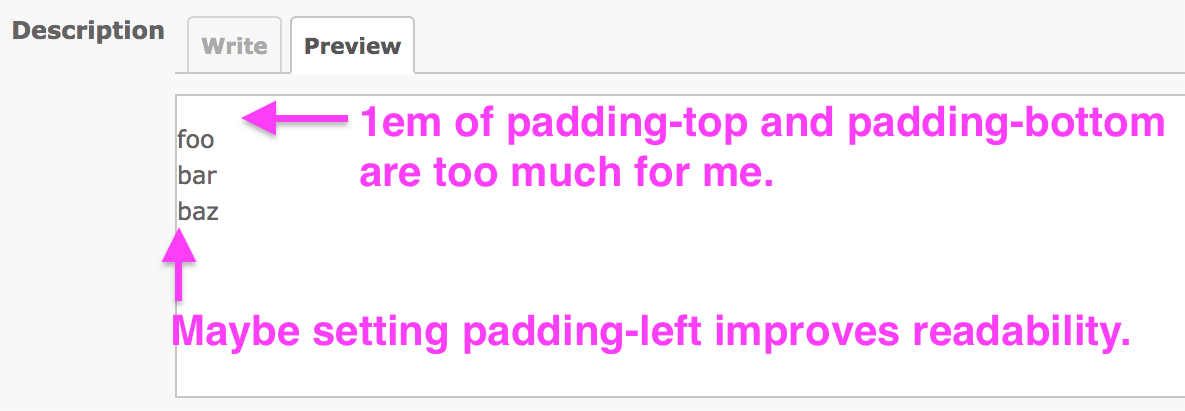
 Updated by Marius BĂLTEANU about 8 years ago
- File preview_with_padding.png preview_with_padding.png added
Thanks for your feedback.
Now is better?

 Updated by Go MAEDA about 8 years ago
Marius BALTEANU wrote:
Now is better?
It looks nice.
 Updated by Marius BĂLTEANU almost 8 years ago
- File deleted (
replace_preview_link_with_write_preview_tabs.patch)
 Updated by Marius BĂLTEANU almost 8 years ago
- File replace_preview_link_with_write_preview_tabs.patch added
Updated the patch to include the fix suggested by Go Maeda.
 Updated by Go MAEDA almost 8 years ago
- File write-20180429@2x.png write-20180429@2x.png added
- File preview2-20180429@2x.png preview2-20180429@2x.png added
- File preview1-20180429@2x.png preview1-20180429@2x.png added
Marius BALTEANU wrote:
Updated the patch to include the fix suggested by Go Maeda.
Thanks. I think it will be perfect if the padding-top in the preview area is dropped. Please see the screenshots.
"Write" tab: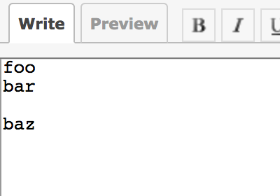
"Preview" tab (the current patch):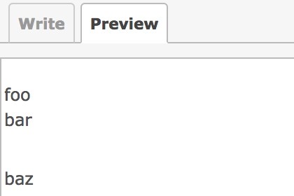
"Preview" tab (padding-top: 0):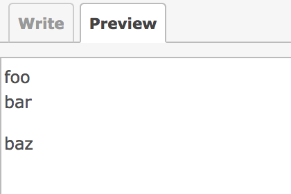
.tabular .wiki-preview p {
  min-height: initial;
  padding: 1em 0 1em 0 !important;
  overflow: initial;
}
 Updated by Marius BĂLTEANU almost 8 years ago
- File replace_preview_link_with_write_preview_tabs.patch added
Attached the fixed version. Sorry for my previous patch, I've totally messed up the CSS rules (I wrote margin instead padding).
 Updated by Marius BĂLTEANU almost 8 years ago
- File deleted (
replace_preview_link_with_write_preview_tabs.patch)
 Updated by Go MAEDA almost 8 years ago
- Assignee deleted (
Marius BĂLTEANU) - Target version changed from Candidate for next major release to 4.1.0
Thank you for attaching the final patch. I suggest implementing this feature in the next release.
 Updated by Martin Blom over 7 years ago
Would love to see this patch included. It would make it much easier less hacky to handle previews in alternative editors like Bestest Markdown Editor, which also integrates the preview view inside the editor.
Would it also add preview support for textarea elements that currently do not have a preview option, like when editing the issue description?
 Updated by Marius BĂLTEANU over 7 years ago
- File deleted (
replace_preview_link_with_write_preview_tabs.patch)
 Updated by Marius BĂLTEANU over 7 years ago
- File deleted (
drop-jstoolbar-textile.min.patch)
 Updated by Marius BĂLTEANU over 7 years ago
- File 0001-drop-minified-version-of-jstoolbar-textile.patch 0001-drop-minified-version-of-jstoolbar-textile.patch added
- File 0002-replace-preview-link-with-write-priview-tabs.patch 0002-replace-preview-link-with-write-priview-tabs.patch added
Updated the patches to apply cleanly on the current trunk and to prevent an error on IE browser.
Martin Blom wrote:
Would love to see this patch included. It would make it much easier less hacky to handle previews in alternative editors like Bestest Markdown Editor, which also integrates the preview view inside the editor.
Would it also add preview support for
textareaelements that currently do not have a preview option, like when editing the issue description?
Yes, it will work anywhere the toolbar is now rendered because the Write/Preview tabs are part of the toolbar.
 Updated by Go MAEDA over 7 years ago
- Assignee set to Jean-Philippe Lang
- Target version changed from 4.1.0 to 4.0.0
 Updated by Jean-Philippe Lang over 7 years ago
- Status changed from New to Closed
- Resolution set to Fixed
Patch committed for 4.0. Marius, thank you for your work on this.
 Updated by Marius BĂLTEANU over 7 years ago
Jean-Philippe Lang wrote:
Patch committed for 4.0. Marius, thank you for your work on this.
Thanks for committing it. I'll keep an eye on possible issues reported by the users.
 Updated by Jean-Philippe Lang over 7 years ago
- Status changed from Closed to Reopened
Write and Preview are hardcoded strings in javascript. We have to support translations for these.
 Updated by Marius BĂLTEANU over 7 years ago
I've looked in the code and support for translations already exists, please see line source:/trunk/public/javascripts/jstoolbar/jstoolbar.js#L101. The jsTab function receives the tab name as a string and it checks first for translation. If exists, it uses the translated string, if not, it uses the string as tab name.
I think we need to add the new strings (Write, Previews) to all translations files. This is a manual process or there is a task to automatically add them?
 Updated by Wim DePreter over 7 years ago
Jean-Philippe Lang wrote:
Write and Preview are hardcoded strings in javascript. We have to support translations for these.
Is "Edit" not better then "Write"?
 Updated by Go MAEDA over 7 years ago
Marius BALTEANU wrote:
I think we need to add the new strings (Write, Previews) to all translations files. This is a manual process or there is a task to automatically add them?
Add keys to en.yml and run rake locales.
 Updated by Jean-Philippe Lang over 7 years ago
Wim DePreter wrote:
Jean-Philippe Lang wrote:
Write and Preview are hardcoded strings in javascript. We have to support translations for these.
Is "Edit" not better then "Write"?
Yes, we can reuse Edit and Preview strings that are already present in locales.
 Updated by Jean-Philippe Lang over 7 years ago
Marius BALTEANU wrote:
I think we need to add the new strings (Write, Previews) to all translations files. This is a manual process or there is a task to automatically add them?
I guess you're speaking about JS translations that sit in public/javascripts/jstoolbar/lang. There's no task to add strings to these. You can just update english and I'll take care of the others. Thanks.
 Updated by Marius BĂLTEANU over 7 years ago
Here it is. I choose to replace also in the code Write with Edit.
 Updated by Jean-Philippe Lang over 7 years ago
- Status changed from Reopened to Closed
I didn't see that the en locale was already filled in your original patch, thanks. I've updated all the others.
 Updated by Marius BĂLTEANU over 7 years ago
- Related to deleted (Feature #7157: Content Editor Preview at the same place where text is)
 Updated by Marius BĂLTEANU over 7 years ago
- Has duplicate Feature #7157: Content Editor Preview at the same place where text is added
 Updated by Takeshi Nakamura over 7 years ago
- File toolbar-4.0.png toolbar-4.0.png added
- File toolbar-3.4.png toolbar-3.4.png added
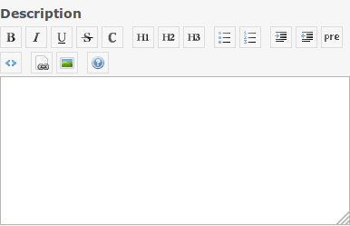
Toolbar buttons are not wrapped when the screen is narrow.
Redmine 4.0

Redmine 3.4
 Updated by Go MAEDA over 7 years ago
- Status changed from Closed to Reopened
- Assignee changed from Jean-Philippe Lang to Marius BĂLTEANU
Takeshi Nakamura wrote:
Toolbar buttons are not wrapped when the screen is narrow.
Marius, could you look into this?
 Updated by Marius BĂLTEANU over 7 years ago
Go MAEDA wrote:
Takeshi Nakamura wrote:
Toolbar buttons are not wrapped when the screen is narrow.
Marius, could you look into this?
I know the issue, I've mentioned about this in note-8 ("- on responsive mode, when the screen resolution width in less than the total width of the js toolbar (tabs + buttons), some buttons become hidden. I'm not happy with the current solution, but is not a blocker from my point of view and we can improve this later when we have a better solution." but I'm not sure which should be the fix because the proposed solution will require a lot of space on small screens and also is not an easy fix.
A quick fix could be to hide the JS toolbar on small screens and on the long term, we can work to a better solution, for example:- group some JS buttons under the same category: (eg: H1, H2 and H3 under H category)
- option to expand/collapse the JS buttons
- horizontal scroll without showing the scroll bar
- left/right buttons (as we have for menu)
IMHO, we can deliver this as it is and we'll fix it in the next minor release when for sure we will have other small improvements to be done for this feature.
 Updated by Go MAEDA over 7 years ago
- Status changed from Reopened to Closed
- Assignee changed from Marius BĂLTEANU to Jean-Philippe Lang
Marius BALTEANU wrote:
IMHO, we can deliver this as it is and we'll fix it in the next minor release when for sure we will have other small improvements to be done for this feature.
I agree with you. Since it is a small issue, it should not delay the release of 4.0.0.
 Updated by Go MAEDA over 7 years ago
- Related to Defect #29694: Some buttons in wiki toolbar are hidden in responsive layout added
 Updated by Go MAEDA over 7 years ago
- Related to Feature #29712: Preview and wiki toolbar for full width custom fields added
 Updated by Marius BĂLTEANU about 7 years ago
- Related to Defect #30988: Preformatted text overflows the preview area added
 Updated by Marius BĂLTEANU about 7 years ago
- Related to Defect #30758: Preview URL in Wiki Toolbar should be escaped added
 Updated by Marius BĂLTEANU about 7 years ago
- Related to Feature #30459: Switch edit/preview tabs with keyboard shortcuts added
 Updated by Go MAEDA over 5 years ago
- Related to Patch #34444: Remove unused key :preview from Redmine::AccessKeys::ACCESSKEYS added