Feature #31353
open
Replace user related links in the top menu bar with a proper user menu.
Description
At the moment the top menu bar offers several user related links which make the top bar look cluttered and which are often confusing for users.
It would be better to have a proper user menu instead of these links. It's a concept users know from many other websites like GitHub, GitLab and Wordpress etc.
Here for example the user menu in wordpress:

Files
Related issues
 Updated by Bernhard Rohloff about 7 years ago
Marius Ionescu BALTEANU I've added you to the watchers list because I think to remember you already worked on something like this in the past, didn't you?
 Updated by Go MAEDA about 7 years ago
- Related to Feature #31348: Add tabs to switch between Profile and My account page added
 Updated by Marius BĂLTEANU about 7 years ago
Indeed, I've a working patch, I'll try to post it today (at least for testing purposes).
Updated by Bernhard Rohloff over 6 years ago
Marius Ionescu have you had time to make any progress on this issue in last time?
If yes, I would love to test it. :-)
 Updated by Anonymous over 6 years ago
Marius Ionescu I would also like to test it, and if it's not ready, we could atleast disassemble it and take a look.
Updated by Marius BĂLTEANU over 6 years ago
- File 0001-move-user-accounts-menu-links-under-a-dropdown-wip.patch 0001-move-user-accounts-menu-links-under-a-dropdown-wip.patch added
You can test the attached patch, I'm not very happy with the implementation, but for a first round of feedback, it should be good enough.
Updated by Anonymous over 6 years ago
Marius BALTEANU wrote:
You can test the attached patch, I'm not very happy with the implementation, but for a first round of feedback, it should be good enough.
I don't know why you re not very happy with current implementation, but I really quite liked it already. I think even if it's not that super perfect it could be fixed up even more later on.
Updated by Marius BĂLTEANU over 6 years ago
- File user_dropdown.png user_dropdown.png added
- File search_and_jump_box_in_top_menu.png search_and_jump_box_in_top_menu.png added
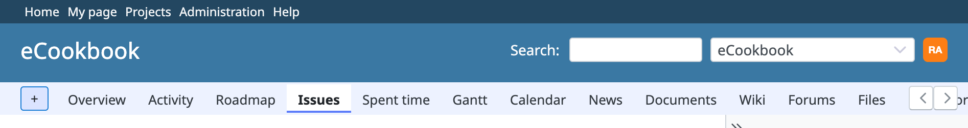
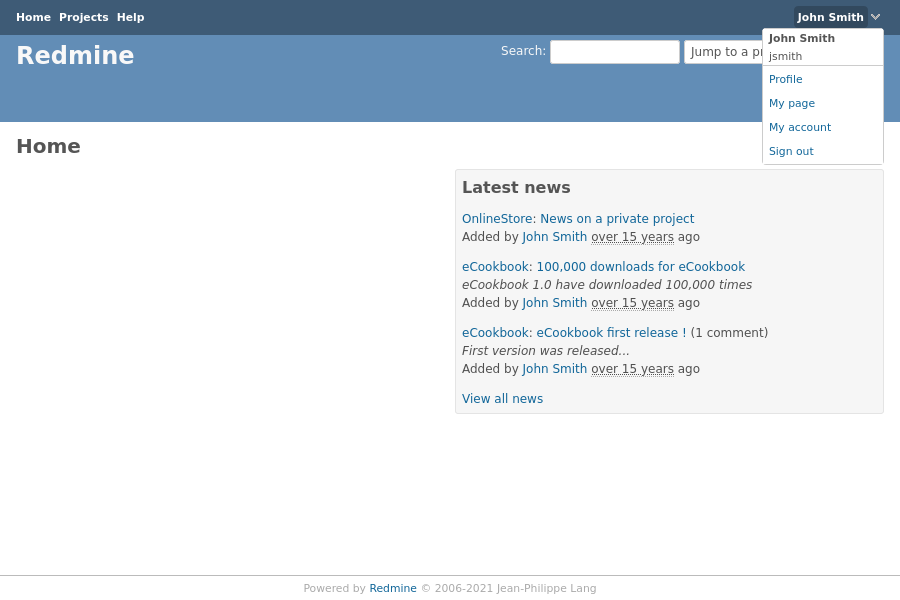
I made some progress and I would like to share two screenshots:
1. Move only user related links under a user dropdown:
2. Move search and project jump box to top menu:
Updated by Anonymous over 6 years ago
Marius BALTEANU wrote:
I made some progress and I would like to share two screenshots
I am all for the second implementation, so we could close #32115 but couple of cents from me:
- It feels like links on the left side are too small for the available space, I think they should be at least the size of text in the white fields on the right side. Please see #32115 where I made links to be a bit bigger.
- Avatar on the fly-out is circle now, while it's not a circle everywhere else, it feels like a super minor, but an inconsistency.
P.S. please add #32115 as related, because now it is :D
Updated by Bernhard Rohloff over 6 years ago
Version 2 FTW! This search bar in the header annoys me as hell.
I've tried your patch and looked nice already. One thing I would like to change is the drop-down trigger. I'm used to trigger the drop-down menu on click rather then on hover, but I guess you have had me in mind on your latest screenshots. ;-)
Updated by Marius BĂLTEANU over 6 years ago
- File 0001-wip.patch 0001-wip.patch added
Bernhard, Antonio, I've reworked the entire patch, you can use the new one for testing. It's more complete, but it still need some work to improve the code and of course, fixes. I've tested only one Chrome.
All 3 proposals were been included.
Feel free to review it.
Updated by Anonymous over 6 years ago
- File 0001-wip-antonio-edition.patch 0001-wip-antonio-edition.patch added
- File 0001-wip-antonio-edition-0.9em-topbar-fontsize.patch 0001-wip-antonio-edition-0.9em-topbar-fontsize.patch added
Marius BALTEANU wrote:
Bernhard, Antonio, I've reworked the entire patch, you can use the new one for testing. It's more complete, but it still need some work to improve the code and of course, fixes. I've tested only one Chrome.
All 3 proposals were been included.
Feel free to review it.
I am happy :)
I took an in-depth look though, and noticed:
#top-menu .profile-menu li.avatar-menu .drdn-content {
  padding-top: 5px;
  padding-bottom: 5px;
}
I don't think this should exist at all, those paddings make the menu look different from the project jump, maybe not padding-top: 5px; but padding-bottom: 5px; absolutely.
#top-menu {
    background: #3E5B76;
    padding: 2px 6px 0px 6px;
    display: flex;
}
I think padding: 2px 6px 0px 6px; should be changed to padding: 0px 6px 0px 6px; to remove 2 unnecessary pixels of padding from up top. This makes things centered even more, and saves us 2 pixels. :D
I also noticed:
#top-menu ul.nav-list li.nav-item > a {
    font-size: 0.9em;
    color: #fff;
}
Here if you remove/disable font-size: 0.9em; entirely, the avatar in the top menu gets more centered and inline with the other white bars, not sure why it's like that though.
Things seem to work just fine and the same in IE11 too.
I'm attaching 2 versions which I think would be perfect, just in case.
Updated by Go MAEDA over 6 years ago
Thank you for writing the patch. I have some requests:
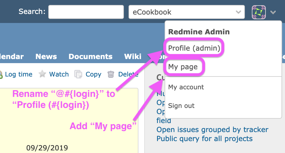
- Change the link text name to "Profile" (
label_profile). The name of page /users/999 is "Profile". I think the correct name should be shown in the menu. - Add "My page" to the menu. All pages related to the user will be accessible from the menu if "My page" is added. IMHO it would be a nice UX improvement.
Updated by Go MAEDA over 6 years ago
- File planio@2x.png planio@2x.png added
Perhaps we can study from Planio, a Redmine based online service. Planio already has account drop-down.
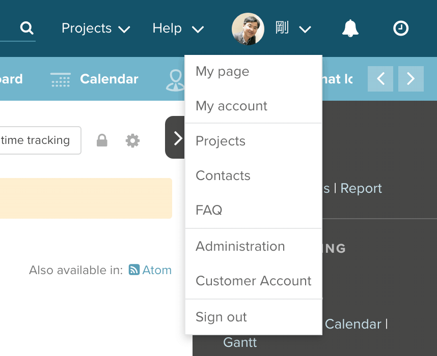
They offer a freemium plan (Bronze plan, 1 project, 2 users, 1GB), so trying Planio is easy.
Updated by Anonymous over 6 years ago
Go MAEDA wrote:
Perhaps we can study from Planio, a Redmine based online service. Planio already has account drop-down.
I like the idea, of moving more links inside user menu :D
Updated by Bernhard Rohloff over 6 years ago
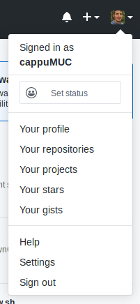
- File usermenu_github.png usermenu_github.png added
Go MAEDA wrote:
Thank you for writing the patch. I have some requests:
- Change the link text name to "Profile" (
label_profile). The name of page /users/999 is "Profile". I think the correct name should be shown in the menu.- Add "My page" to the menu. All pages related to the user will be accessible from the menu if "My page" is added. IMHO it would be a nice UX improvement.
I'm also in favor of moving user related links inside the user menu. This makes thinks very easy for new users.
Github's user menu is also a nice case study of this practice. I also like the plus menu next to the user menu. <3
Updated by Bernhard Rohloff over 6 years ago
By the way...
... display:block; and padding:0; on the avatar link aligns it vertically with the rest. ;-)
#top-menu ul.nav-list li.nav-item > a {
  font-size: 0.9em;
  color: #fff;
  display: block;
  padding: 0;
}
 Updated by Mischa The Evil over 5 years ago
- Related to Patch #32115: Move search bar and project selector to the top bar added
Updated by Bernhard Rohloff over 4 years ago
- File user_menu_gravatar.png user_menu_gravatar.png added
- File user_menu_no_gravatar.png user_menu_no_gravatar.png added
- File 0003-added-hook-to-right-section-of-the-top-menu.patch 0003-added-hook-to-right-section-of-the-top-menu.patch added
- File 0002-changed-and-added-tests.patch 0002-changed-and-added-tests.patch added
- File 0001-moved-user-links-under-a-drop-down-menu.patch 0001-moved-user-links-under-a-drop-down-menu.patch added
I've made new patches for this feature which apply on the latest trunk.
The menu is based on the existing drop down menu structures and has two versions for usage with and without gravatars. Additionally we can add a new hook to the top menu to make it more extendable by plugin developers to add more widgets like for example a punch clock or notification menu.
![]()
![]()
Updated by Marius BĂLTEANU 9 days ago
- File 0001-Improve-top-menu-navigation-31353.patch added
- Target version set to Candidate for next major release
- use nav html tag instead of div
- refactor top menu classes for desktop view based on the flyout menu
- move administration link before user menu as icon only
- added a new dropdown component based on Stimulus JS (
dropdown_controller.js) with the CSS indropdown.css - apply on hover same style from header links.
Before discussing which links to move under the user menu, I would like first to agree on this first patch.
Updated by Marius BĂLTEANU 9 days ago
- File deleted (
0001-Improve-top-menu-navigation-31353.patch)
Updated by Marius BĂLTEANU 9 days ago
Updated by Go MAEDA 9 days ago
Marius BĂLTEANU wrote in #note-22:
I've reworked the patch:
- use nav html tag instead of div
- refactor top menu classes for desktop view based on the flyout menu
- move administration link before user menu as icon only
- added a new dropdown component based on Stimulus JS (
dropdown_controller.js) with the CSS indropdown.css- apply on hover same style from header links.
Thank you for posting this patch to improve the menu. I think the overall direction is good, and the UI looks more modern.
That said, I feel there is still some room for improvement in the following areas.
- The top menu feels slightly too tall. It might look better if the icon size and padding were reduced a little.
- I found changing "Administration" to an unlabeled gear icon somewhat unclear. Personally, I prefer keeping the "Administration" label to the left of "Help", as it is now.
- Also, since the unlabeled gear icon is placed close to the user icon, some users might mistake it for a user settings menu.
Updated by Marius BĂLTEANU 9 days ago
Thanks!
Go MAEDA wrote in #note-25:
Marius BĂLTEANU wrote in #note-22:
I've reworked the patch:
- use nav html tag instead of div
- refactor top menu classes for desktop view based on the flyout menu
- move administration link before user menu as icon only
- added a new dropdown component based on Stimulus JS (
dropdown_controller.js) with the CSS indropdown.css- apply on hover same style from header links.
Thank you for posting this patch to improve the menu. I think the overall direction is good, and the UI looks more modern.
That said, I feel there is still some room for improvement in the following areas.
- The top menu feels slightly too tall. It might look better if the icon size and padding were reduced a little.
I will try to adjust the size, but the height is push by user avatar size.
- I found changing "Administration" to an unlabeled gear icon somewhat unclear. Personally, I prefer keeping the "Administration" label to the left of "Help", as it is now.
- Also, since the unlabeled gear icon is placed close to the user icon, some users might mistake it for a user settings menu.
In order to not block the implementation, I will move the "Administration" link back and we postopone this discussion for another ticket.
 Updated by Florian Walchshofer 8 days ago
Nice step forward, this looks much better
I’m not sure if the administration link/icon is that relevant in the top menu, since not many users have access to it. I could imagine moving it into the user menu (under the avatar) instead. Nothing critical — keeping it as a text link or updating the icon would also be fine.
A couple of minor UI details:- The icon hover state looks slightly vertically off / not perfectly centered
- The avatar might look cleaner with a slightly smaller size (e.g. 22px)
- The icon padding could also be reduced a bit to better match the avatar
- due to the reduced icon padding, additional gap was introduced on the top-menu__links container to maintain spacing
Updated by Go MAEDA 4 days ago
The following screenshot shows my design idea for 0001-Improve-top-menu-navigation-31353.patch.
- Move the user's avatar next to `#project-jump` to eliminate the issue where the height of `#top-menu` increases.
- Keep the "Administration" menu displayed as a text link, as it is today.