Patch #31971
closedChange the color of the input field frame when in focus
Added by Mizuki ISHIKAWA over 5 years ago. Updated over 5 years ago.
Description
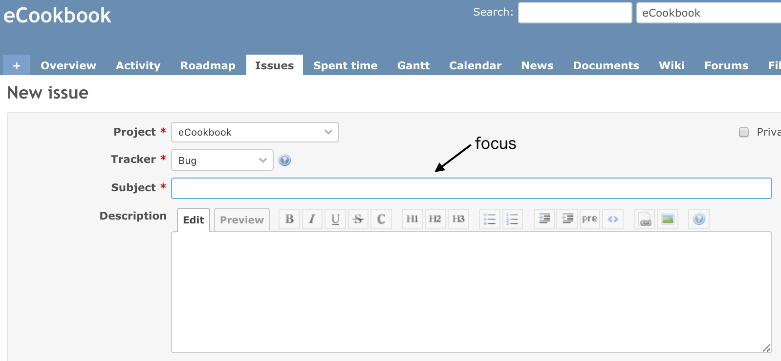
In Redmine 4.0, the frame color changed when the input field was focused.
When the trunk Redmine is run on a browser such as Firefox, the frame color no changes.
I attached a patch to change the frame color.
Screenshot after patching:
Files
| ScreenShot-2019-08-29-9.33.14.png (95 KB) ScreenShot-2019-08-29-9.33.14.png | Mizuki ISHIKAWA, 2019-08-29 02:54 | ||
| diff.patch (754 Bytes) diff.patch | Mizuki ISHIKAWA, 2019-08-29 02:55 | ||
| corners-not-rounded.png (12.2 KB) corners-not-rounded.png | Go MAEDA, 2019-09-21 17:08 | ||
| rounded-outline.png (12 KB) rounded-outline.png | Go MAEDA, 2019-09-21 17:16 |
Related issues
 Updated by Go MAEDA over 5 years ago
- Related to Patch #31147: Add custom styles for all fields added
 Updated by kim kk over 5 years ago
Subjectの部分を一回目クリックした場合は、
Hoverしたデータのリストが表示されますが、
他のText Areaをクリックした後、再度Subjectをクリックしても、
Hoverしたデータのリストが表示されないです。
Sorry. English is no good. use Japanese.
 Updated by Go MAEDA over 5 years ago
kim kk wrote:
Sorry. English is no good. use Japanese.
Thank you for your feedback. I will add English translation to #31971#note-2 later.
 Updated by Go MAEDA over 5 years ago
kim kk wrote:
Subjectの部分を一回目クリックした場合は、
Hoverしたデータのリストが表示されますが、
他のText Areaをクリックした後、再度Subjectをクリックしても、
Hoverしたデータのリストが表示されないです。
Do you mean that the patch breaks the auto-complete feature? I could not reproduce the problem. The patch changes only the appearance of elements, so I think it does not affect auto-complete.
Could you describe the detailed steps to reproduce and attach screenshots?
 Updated by Go MAEDA over 5 years ago
- File corners-not-rounded.png corners-not-rounded.png added
- File rounded-outline.png rounded-outline.png added
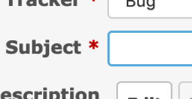
I tried out the patch with Firefox. It made the appearance nicer but I round a problem. Input fields have rounded corners, but the corners of the outline are not rounded.

How about updating the patch as follows? I think it makes the appearance much nicer.
diff --git a/public/stylesheets/application.css b/public/stylesheets/application.css
index b66a07e7d..7c5eb5838 100644
--- a/public/stylesheets/application.css
+++ b/public/stylesheets/application.css
@@ -484,6 +484,16 @@ input[type="submit"] {
 input[type="submit"]:hover {
   background-color: #ddd;
 }
+
+input[type="text"]:focus, input[type="text"]:active,
+input[type="password"]:focus, input[type="password"]:active,
+input[type="date"]:focus, input[type="date"]:active,
+select:focus, select:active,
+textarea:focus, textarea:active {
+  border: 1.5px solid #5ad;
+  outline: none;
+}
+
 select[multiple=multiple] {background: #fff; padding-right: initial; height: auto;}
 fieldset {border: 1px solid #e4e4e4; margin:0; min-width: inherit;}
 legend {color: #333;}

 Updated by Go MAEDA over 5 years ago
- Target version set to 4.1.0
Setting the target version to 4.1.0.
 Updated by Mizuki ISHIKAWA over 5 years ago
Go MAEDA wrote:
I tried out the patch with Firefox. It made the appearance nicer but I round a problem. Input fields have rounded corners, but the corners of the outline are not rounded.
How about updating the patch as follows? I think it makes the appearance much nicer.[...]
The change looks better!
I think it would be better to change "border: 1.5px" to “border: 1px” to match the existing border style.
diff --git a/public/stylesheets/application.css b/public/stylesheets/application.css
index 04fc3ae12..edf96d4fe 100644
--- a/public/stylesheets/application.css
+++ b/public/stylesheets/application.css
@@ -484,6 +484,16 @@ input[type="submit"] {
 input[type="submit"]:hover {
   background-color: #ddd;
 }
+
+input[type="text"]:focus, input[type="text"]:active,
+input[type="password"]:focus, input[type="password"]:active,
+input[type="date"]:focus, input[type="date"]:active,
+select:focus, select:active,
+textarea:focus, textarea:active {
+  border: 1px solid #5ad;
+  outline: none;
+}
+
 select[multiple=multiple] {background: #fff; padding-right: initial; height: auto;}
 fieldset {border: 1px solid #e4e4e4; margin:0; min-width: inherit;}
 legend {color: #333;}
 Updated by Go MAEDA over 5 years ago
Mizuki ISHIKAWA wrote:
The change looks better!
I think it would be better to change "border: 1.5px" to “border: 1px” to match the existing border style.
Thank you for your feedback. I think the patch in #31971#note-7 is ready to commit.
 Updated by Go MAEDA over 5 years ago
- Status changed from New to Closed
- Assignee set to Go MAEDA
Committed the patch. Thank you.
 Updated by Marius BĂLTEANU over 5 years ago
- Status changed from Closed to Reopened
Go Maeda, Mizuki, is there any reason for why you chose to target each type of input instead of using input?
Mariuss-MacBook-Pro:redmine mariusbalteanu$ git diff
diff --git a/public/stylesheets/application.css b/public/stylesheets/application.css
index 95f857074..169b1ef48 100644
--- a/public/stylesheets/application.css
+++ b/public/stylesheets/application.css
@@ -512,10 +512,7 @@ input[type="submit"]:hover {
   background-color: #ddd;
 }

-input[type="text"]:focus, input[type="text"]:active,
-input[type="password"]:focus, input[type="password"]:active,
-input[type="date"]:focus, input[type="date"]:active,
-input[type="number"]:focus, input[type="number"]:active,
+input:focus, input:active,
 select:focus, select:active,
 textarea:focus, textarea:active {
   border: 1px solid #5ad;
 Updated by Marius BĂLTEANU over 5 years ago
- Status changed from Reopened to Closed