Patch #29184
open
Add home to the application menu
0%
Description
This patch makes the following two changes
・Add home to application menu
・Change to display application menu on home screen
By applying this change you can check issues and activities as soon as you login.

Files
Related issues
 Updated by Mizuki ISHIKAWA about 7 years ago
- Copied to Patch #29185: Add my_page to the application menu added
 Updated by Go MAEDA about 7 years ago
- Copied to deleted (Patch #29185: Add my_page to the application menu)
Updated by Go MAEDA about 7 years ago
- Related to Patch #29185: Add my_page to the application menu added
Updated by Go MAEDA about 7 years ago
- Target version set to Candidate for next major release
I think this is a small patch but a big improvement. Users can go to cross-projects issues, gantt, news, and other useful pages with just one click.
You see the Home page every time after sign in. Currently, there are no tabs on the page, so it requires some clicks to see useful information (e.g. click "Projects" then "Issues").
This is also helpful for beginners. They usually cannot understand what they should do next after sign in. But the proposed menu on the Home page should be a good guide for them.
Updated by Go MAEDA about 7 years ago
- Related to Feature #5920: Unify and improve cross-project views layout added
 Updated by Marius BĂLTEANU about 7 years ago
I'm not sure what to say about this change because even if I agree with the most of the arguments posted by Go Maeda, I find it quite awkward to have more duplicated items in the menus (when I'm saying this I have in mind also the proposal from #29185).
IMHO, we should try to find a solution to merge these 2 menus (even if it'll be a major UI change) and maybe to completely redesign the whole top area, including:
- moving the "jump to project" drop-down on hover the "Projects" item menu - how Jean-Philippe proposed initially in #23310
- moving the search in the menu - how it is the plan.io design
 Updated by Bernhard Rohloff about 7 years ago
I also have concerns about copying the top menu items into the main menu. It's really odd to have the same link twice just next to each other. As I understand it, the top menu's purpose is to reach places in Redmine, which doesn't share the same context. It's confusing for me to have a "Home" tab in the main menu of the global overview but not if you are in a specific project. Then you have to take the old path through the top menu. All that said I can see the benefit of doing so. The tiny top menu is hard to recognize and not a great selling point of Redmine.
Marius BALTEANU wrote:
IMHO, we should try to find a solution to merge these 2 menus (even if it'll be a major UI change) and maybe to completely redesign the whole top area, including:
- moving the "jump to project" drop-down on hover the "Projects" item menu - how Jean-Philippe proposed initially in #23310
- moving the search in the menu - how it is the plan.io design
I also think this would be the way to go. A redesign of the header section and the global navigation paradigm would make much more sense and would be appreciated by many people.
Updated by Bernhard Rohloff about 7 years ago
I've taken a second glimpse on the screenshot and I think the patch would work superior if we would change the 'Home' tab name to something else like 'Welcome' or 'Start'. In this case the 'Home' section is recognized as the whole view including the main menu and not just a subsection. If the 'Home' view becomes the tabbed view as proposed, we can move everything (except for help) from the top menu to the main menu.
 Updated by Felix Schäfer over 4 years ago
Go MAEDA wrote:
This is also helpful for beginners. They usually cannot understand what they should do next after sign in. But the proposed menu on the Home page should be a good guide for them.
This alone should be a good enough reason to add this even if it duplicates already present menu entries. Let's ask the question the other way around: why would someone, especially a beginner, be required to go and especially need to know to go to "Projects" in the top left menu to be able to see Issues and so on. It is also quite surprising, and I would think doubly so for a beginner, that the tabs exists "everywhere" (either as project menu or the global application menu) except on the Home/Welcome page.
I agree that that part of the UI/UX could be reworked and overhauled, but accomplishing that work should not hold back a big improvement for beginners and casual users.
Updated by Bernhard Rohloff over 4 years ago
Felix Schäfer wrote:
I agree that that part of the UI/UX could be reworked and overhauled, but accomplishing that work should not hold back a big improvement for beginners and casual users.
I agree with you on that point and from my point of view it's also an improvement in convenience to have the global project view right after login and without the need of navigating to it afterwards. After logging in, first view I navigate to is the activity page. The patch would save me at least an annoying click every day. But I think there's further room for improvement on this topic.
IMHO the "Home" page isn't very useful and in this view, with its news and activity tabs, it is also quite redundant. As a logged in user I'd rather prefer the "my page" tab proposed in #29185 as a kind of dashboard.
So here's how I think it should be realized...
For visitors who aren't logged in, the "Home" link points to the "Home" or even better "Welcome" tab as a point of introduction to the Redmine instance. After logging in, the "Home" tab gets replaced by the "My Page" or maybe "Dashboard" tab and the "Home" link in the top menu points to this new view. The "My Page" link gets removed from the top menu as it's no longer needed.
There are only two views left. The global one and the project specific. It's easy for the user to determine his current location and how to switch between the two views.
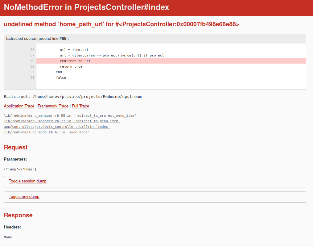
Updated by Bernhard Rohloff over 4 years ago
- File patch_29184_error.png patch_29184_error.png added
BTW the patch causes an error if one is on the "Home" tab and tries to select "All projects" from the quick-jump dropdown menu.